Top 13 Graphic Design Trends (2024)
You may also like:
From generative AI to new styles and consumer preferences, the graphic design space is changing quickly.
However, generative AI isn't the only trend impacting graphic design right now.
And in this report we'll cover the 13 most important trends in graphic design happening right now.
1. Generative AI Brings New Threats (And Opportunities)
Generative AI has the potential to completely disrupt the graphic design industry.
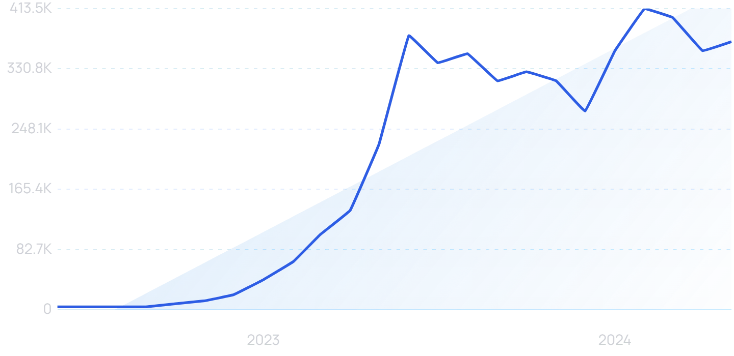
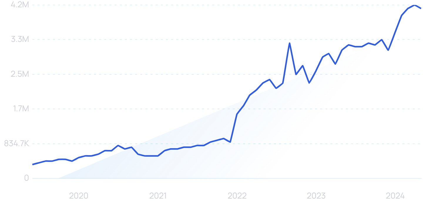
Searches for "generative AI" have increased by over 8,000% over the last two years.
While many say generative AI will put designer out of work, others see LLMs as just another tool in the toolbox.
A tool that could allow designers to create better work.
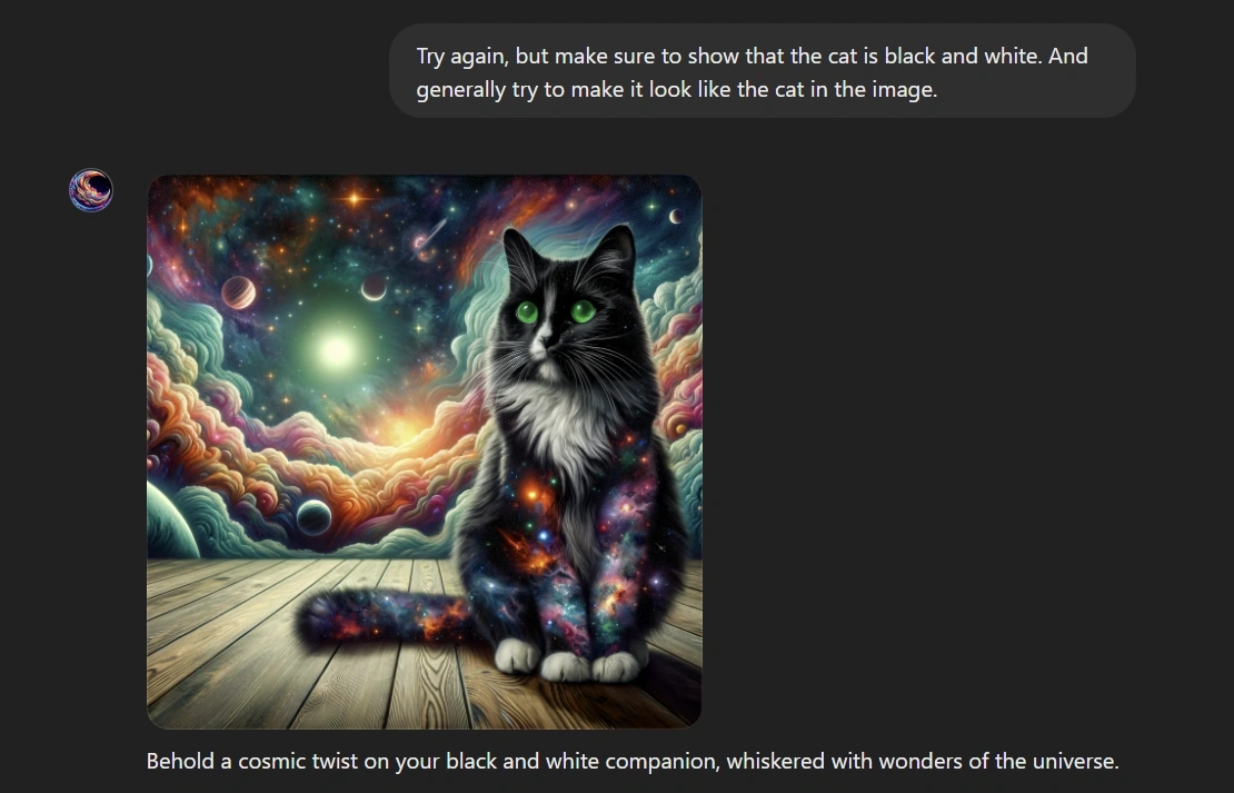
Currently, LLM-powered tools like Midjourney and Dall-E (inside of ChatGPT) are being used by millions of people all over the world to create images.
The images created include concept art, logos, website mockups, t-shirt designs and more.
Tools like Dall-E allow text to image generation.
In general, LLMs have the potential to make anyone with knowledge of prompt engineering (and context engineering) a designer. Which does pose a very real threat to designers of all kinds.
But these tools also allow professional graphic designers to become more efficient.
For example, McKinsey reports that "gen AI enables industrial designers to explore more ideas and product experiences, including previously unimagined ones, and develop initial design concepts significantly faster than with traditional methods."
In other words, they estimate that generative AI will actually be a net positive for the design industry.
It's still too early to tell how exactly generative AI will affect designers.
But there's no question that the tools are going to have a massive impact on the industry in 2024 and 2025.
2. Hand-drawn Illustrations
Nearly 90% of consumers say authenticity is important when deciding what brands they like and support.
Utilizing custom illustrations in visuals is one-way businesses are boosting their authenticity among consumers.
Hand-drawn art conveys originality on the part of the business. It provides the personal, unique approach that today’s consumers desire.
According to the Adobe Trust Report, 72% of consumers say poor personalization decreases their trust in brands.
On the other hand, the right imaging and content can demonstrate empathy and understanding for consumers.
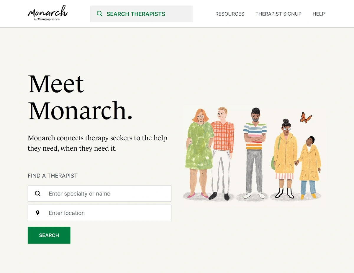
The homepage for Monarch was designed by Jessica Strelioff.
Custom illustrations and visuals also stand out among the competition. Consumers are more interested in looking at custom art than stock photography.
This is especially true on social media.
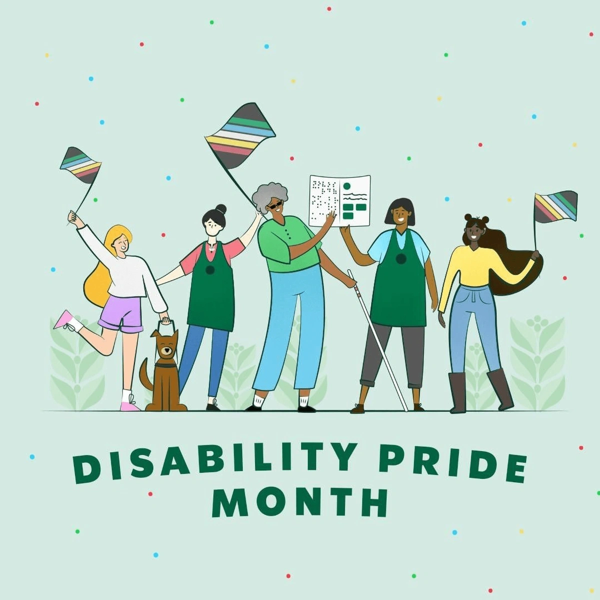
Starbucks used hand-drawn illustrations for this social media campaign in Summer 2022.
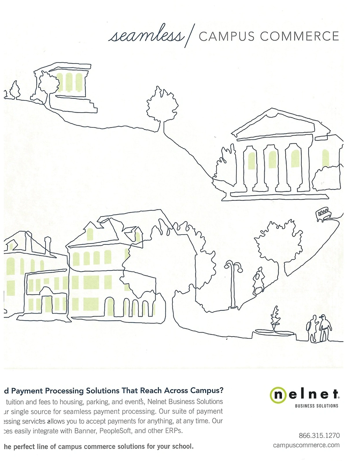
Many of the examples of this trend are hand-drawn doodles and line art.
A print ad for Nelnet, a payment solutions provider for higher education.
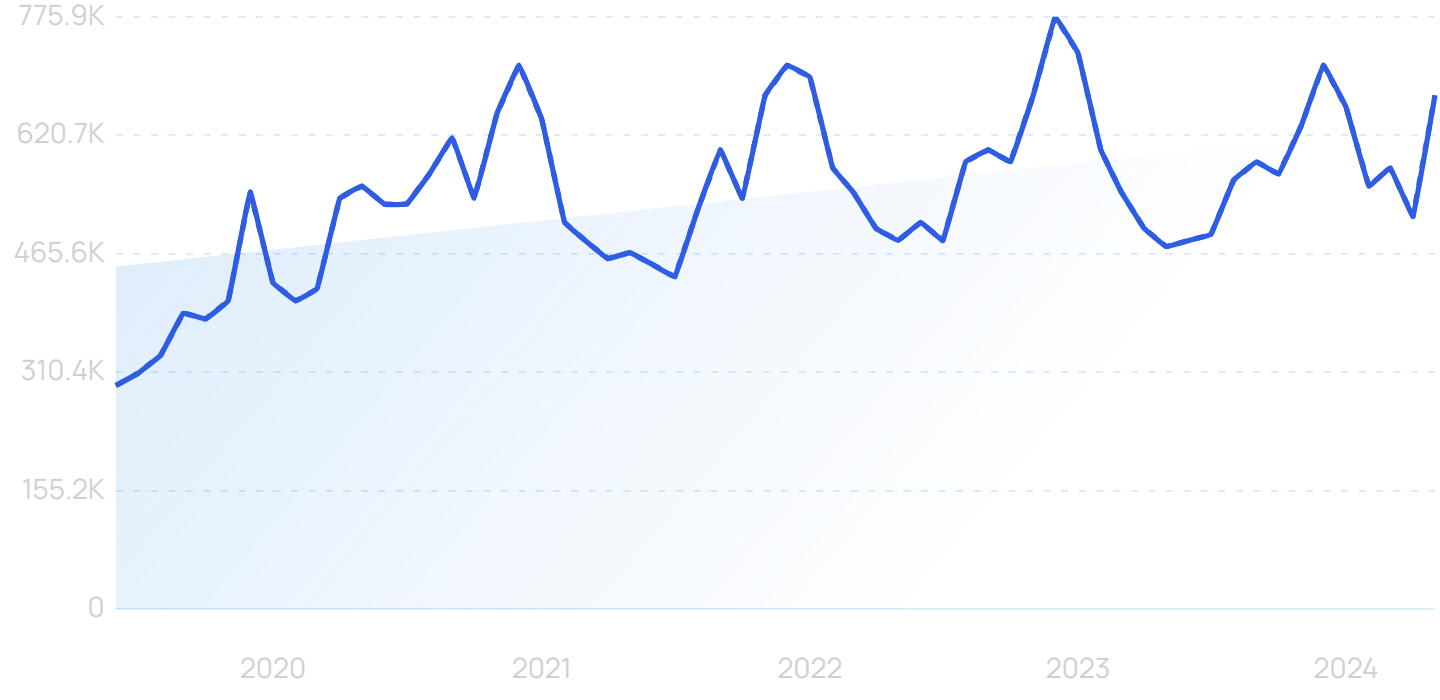
As for illustrating tools, the apple pencil continues to be a favorite.
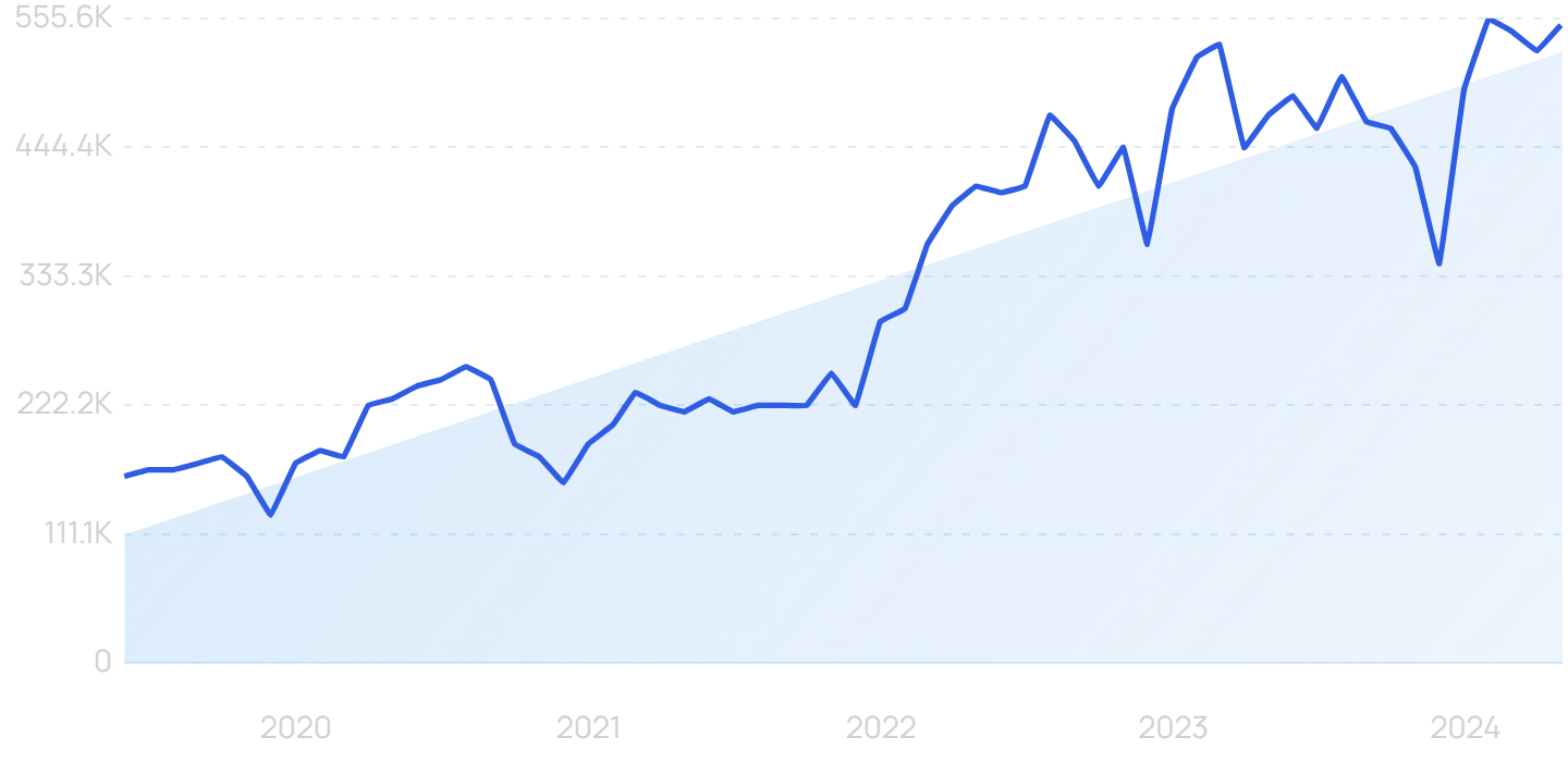
Search volume for “apple pencil” is up in the past 5 years.
This tool is especially appealing to illustrators because it literally works like a pencil on paper.
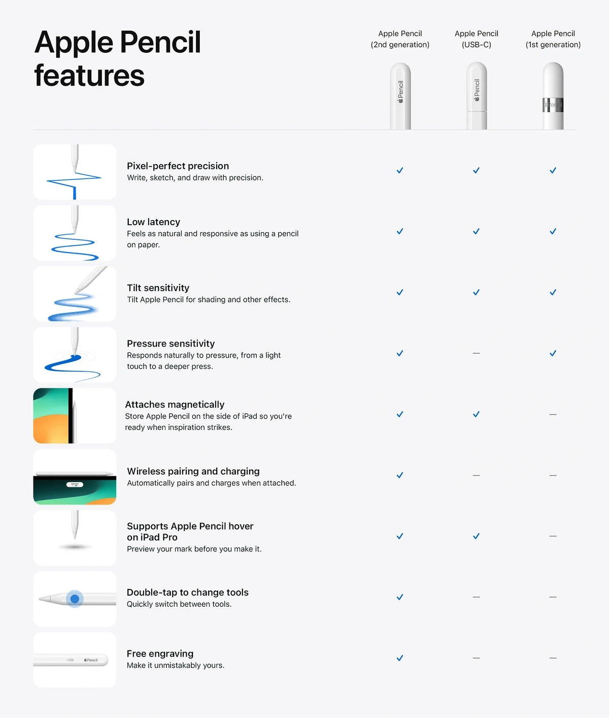
Users can adjust the pressure in order to thicken or lighten the line, and they can hold it at an angle to shade. It’s also accurate down to the pixel.
The newest version of the Apple Pencil was released in November last year.
Apple's new Pencil has a number of features designed to improve accuracy and precision.
This Apple Pencil iteration of allows for no-touch previews, wireless charging and heightened pressure sensitivity.
3. Colorful Minimalism
Minimalistic design is all about “telling a lot by saying a little”.
Distinguished brands have utilized minimalism in the past in order to convey a feeling of simplicity and sophistication.
This type of graphic design usually relies on simplicity, order, and clean lines.
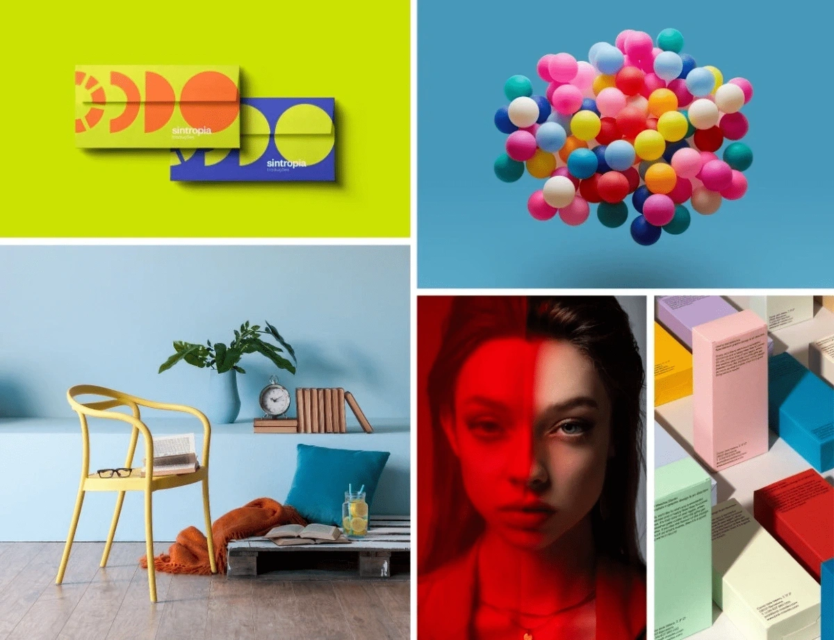
However, industry experts point to colorful minimalism bringing an “ultra-bright, happy approach” to graphic design in 2024.
This trend favors the simplicity of minimalism with a hit of color.
This trend is rooted in pandemic fatigue and individuals’ desire to get out, travel, and embrace new experiences.
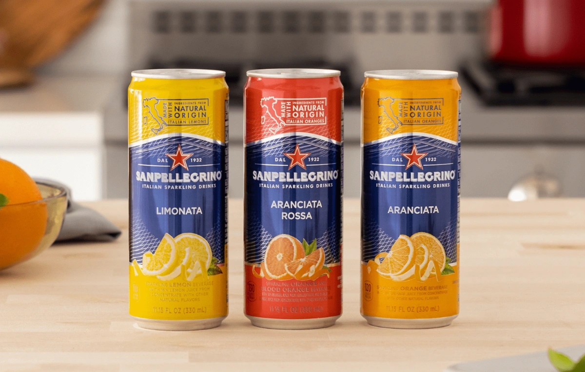
San Pellegrino is one brand that’s recently turned to a colorful minimalistic design for packaging.
San Pellegrino launched a new style of can with a minimalist design approach.
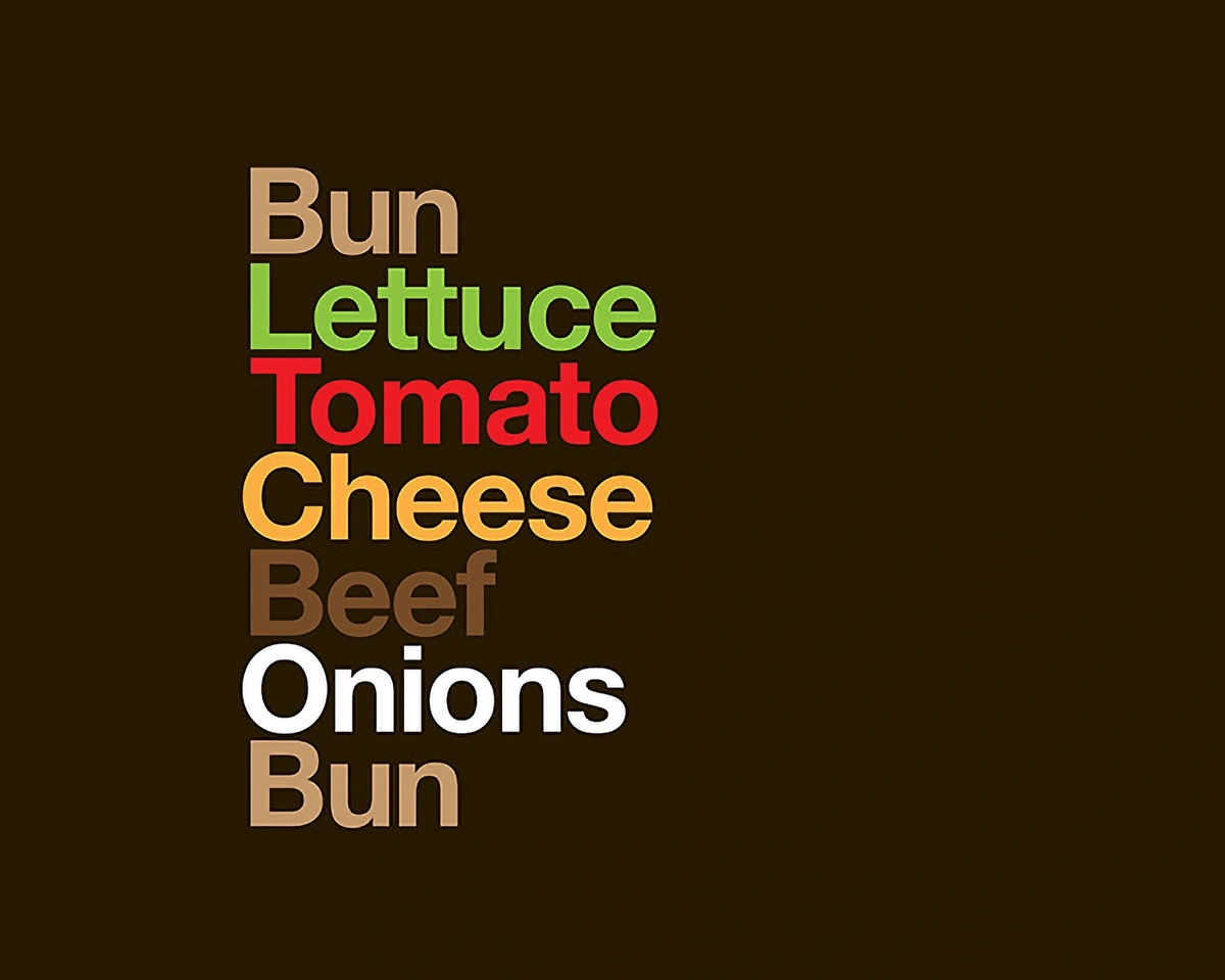
McDonald’s has also recently launched ad campaigns using traditional minimalist design elements.
In one example, the ads simply feature a list of ingredients in the brand’s colors.
McDonald’s partnered with Leo Burnett London and David Schwen to create this outdoor branding campaign.
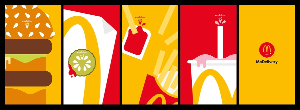
However, they’ve also embraced the colorful minimalist illustrations to promote their home delivery service.
These poster advertisements were released in the UK.
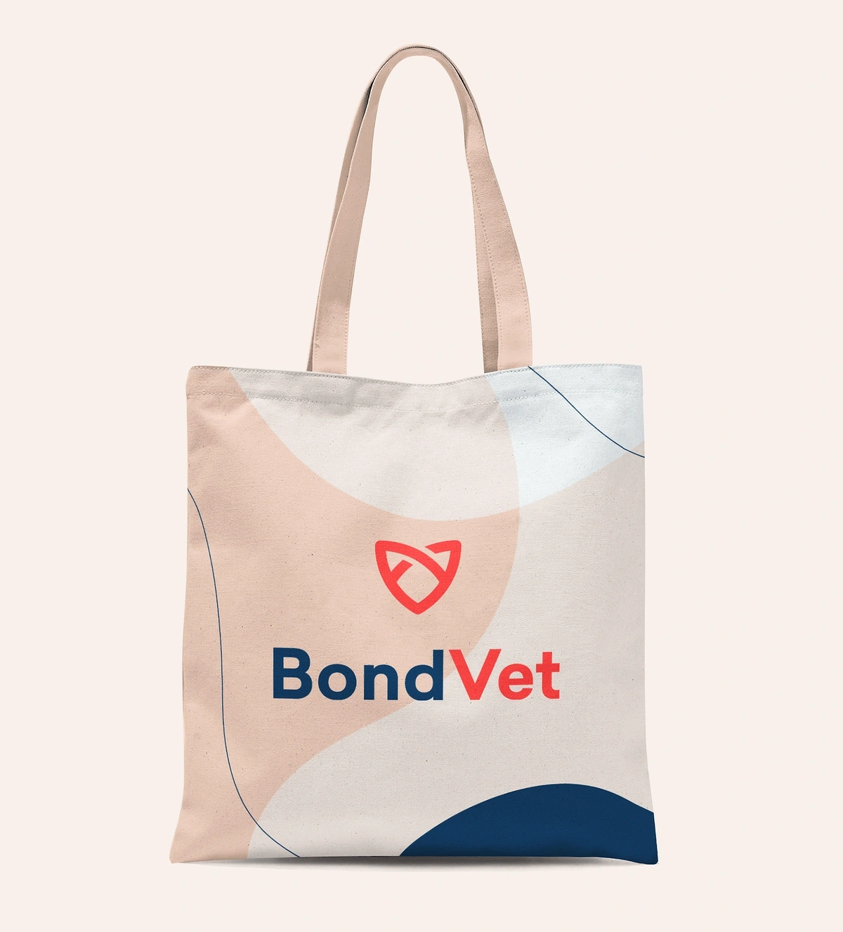
We’re also seeing colorful minimalism in logos.
Instead of stark black and white, businesses are using distinct colors to evoke emotions. However, the simple and memorable illustrations are in keeping with traditional minimalism.
Logo for a Brooklyn veterinarian designed by Manureva Studio.
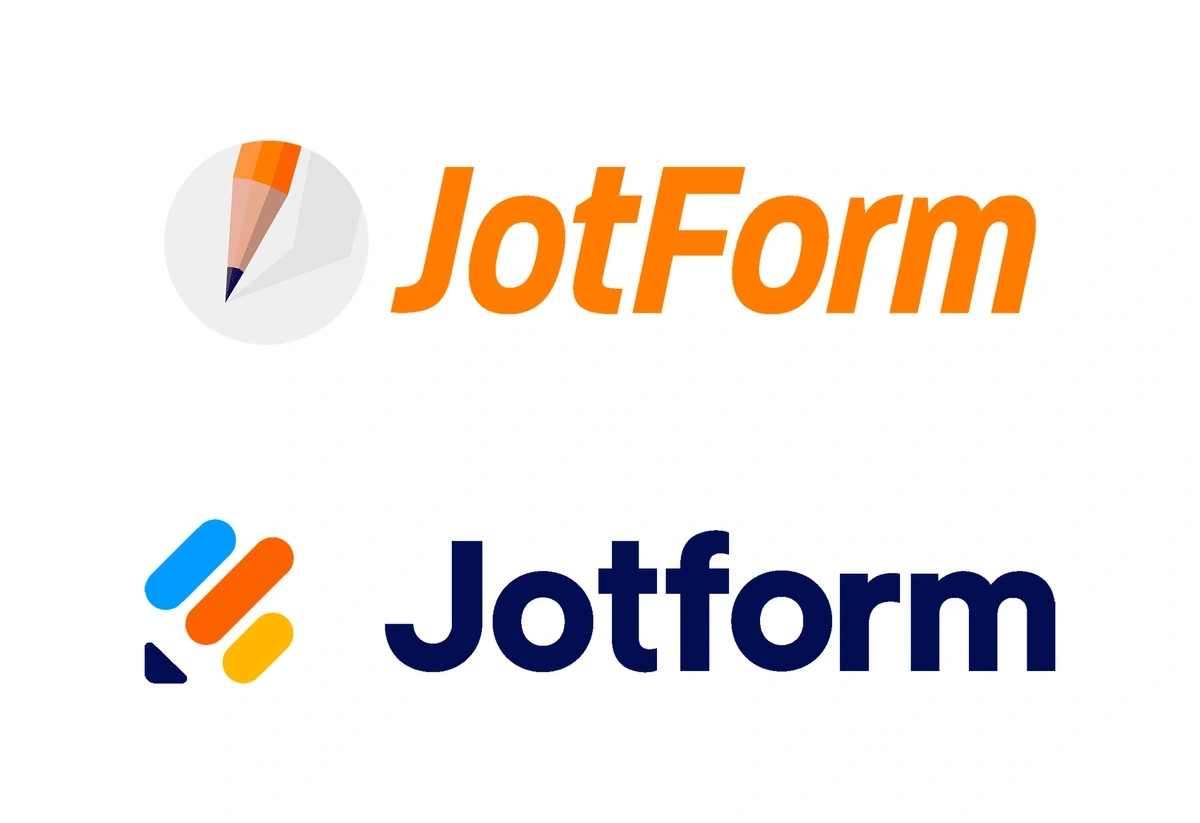
Jotform, an online form-building tool, completed a logo update in order to boost its visual identity as its business continued to grow.
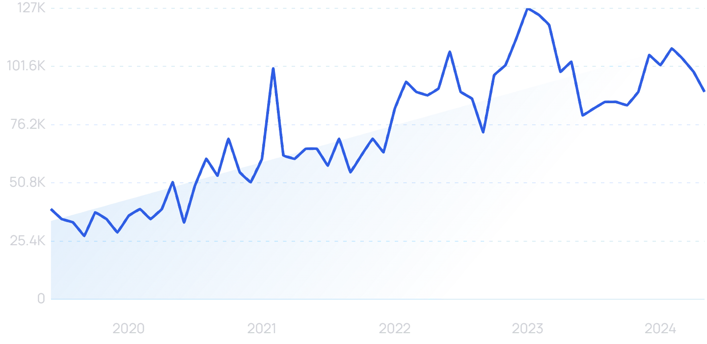
Search results for “Jotform” are up more than 241% over the past 5 years.
The company kept the pencil visual but simplified it and modernized it. They also added just the right pop of color.
Jotform recently launched a new logo for the first time in the company’s 16-year history.
4. Maximalism
Despite the bright and simple motif that we expect colorful minimalism to bring to the industry in the coming years, maximalism is making its mark at the other end of the spectrum.
Where minimalism strives for clean and simple, maximalism ignores boundaries and delights in excess.
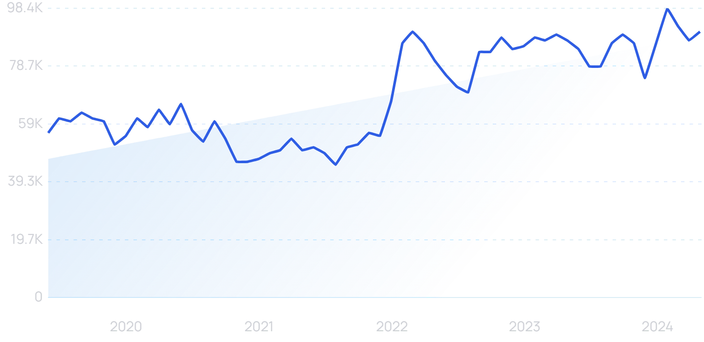
Search results for “maximalism” jumped in 2021 and are climbing again on 2024.
Some graphic designers are boldly stepping away from the conventions of minimalism and turning toward maximalism.
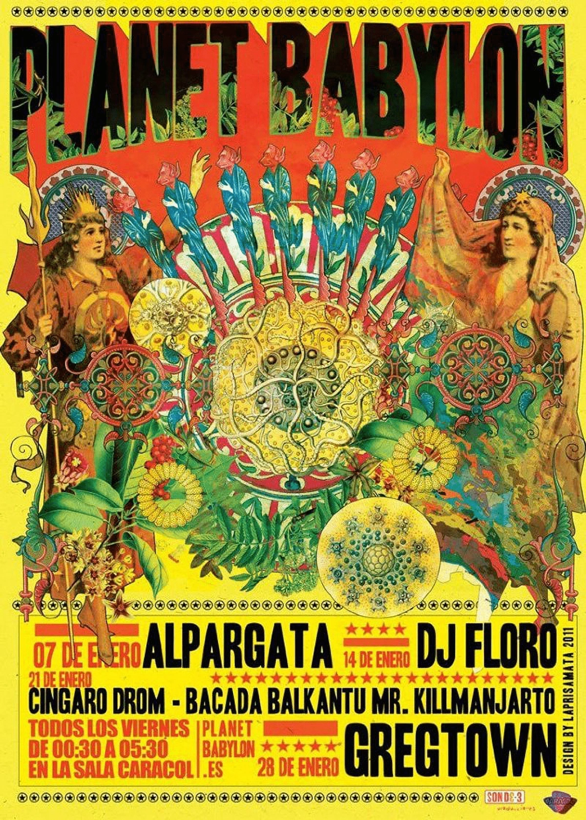
This style is a bold mix of colors and patterns, excessive layering, off-balance designs, and a lack of negative space.
This music poster was designed by Laprisamata.
It’s a tricky line to walk, though.
One visual designer put it this way: “One reviewer called this ‘rather ugly,’ and another said it was one of the most beautiful books they’d ever seen. People either loved it or thought it was hideous”.
Gen Z is one segment that seems to be attracted toward maximalist designs.
It’s an ideal fit for the generation’s individualism and rebellion against the status quo.
SCREENSHOT Media reports that Gen Z is taking the popular Marie Kondo approach in a different direction. They’re purchasing items that spark joy for them personally, no matter how complicated or untidy their space becomes.
In the coming months, we expect to see more brands wanting to create an identity that breaks with convention and begin to utilize maximalism in their packaging and websites.
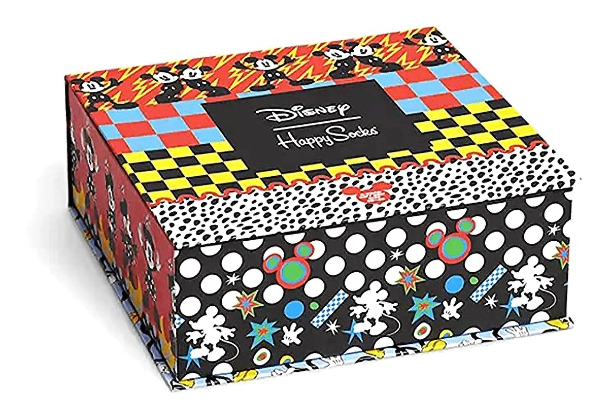
Happy Socks is one brand that’s capitalizing on a maximalist aesthetic to create a unique identity.
Happy Socks’ packaging features loud designs and little white space.
And, although minimalism has typically been touted as the ideal design aesthetic for websites, some brands are leaning into maximalism.
In particular, graphic designers like to use this style for musicians and fashion labels, industries in which spontaneity and one-of-a-kind designs are key.
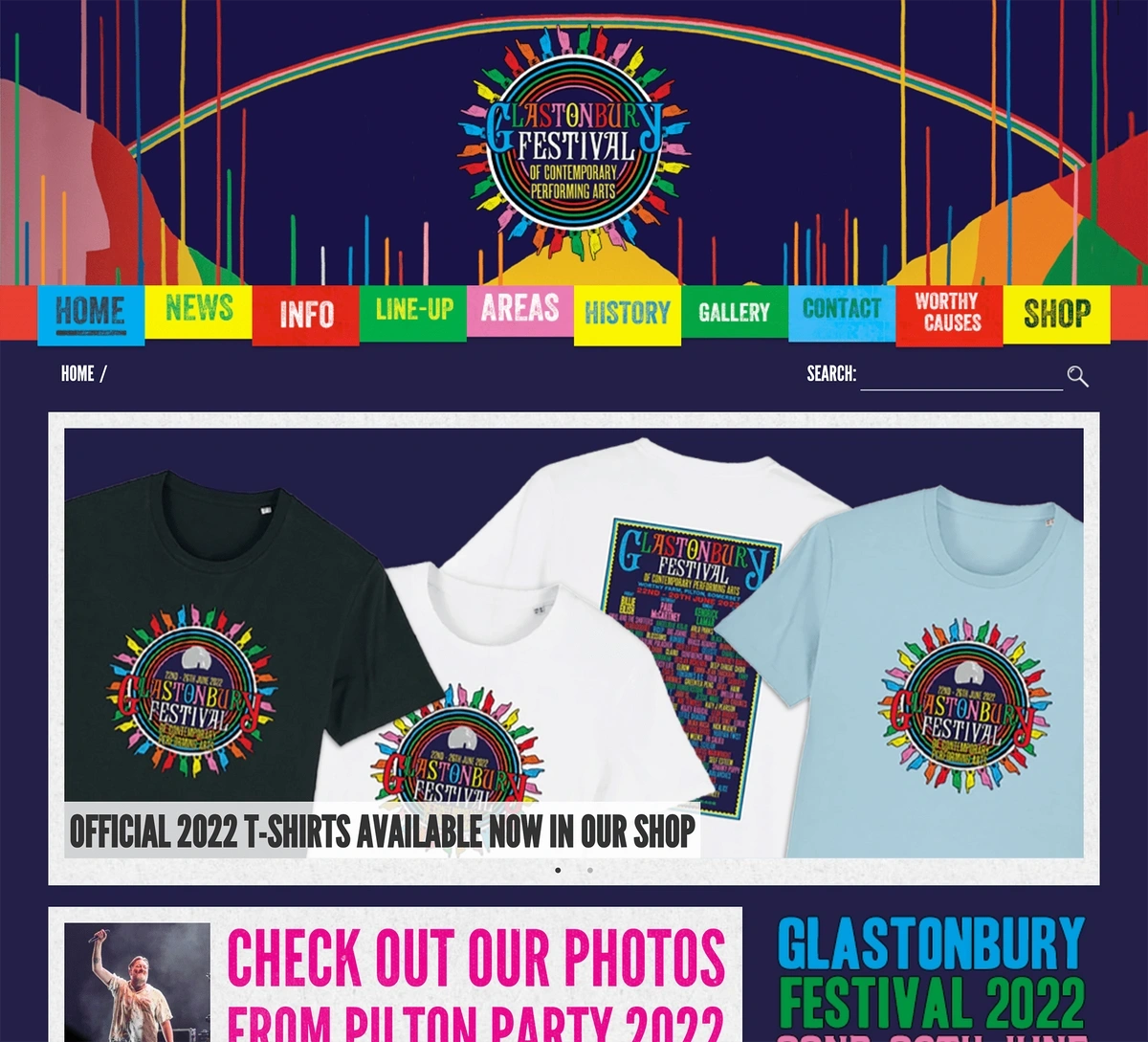
The Glastonbury Festival takes place in England. The maximalist style of their site points to the festival’s hippie roots.
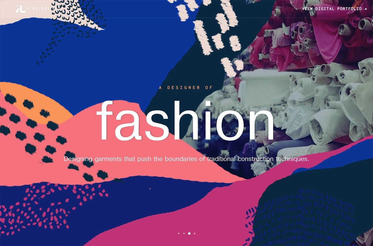
Digital portfolio site for an art director.
5. Data Visualization
Brands create visuals with the goal of catching the eye of consumers.
When a brand is trying to communicate complicated data, this task is nearly impossible.
However, new trends in data visualization are showing that graphic design techniques can be successful in getting consumers to stop and digest information.
Searches for “data visualization” have increased by 61% since late 2019.
Aside from simply catching the attention of consumers, data visualization is key to communicating authority and accountability without drowning consumers in pages and pages of data.
In fact, our brains can process visuals 60,000x faster than text.
Graphic designers are evolving their methods of data visualization to create a story and engage with the audience.
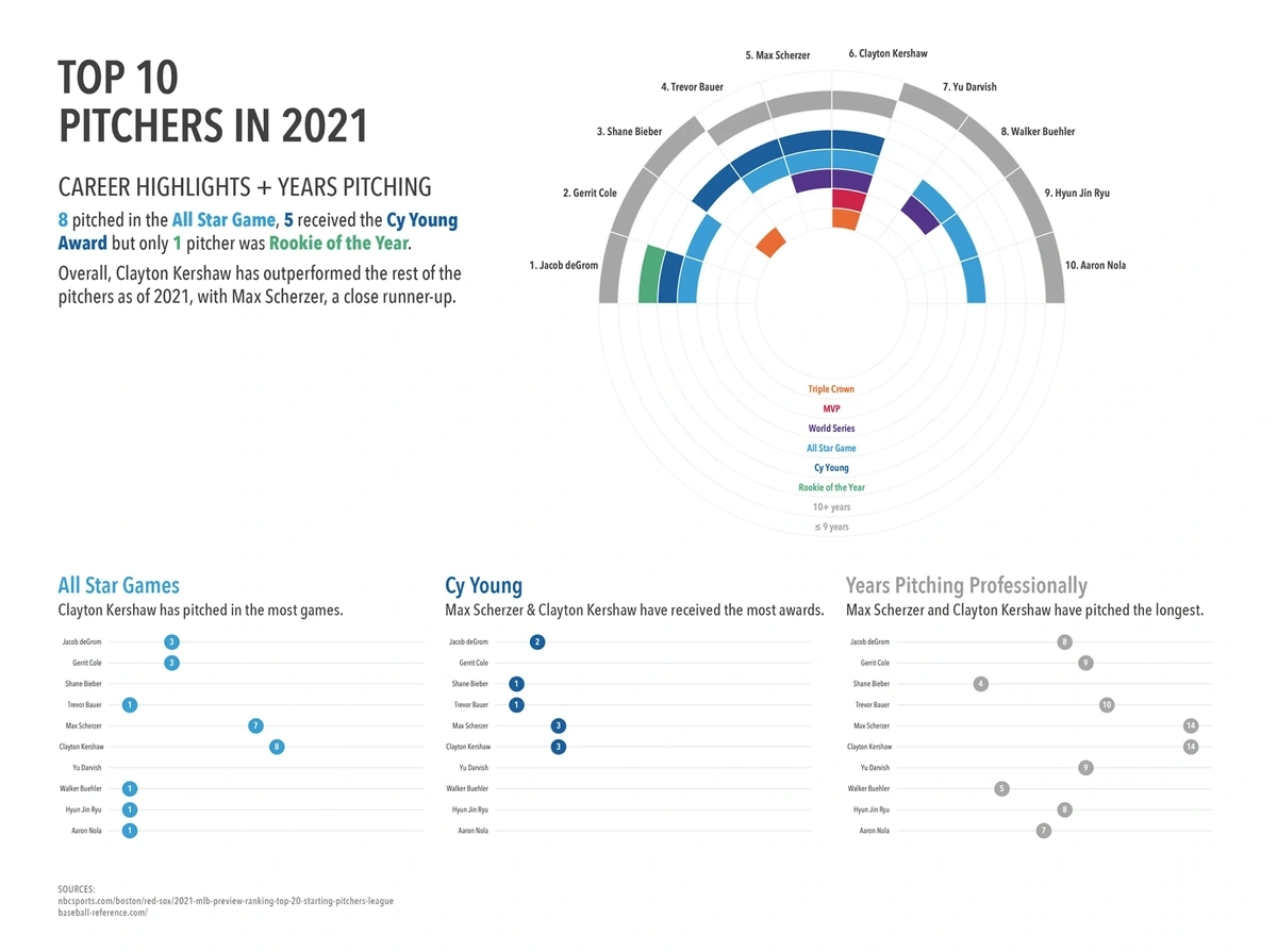
Data visualization for baseball statistics.
In fact, some graphic designers argue that the visual presentation is just as important as the data itself.
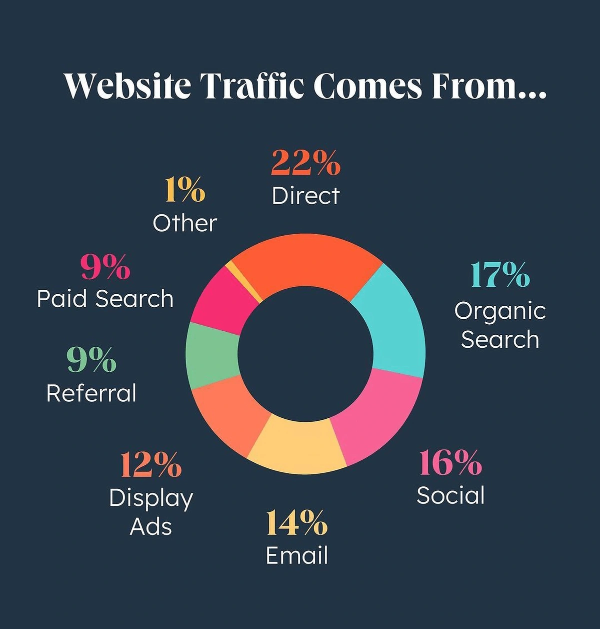
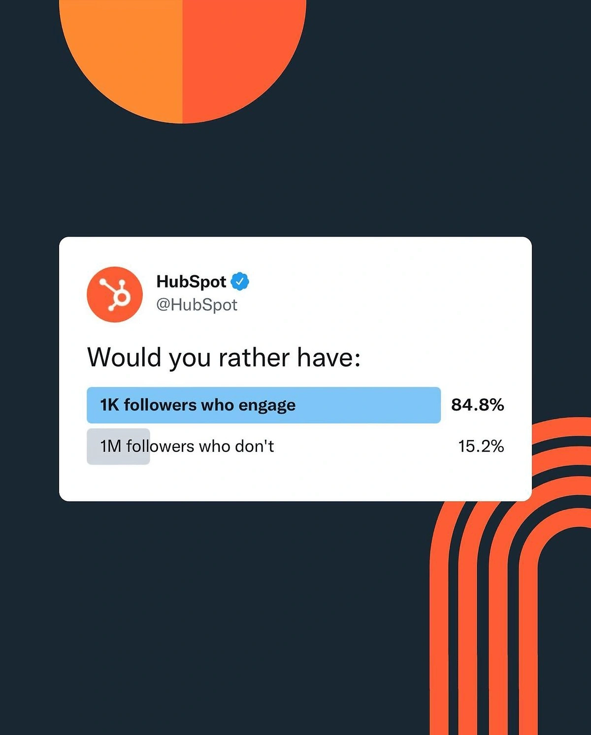
HubSpot’s Instagram account uses several on-trend designs to display data from their surveys.
HubSpot’s visual displays data regarding website traffic.
HubSpot’s Instagram post communicates data from a recent survey.
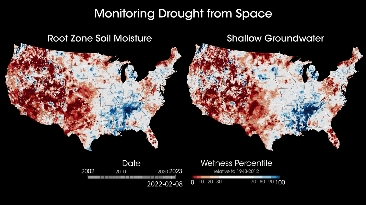
NASA has an entire branch devoted to data visualization.
The Scientific Visualization Studio works with scientists to help Americans understand NASA’s work.
Their designs communicate a wealth of information in a quick, user-friendly way, a characteristic that will become more and more important as consumer attention spans shrink even further.
For example, their maps illustrating the drought in the United States use simple contrasting colors to show the wetness percentile from 2002 to 2023.
The maps play in smooth succession in a video that lasts just under two minutes.
Data and graphic design meld in this creation from the Scientific Visualization Studio.
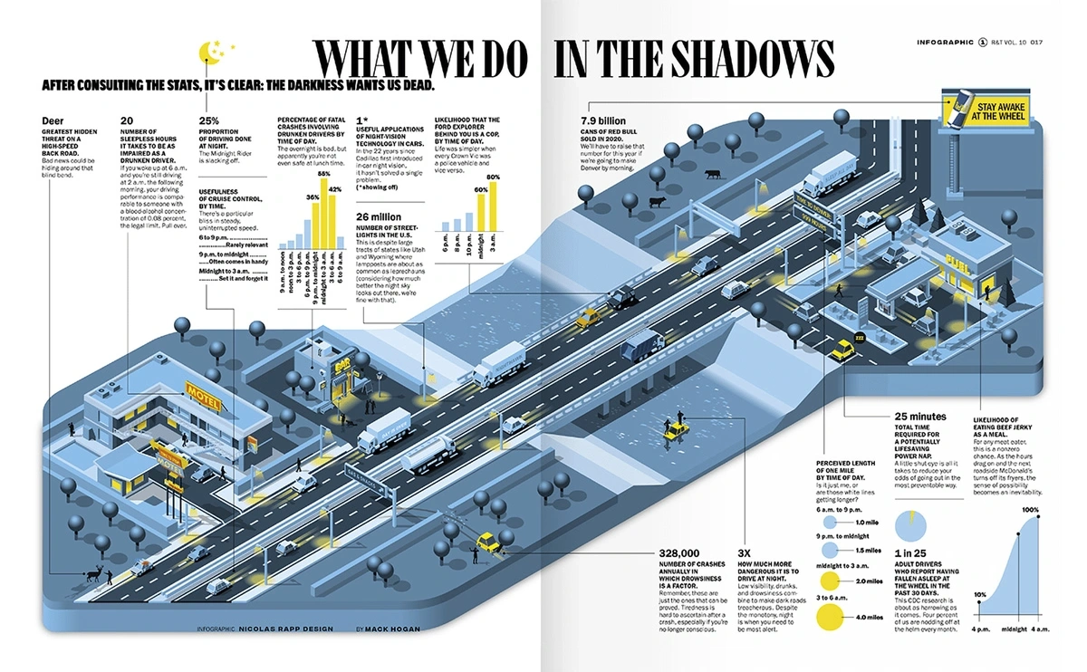
Infographics are getting a makeover in 2024, too.
Instead of presenting numbers on their own, graphic designers are turning the data into a real story.
Infographic appearing in Road & Track Magazine by Nicolas Rapp Design Studio
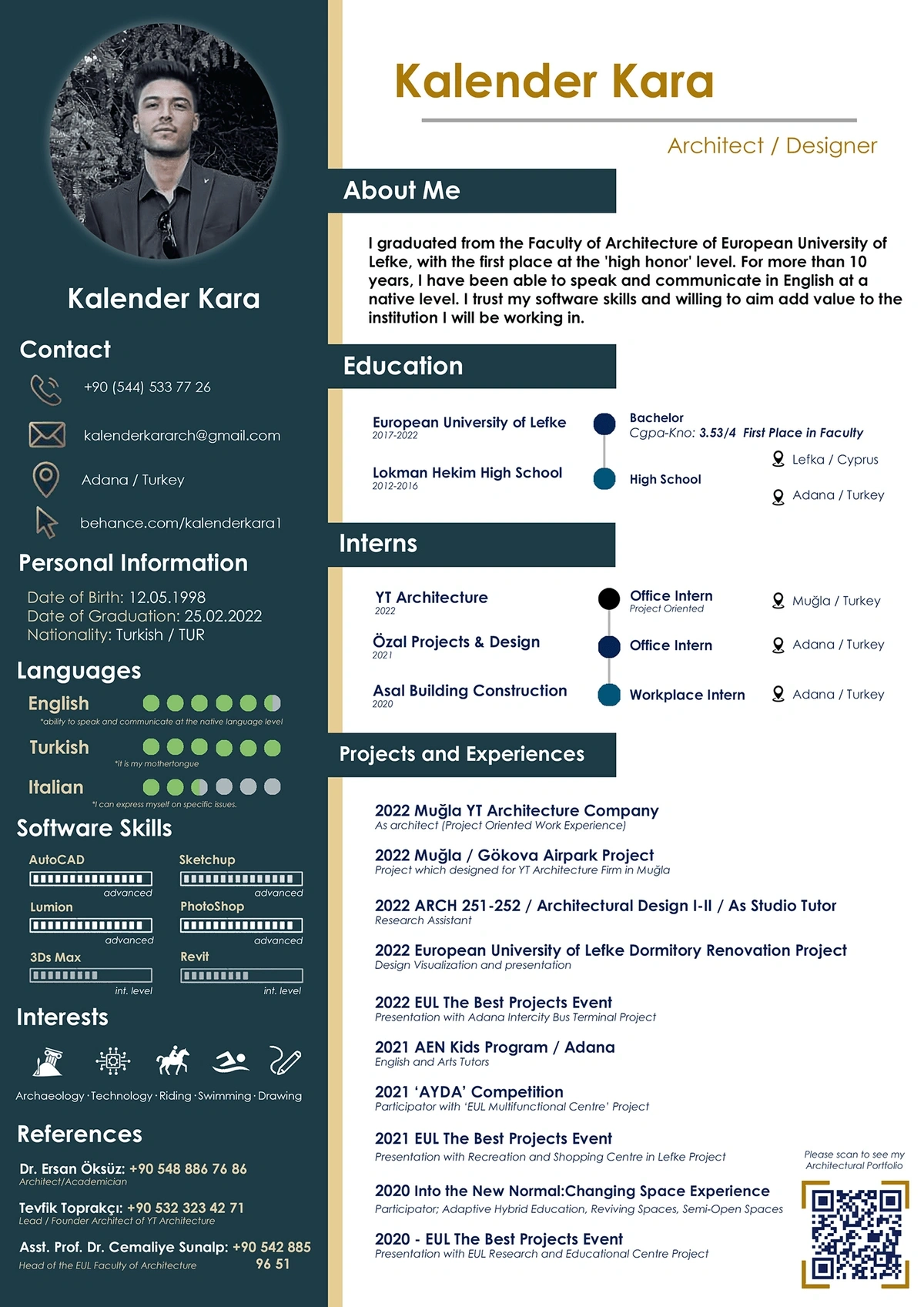
In an unexpected use of infographics, some creative job seekers are using the style to revamp their resumes.
Resume created by a recent architecture graduate.
6. Candy-Colored Pastels
The recent trend of using candy-colored pastels is sending a youthful, optimistic vibe to audiences.
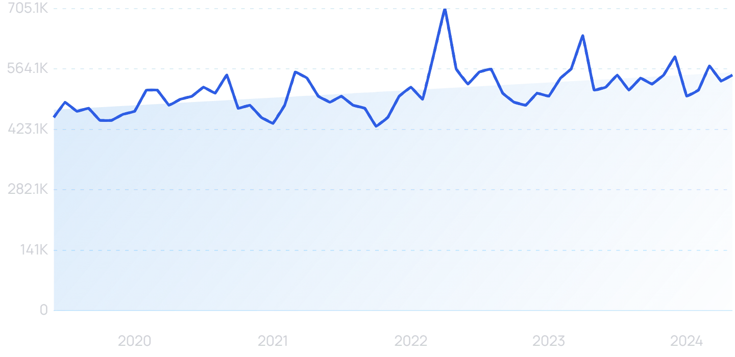
Searches for “pastel colors” have steadily increased over the last 5 years.
Psychologically, these colors can bring about feelings of laughter, freshness, and growth.
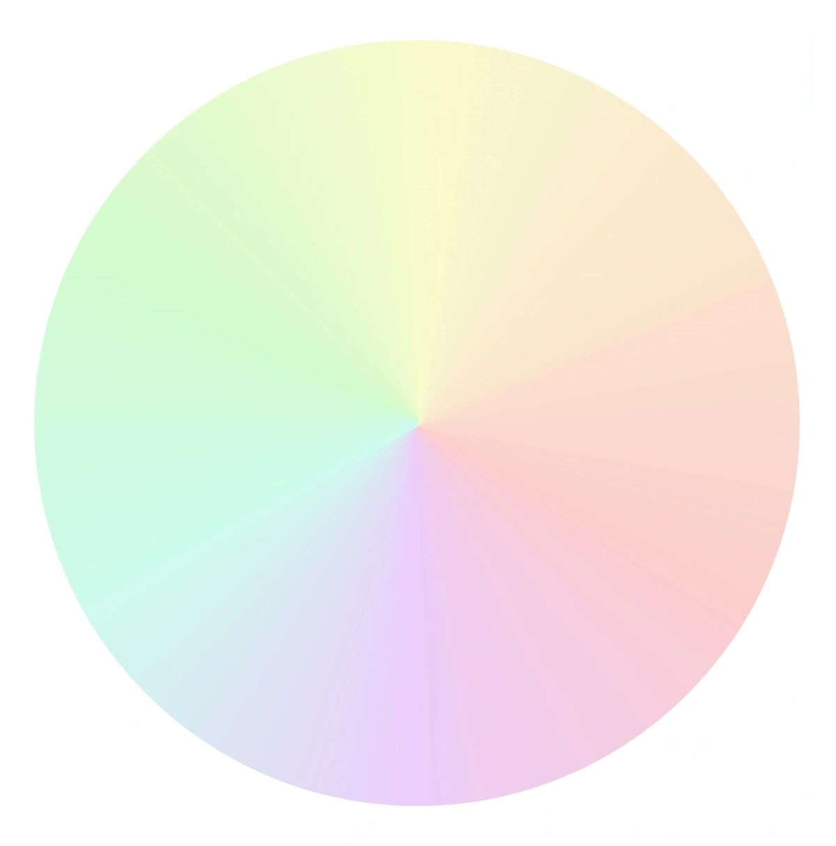
The pastel color wheel.
Pastels have seen a recent boost in popularity in home decorating and fashion, and we’re seeing the colors hit graphic design too.
Even in designs that are meant to be marketed to adults, these candy colors can create a spark and feeling of playfulness in consumers.
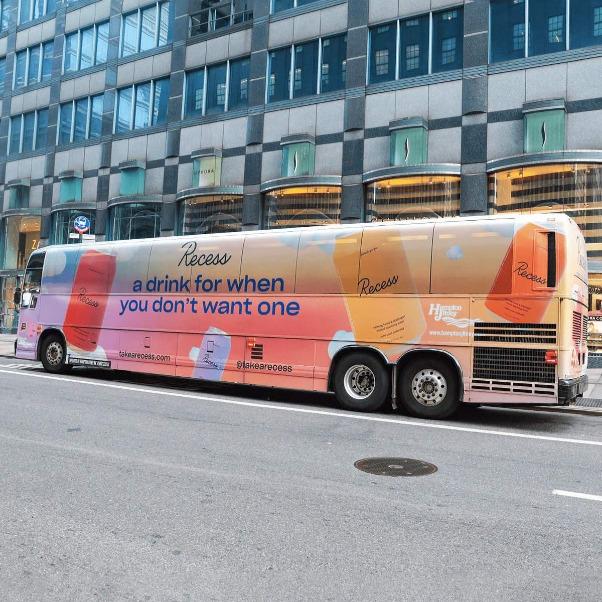
Recess, creator of a sparkling water infused with hemp and adaptogens, uses candy-colored pastels in their marketing.
At times, designers are even using the colors to give visuals a psychedelic touch.
Design by Yoyo The Ricecorpse.
Pinks are predicted to be part of the pastel color trend in the years to come.
Not surprisingly, pink is a popular color when it comes to brands and products that market to women.
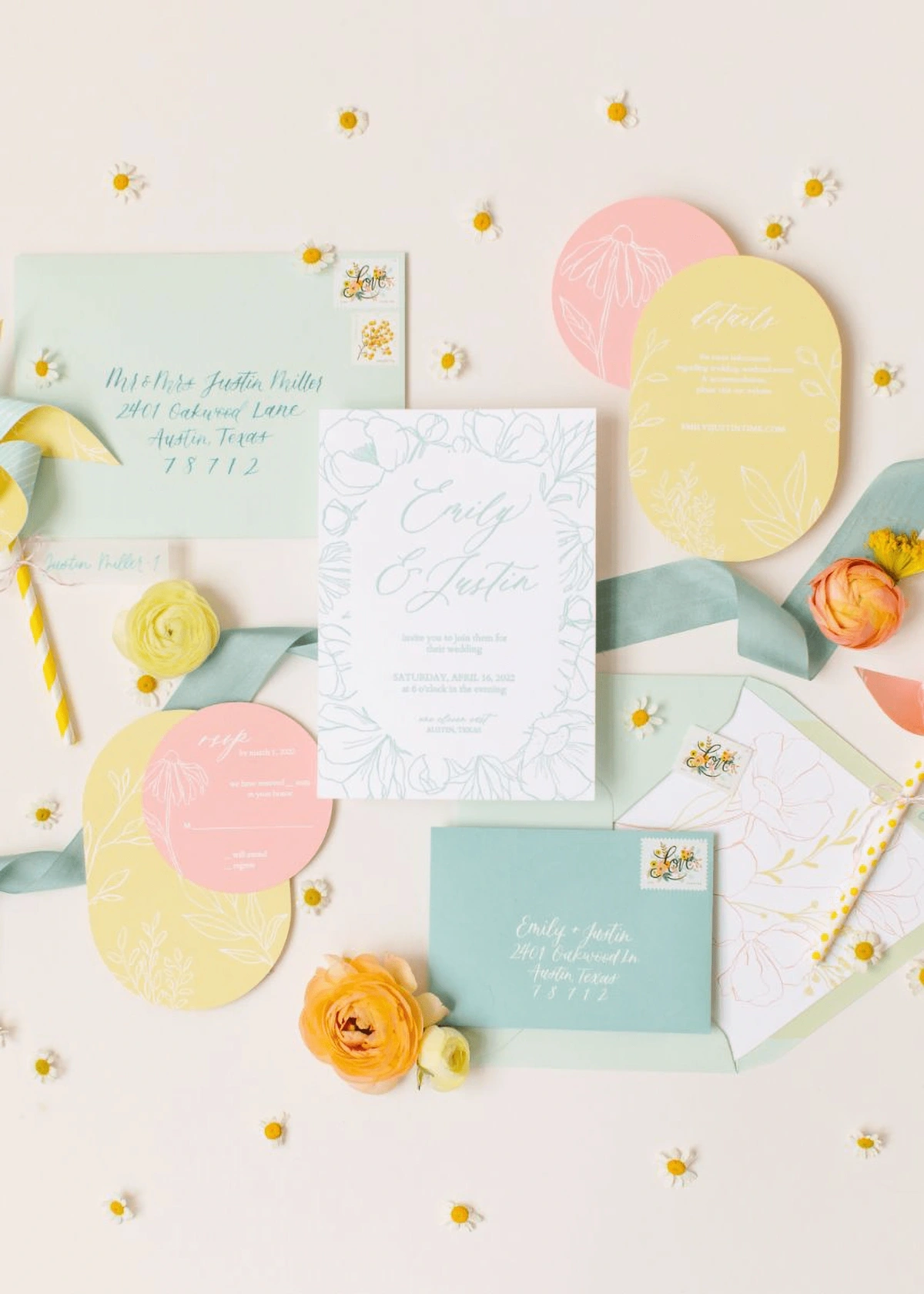
Wedding invitations and stationary with a pastel color palette.
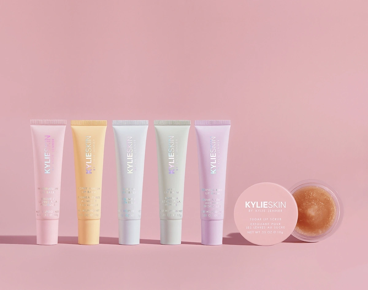
Kylie Cosmetics uses pastels to convey the femininity of their products to consumers.
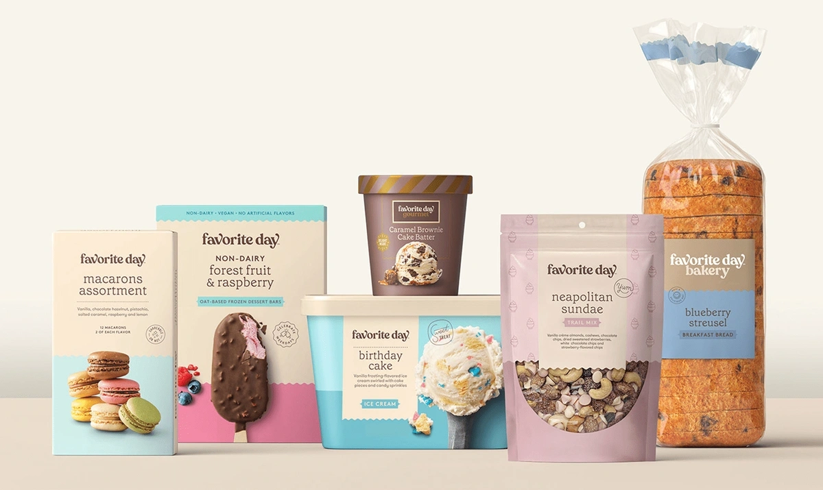
This trend is also impacting packaging in the grocery industry.
Target’s Favorite Day lineup of products have a distinctly pastel appearance.
Collection of products from Target’s "Favorite Day" grocery line.
7. Natural patterns and textures
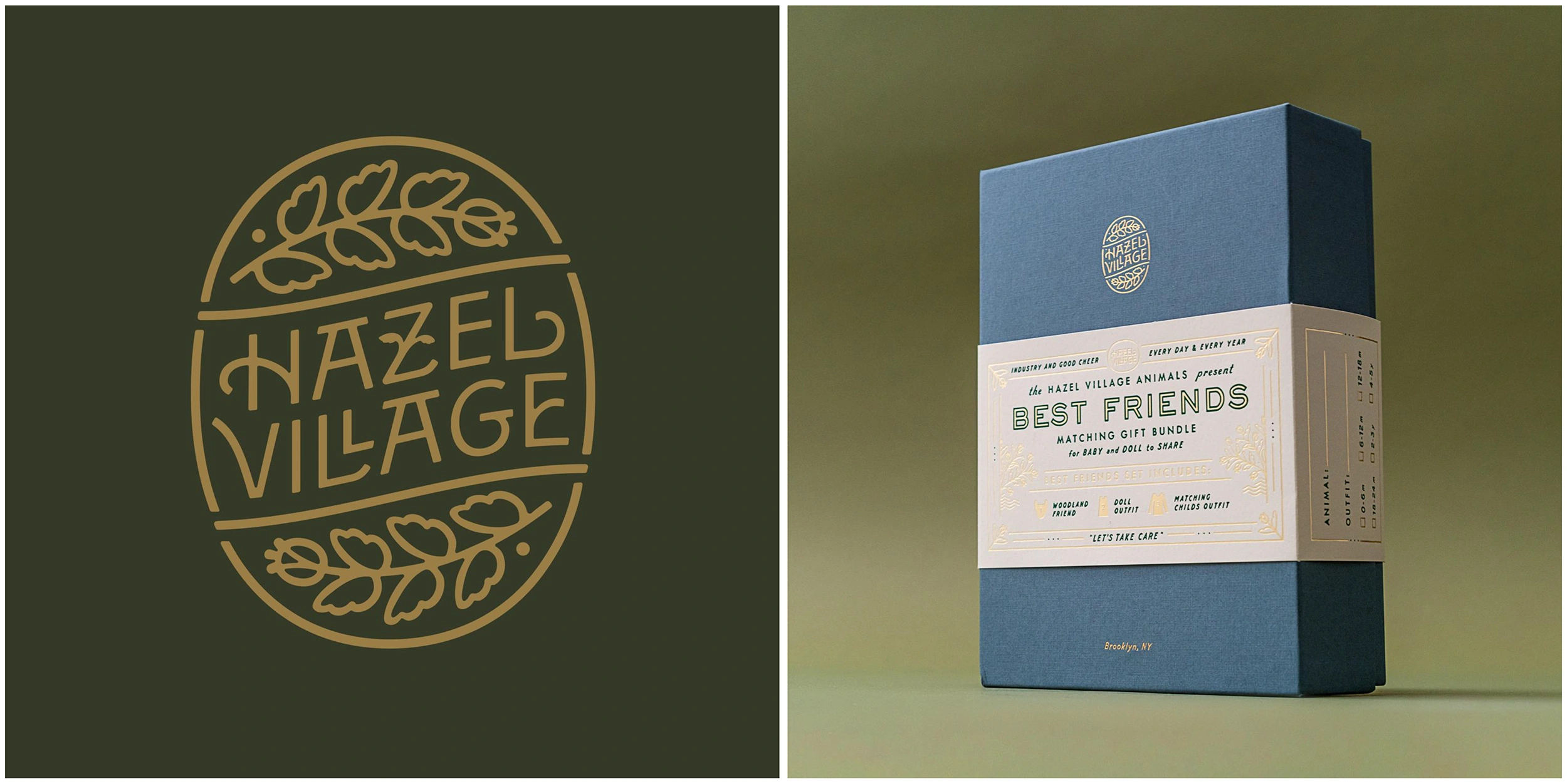
Logo design and branding by YoungJerks for Hazel Village
Pew Research conducted a study that revealed that 52% of Americans think dealing with climate change is the top priority - 14 percentage points higher than three years prior.
It’s likely that as the concern about the environment increases, consumer’s appreciation for natural motifs will also increase.
This means that nature-inspired visuals will likely continue to trend in 2024 and beyond, as they resonate with the consumer’s interests in plants and concern for sustainability.
Images of plants, flowers, wood texture, blue skies, bugs, and animal patterns like leopard, zebra, and cow print are all popular nature motifs.
8. Diversity and inclusion
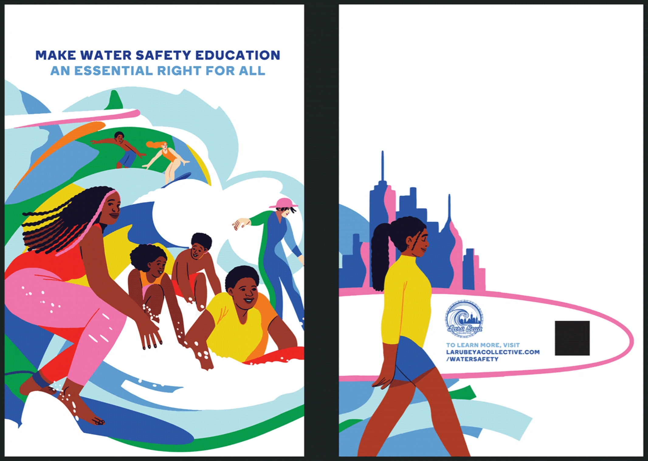
Eugenia Mello’s design for Patagonia’s NYC window fronts.
Ramon Tejada, assistant professor at Rhode Island School of Design says that the future of design must “make space, a lot of it, for the voices, ideas, thoughts, and points of view that we have ignored.”
Due to this shift in attention, the world of graphic design will likely see a much larger emphasis on depicting people of different ethnicities, genders, sexualities, ages, and abilities.
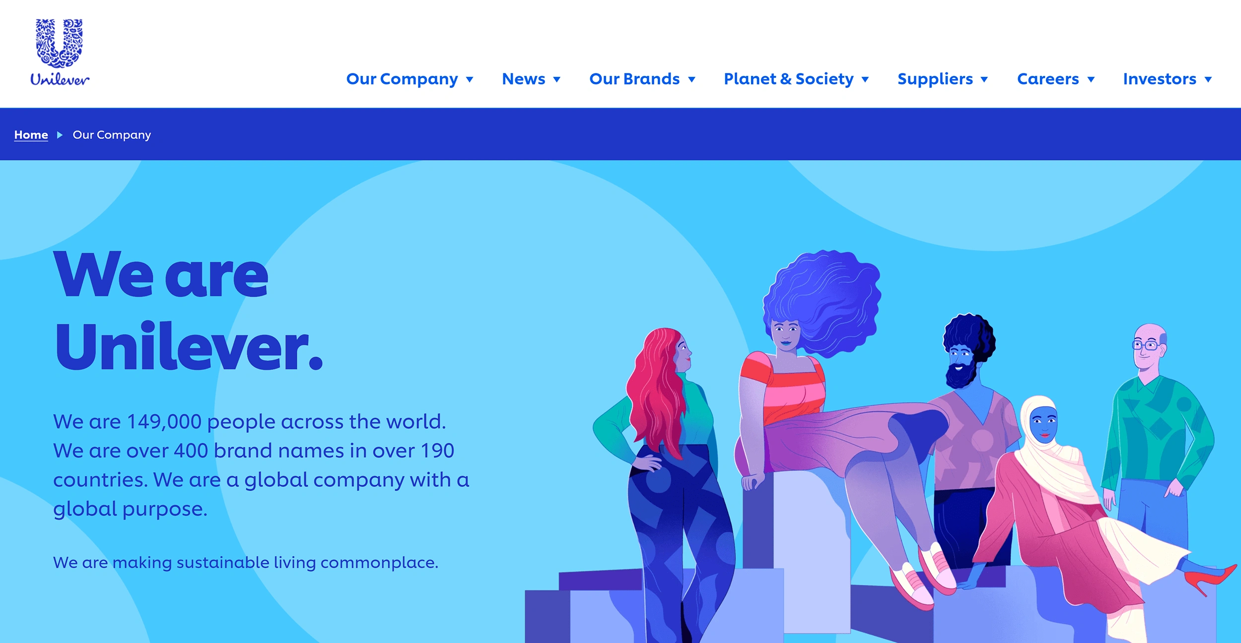
Unilever’s website provides an example of applying diverse representation in a company’s design.
Unilever’s website shows people of a variety of backgrounds.
The push to consider many different kinds of people affects more than the content of the design.
There is a discussion among design professionals to hire with inclusivity in mind, in order to diversify the group contributing to graphic design creation.
While only 60% of the US is white, 75% of graphic designers are.
In the coming years, the industry is likely to shift to a more representative talent pool.
Inclusivity also applies to the function of graphic design, when designs are created with accessibility in mind. This is a form of universal design.
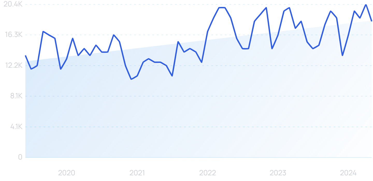
Search interest in “universal design” has grown in popularity over the last 5 years.
Universal design as applied in graphic design considers those with visual differences like dyslexia and color blindness.
As approximately 1 in 12 men and 1 in 200 women have red-green color blindness, experts recommend that designers use good contrast and never use color alone to convey information.
Typography in a sans serif style will likely remain popular for its readability for those with dyslexia.
9. 3D design elements
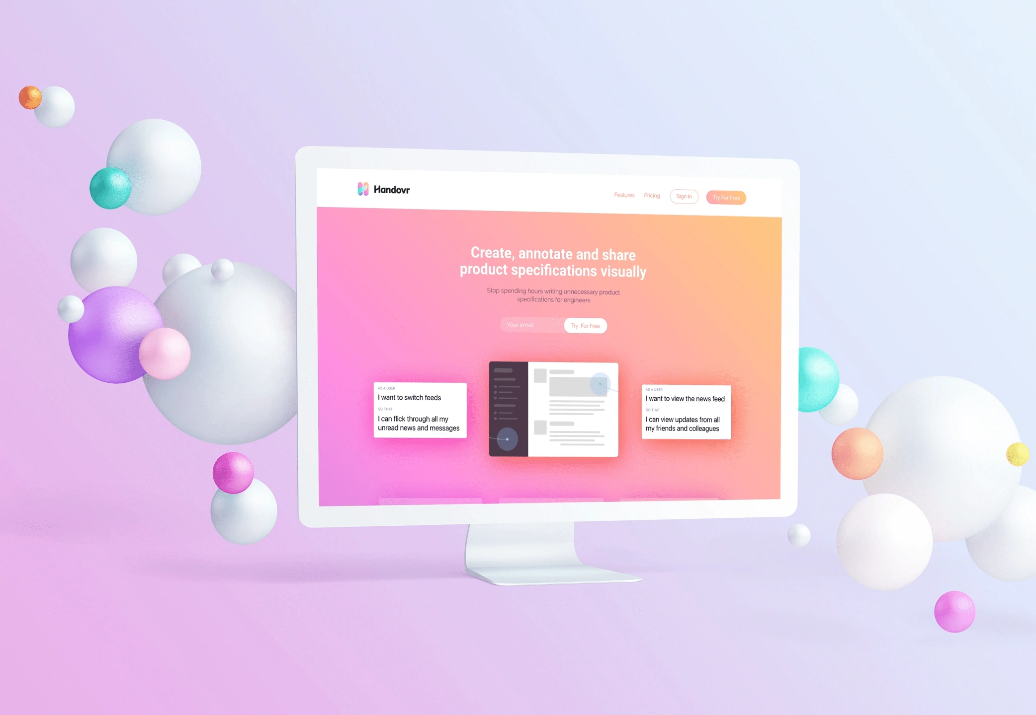
DrewDrew Design’s 3D work for the business communications app, Handovr.
3D designs aren’t brand new, but in the coming years, we will likely see a rise in the visual trend.
This is largely because new technologies make rendering intricate 3D textures on web pages easier than ever.
With advanced programs like Cinema 4D and Adobe’s 2019 addition of the Substance tool suite, more designers are able to add 3D modeling to their skillset.
The 3D modeling market is projected to grow 20% annually by 2026.
They cite the increasing access to advanced technology able to render 3D as a major force behind this trend.
Where can we expect to see the application of this 3D technology?
3D can be applied across every discipline of design, from user interfaces to illustrations.
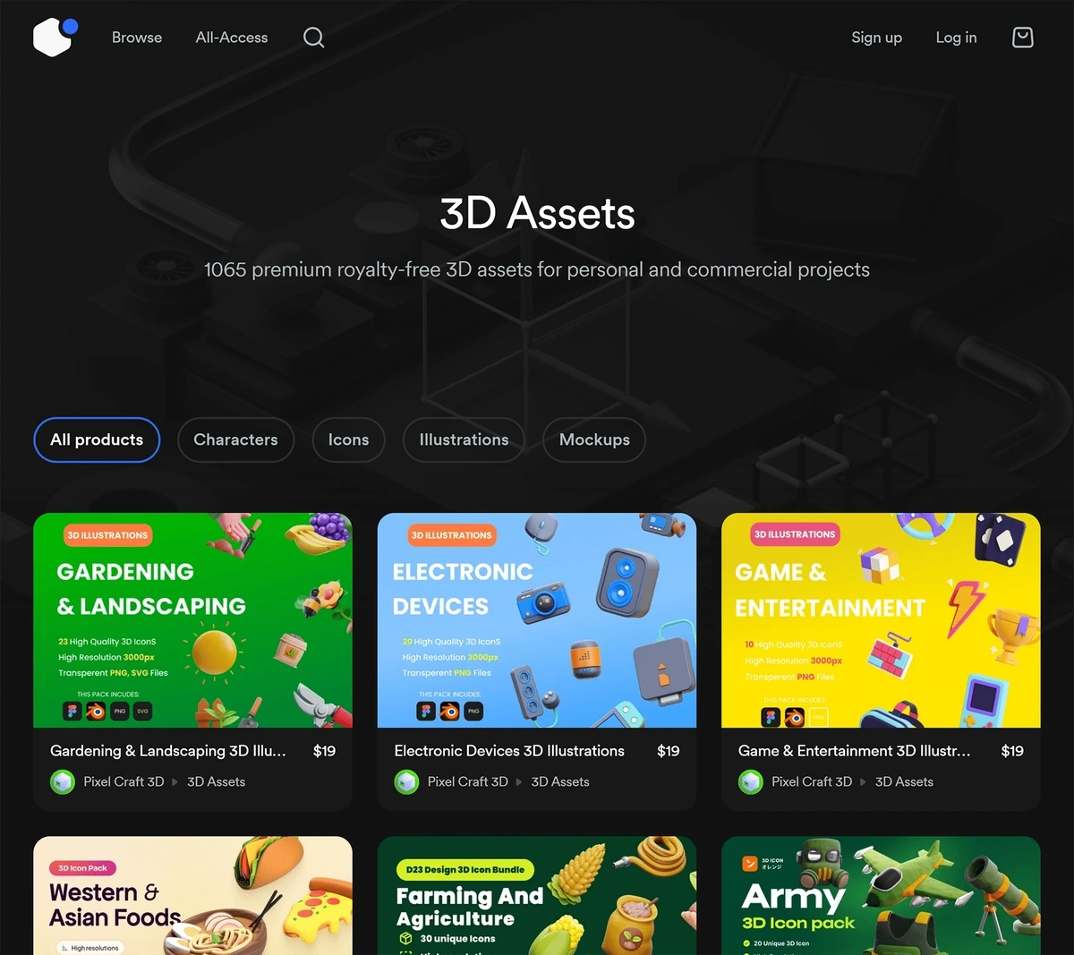
Open-source programs with easy-to-use 3D rendering tools like Blender, Sketchup, and Figma mean that more designers have access to entry-level programs, and therefore talent is more accessible.
It’s likely that in the coming years, the popularity of using open-source programs to design will increase.
Searches for "Figma", another popular web-based design software that supports 3D, has increased 1,125% over the last 5 years.
10. Geometric shapes
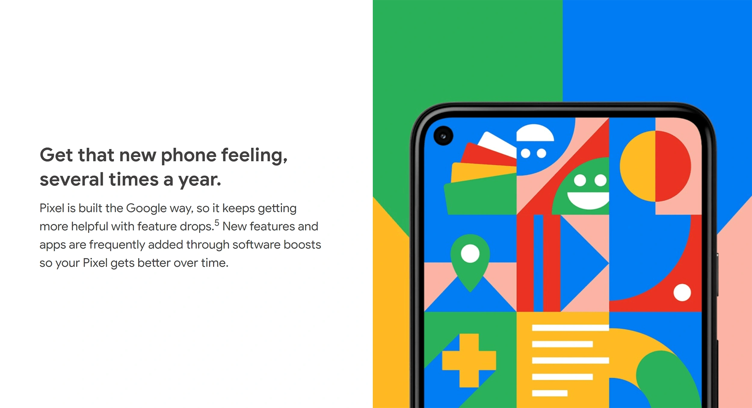
Google Pixel 4’s web page features a simplistic geometric design.
Teachers of Bauhaus believed in art as a method for social change, which may explain why the art style is experiencing a resurgence.
The Bauhaus school was established in 1919 with a mission to unify art with everyday material objects.
In 2024 we're seeing even more graphic designs that take inspiration in part from the school of design — clean shapes, geometric compositions, and bright primary color palettes.
Another reason that geometric shapes are trending: They are the first we learn as children and are associated with approachability.
As consumer demand for transparency increases, it is likely that designs with geometric shapes that convey simplicity will as well.
Brands hopping on this trend include Walmart’s new clothing brand, Free Assembly, and the jewelry company Swarovski.
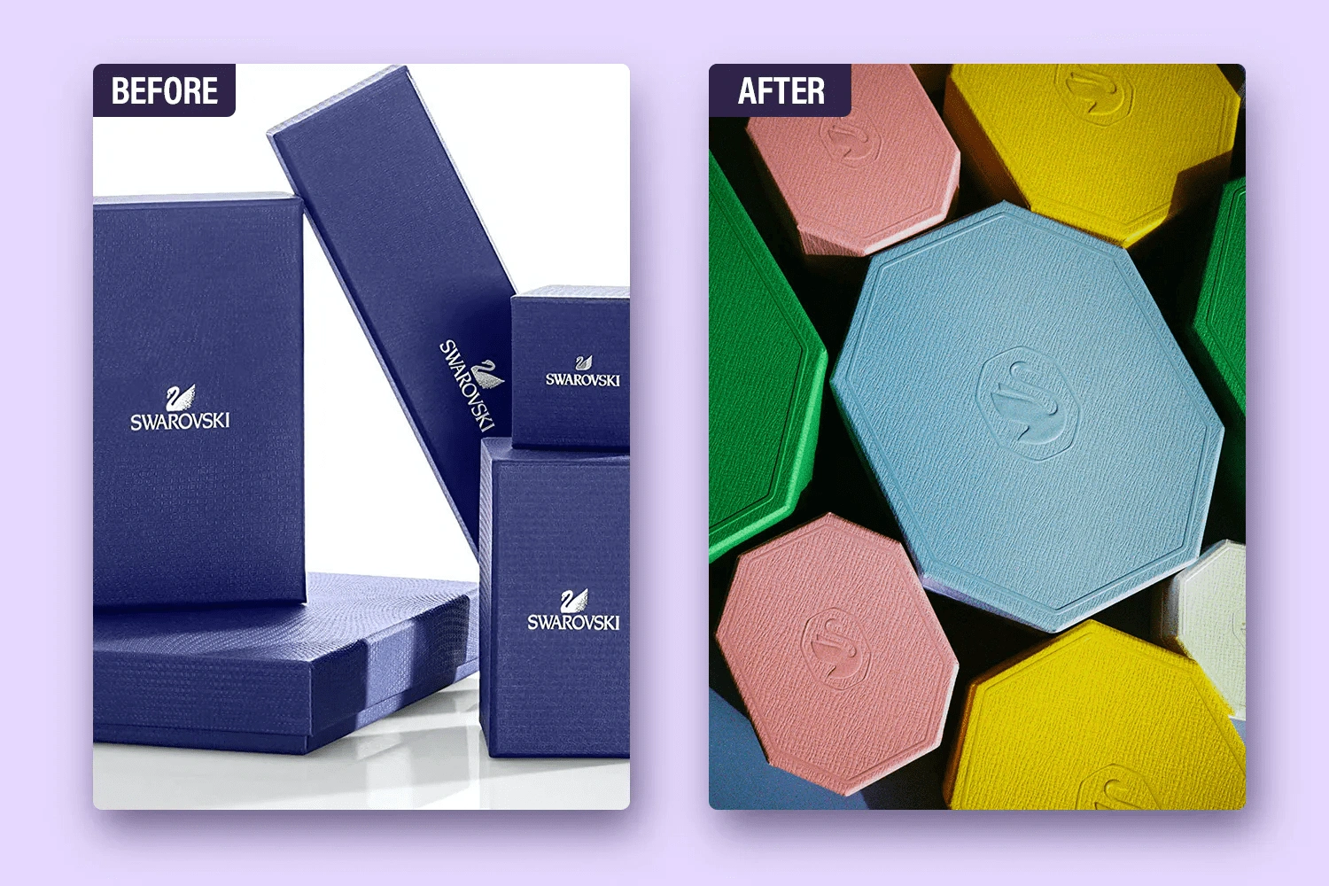
Around three years ago, Swarovski announced a rebrand that included a shift from square boxes to octagonal boxes with a pastel color scheme.
Swarovski’s packaging before and after their updated brand identity.
11. Serif fonts
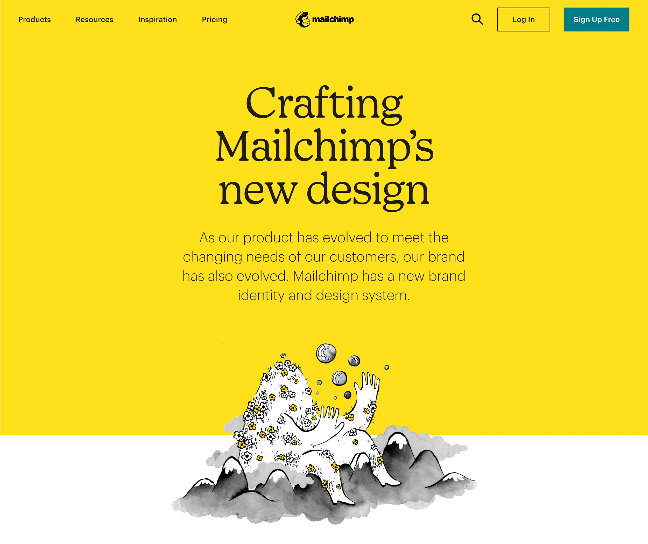
Mailchimp’s rebrand became a well-known example of a switch to serif fonts helping to build authority.
Serifs - the horizontal lines at the top of and bottom letters in fonts like Times New Roman - had been on the out as tech brands of the 2000s adopted the clean, simple, and highly readable look of sans serif fonts.
However, serif fonts are coming back into style.
Why?
Largely to the sense of security and tradition they evoke.
Global communications firm Edelman recently published research that found brand trust is now the “make or break” factor in brand use.
With 70% of people agreeing that trust is more important today than ever.
The main reasons for this cited in the study are that people rely on brands more during the pandemic, and they care more about the brand’s environmental impact.
It is this shift in consumer behavior that will likely cause a rise in imagery designed to build trust - including serif fonts.
Carl Cosgrove, senior typeface designer at Monotype says “Somehow sans type is so prevalent that now serif type seems quaint or unusual...customers expect more intimate relationships with the brands they follow”.
Serif fonts have more character, partly because they have a much longer history.
They remind us of traditionally published newspapers and reputable journals.
One of the world’s oldest fonts, dating back to 43 BC, Trajan, is a serif font.
To this day, major media outlets like The New York Times and The Washington Post maintain a Serif logo to reference their trustworthiness, resilience, and stability.
More companies are making the switch to serifs.
Take for example Print Mag, an authority on graphic, online, and print design. They transitioned their web font from a sans serif to a more traditional serif font midway through last year.
Printmag.com as it was in June 2020, retrieved from the internet archive.
Printmag.com after their redesign. Note the navigation text is now serif.
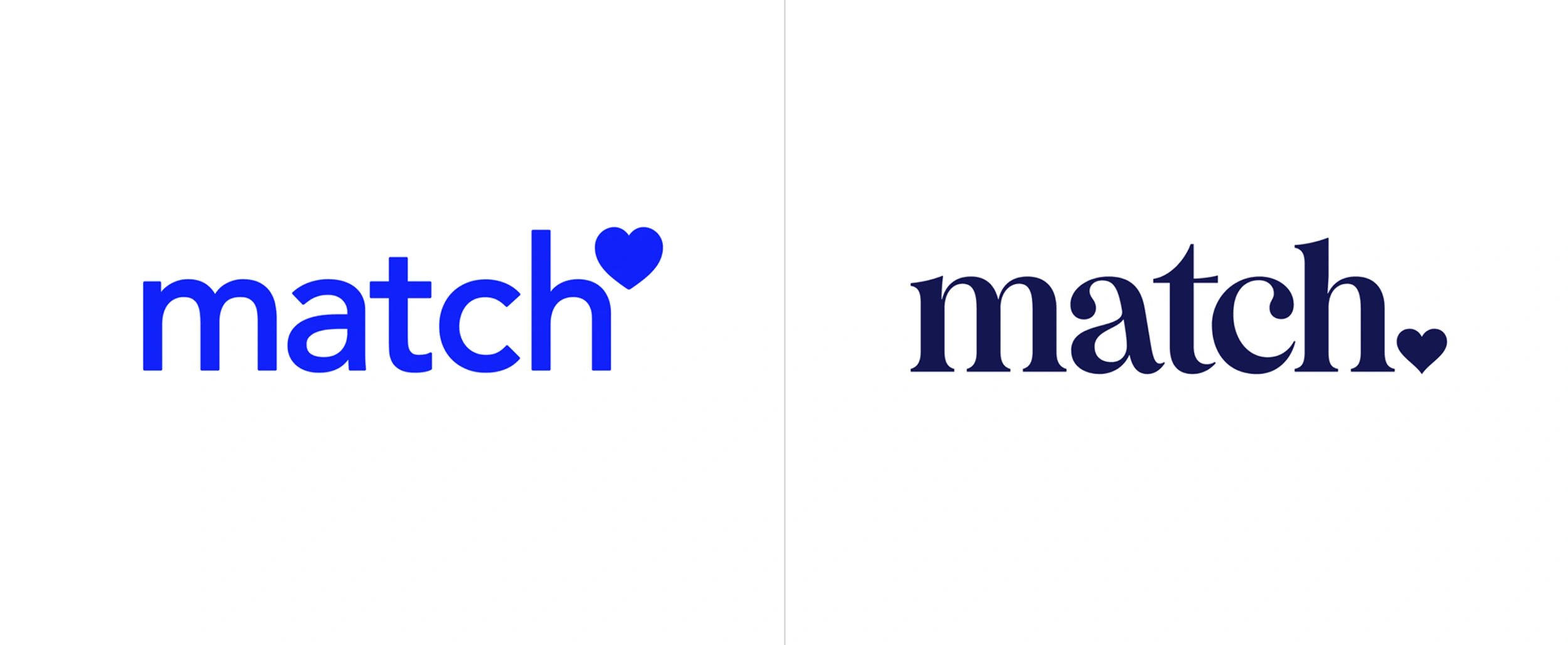
Other brands like Chobani, and, ExpressVPN, and Match have all made the switch within the 24 months as well.
Dating website Match.com’s new logo compared with the old logo, from a design review website, Brand New.
VPN provider ExpressVPN’s logo compared with the old logo, from the design review website, Brand New.
12. References to traditional media
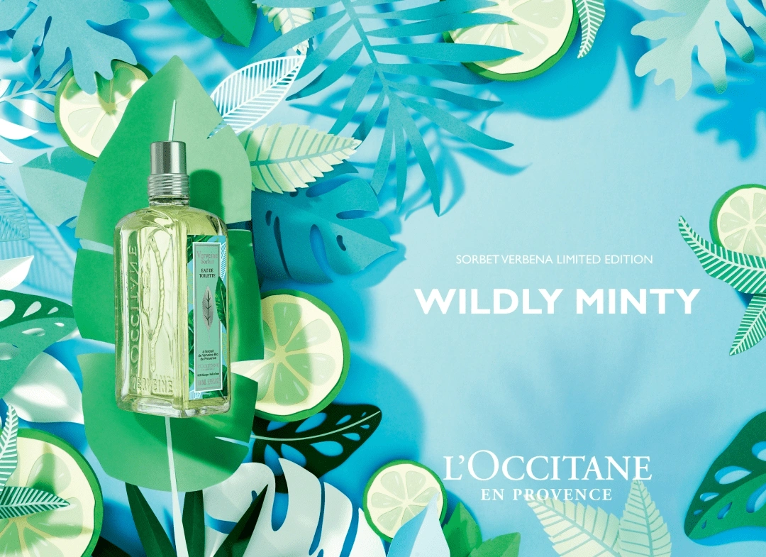
Adrian & Gidi’s paper-like florals for L’occitane.
This trend is related to the increase in natural shapes and textures, as they both rely on imperfection that evokes a personable warmth.
The images that look like they have been made with human hands engender a feeling of connection that people desire more than ever — 64% of consumers want brands to make a connection.
Because of this, the next 2-3 years will likely see a rise in DIY-style art, with collage, torn paper, twine accents, wood grain, painterly brushstrokes, and references to fine art.
The rise in DIY aesthetics is also related to the popularity of programs like Adobe Fresco and Procreate.
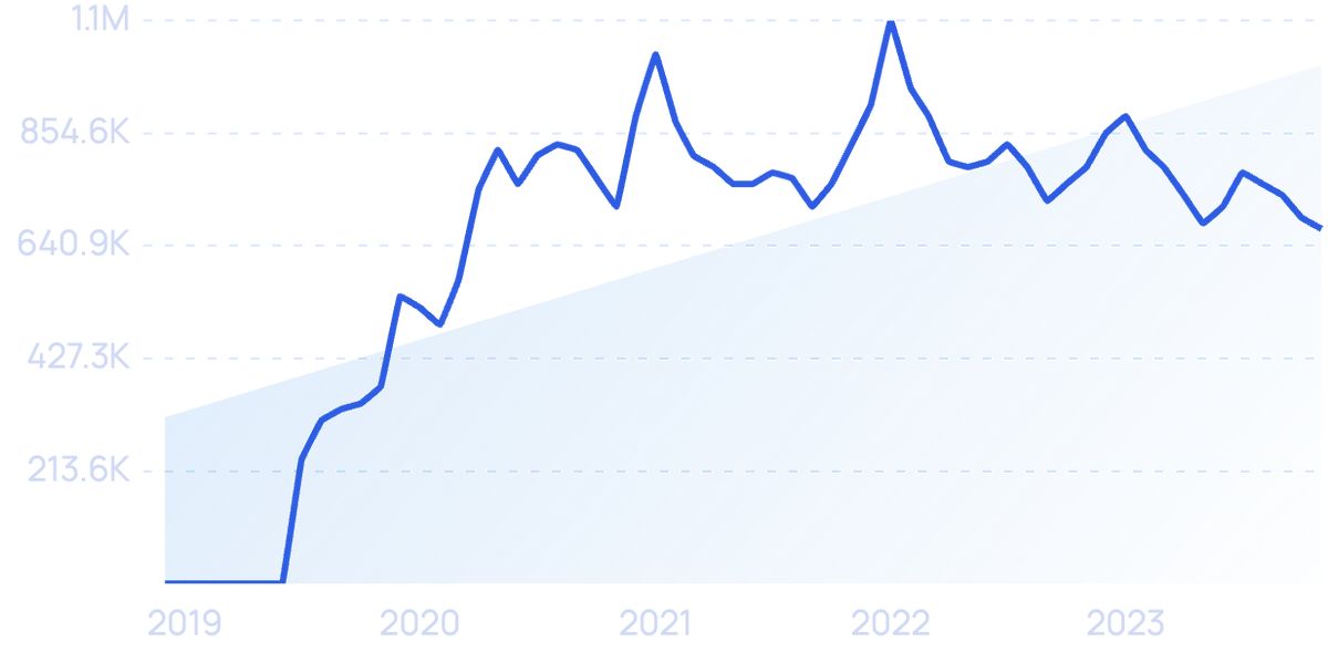
Searches for “Procreate” have increased 6,200% in the last 5 years.
They are both known for their mixed media brush library that mimics the textures of pencil, pen, watercolor, charcoals, oils, and pastels.
As the popularity of these apps increases, it is likely the style they create will as well.
13. Vibrant Nostalgia
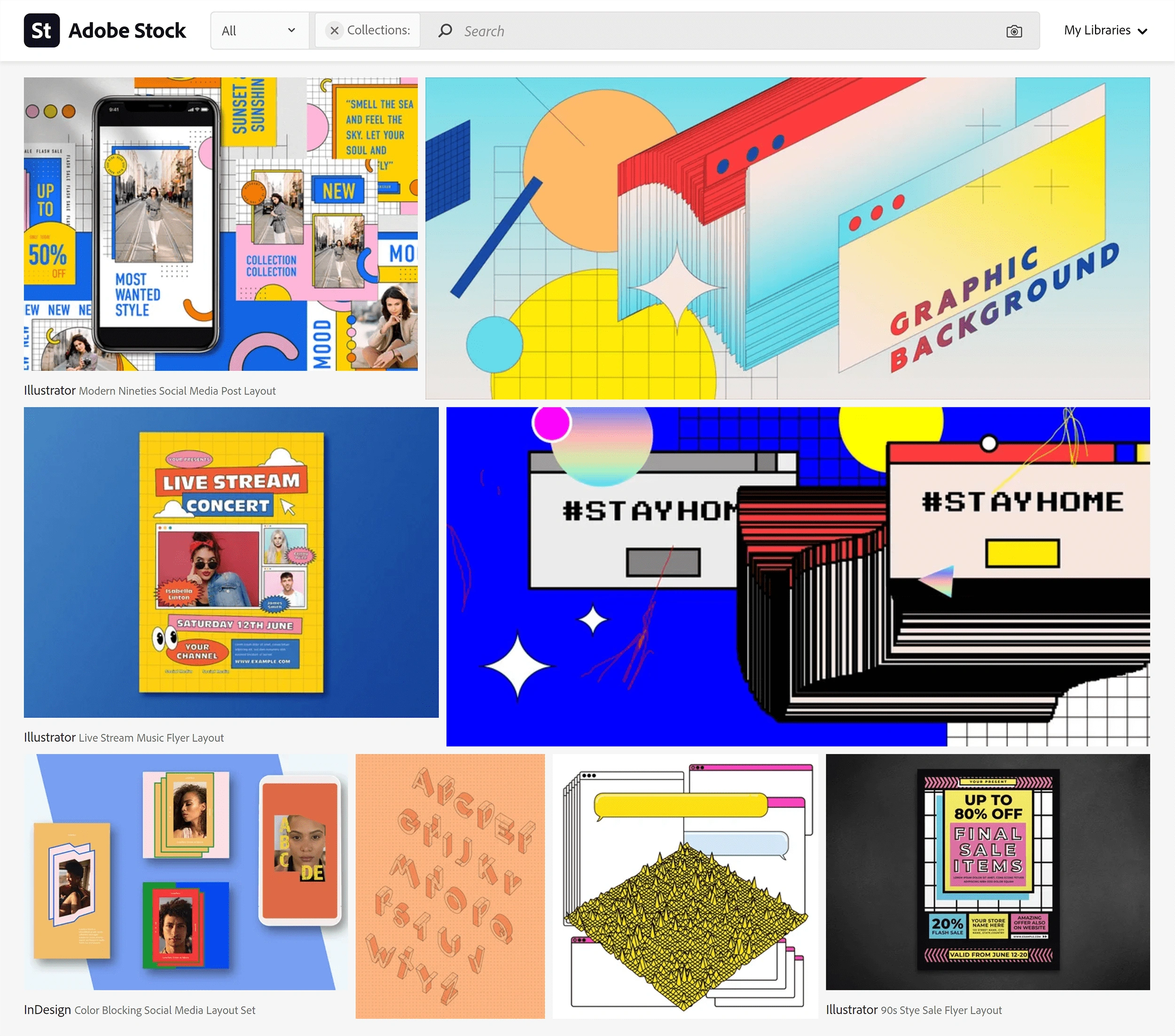
Adobe Stock’s collection of vintage vaporwave designs
A retro look in graphic design has always been trendy. And that’s no exception for 2024 and beyond.
Graphic design in the next year will likely go against the minimalist trend that dominated the 2010s.
Instead, we're seeing a trend towards a colorful vintage aesthetic that references the 70s and 80s, with touches of the psychedelic, and retro-futurism.
The designs of the next year will be bright, feature bold gradients, use gritty textures, and rely on unusual typefaces.
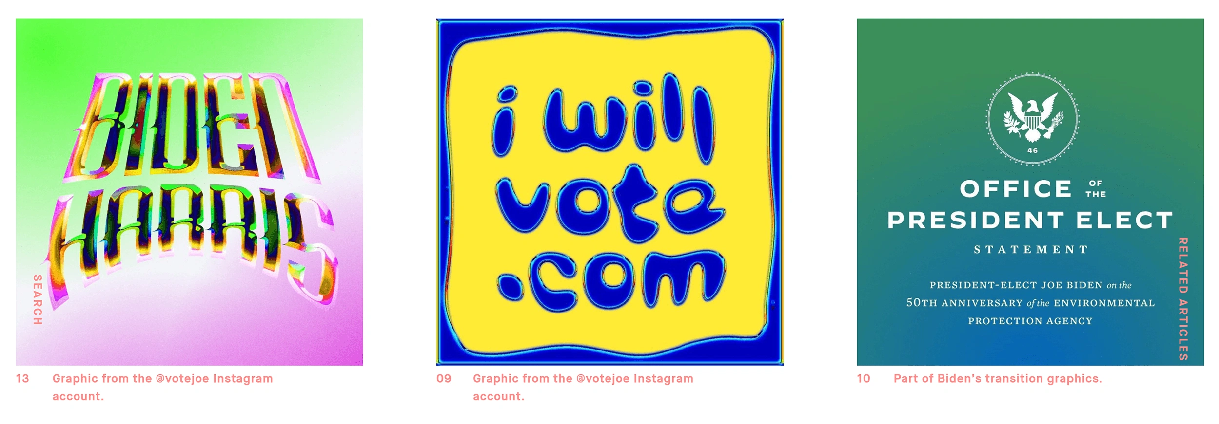
One early indicator of this emerging trend was Joe Biden’s social media campaign materials.
Senior creative advisor Robyn Kanner who oversaw the colorful psychedelic images said “I think isolation is a very big thing that happened over the last year, and there’s a fundamental warmth to gradients that beats flat color”.
Graphics from the 2020 Biden/Harris presidential campaign, from AIGA.
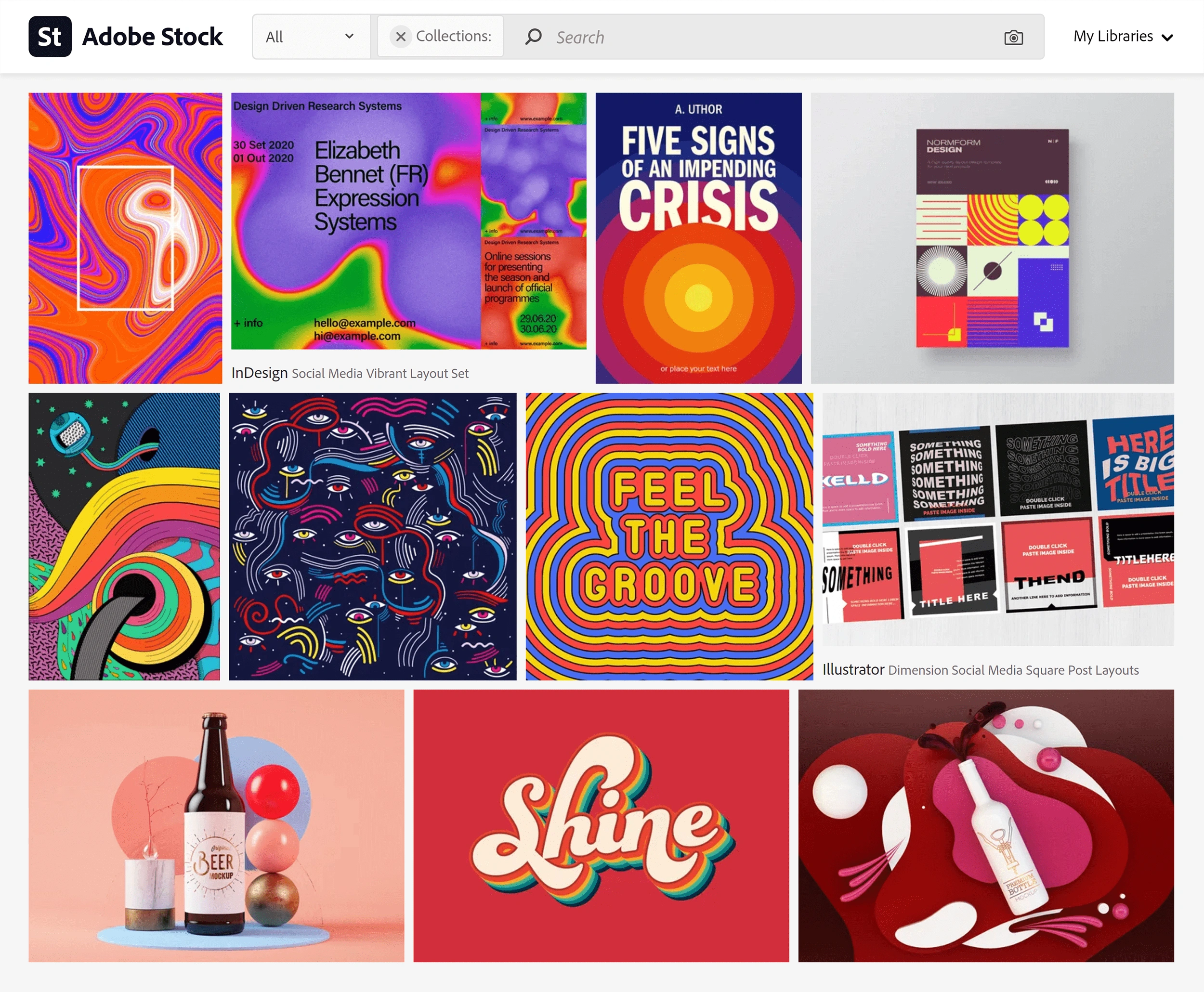
A variety of brands like Burger King will likely adopt Psychedelic swirls, funky 70s fonts, and subject matter that tackles social and political issues in the next year, a part of the larger trend towards escapism.
Adobe stock’s collection of psychedelic images.
Shea Molloy, vectors and illustrations lead at Adobe Stock calls the trend in psychedelic imagery a response to increased attention to climate and sustainability, and an “expressive fantasy” escape from long months of sheltering in place.
Conclusion
From 3D elements to nostalgic callbacks, these are the top graphic design trends to watch over the next few years.
Overall graphic design will seek to meet the unpredictability of the previous year with greater attention to authenticity, human connection, and social purpose.
As with other creative arts, expect graphic design to continue to evolve closely alongside cultural attitudes.
Stop Guessing, Start Growing 🚀
Use real-time topic data to create content that resonates and brings results.
Exploding Topics is owned by Semrush. Our mission is to provide accurate data and expert insights on emerging trends. Unless otherwise noted, this page’s content was written by either an employee or a paid contractor of Semrush Inc.
Share
Newsletter Signup
By clicking “Subscribe” you agree to Semrush Privacy Policy and consent to Semrush using your contact data for newsletter purposes
Written By


Josh is the Co-Founder and CTO of Exploding Topics. Josh has led Exploding Topics product development from the first line of co... Read more

