Get Advanced Insights on Any Topic
Discover Trends 12+ Months Before Everyone Else
How We Find Trends Before They Take Off
Exploding Topics’ advanced algorithm monitors millions of unstructured data points to spot trends early on.
Keyword Research
Performance Tracking
Competitor Intelligence
Fix Your Site’s SEO Issues in 30 Seconds
Find technical issues blocking search visibility. Get prioritized, actionable fixes in seconds.
Powered by data from
Latest Blog Posts
Featured Case Studies
See what's trending before everyone else
Each week, we'll send you our best Exploding Topics. Plus, expert insight and analysis.
6 Important Brand Design Trends (2024 & 2025)
Visual content is king right now.
That’s why it’s critical for brands to have a visual identity that’s able to instantly capture attention and stick in the minds of consumers.
When consumers see a brand’s designs, they want to be able to see the authentic side of the brand (how it’s living out its values). They’re also looking for brand designs that connect with them on a personal level, whether that be aspirational, soothing, or experiential.
In this report, we’ll cover the top six brand design aesthetics that are trending today like line-art illustrations, minimalism, and others. And, we’ll take a look at several companies that are incorporating these trends into their branding right now.
1. Tapping into the ‘70s and ‘90s
Using nostalgic designs is an effective way for brands to get consumers thinking about “the good old days”.
No matter what decade the design harkens back to, classic designs tend to prompt happy, peaceful emotions in consumers.
Many brands are continuing to tap into the feelgood days of the 1970s.
They’re using earthy color schemes with a focus on warm colors like browns, reds, and oranges.
Serif fonts and wavy lines are also popular.
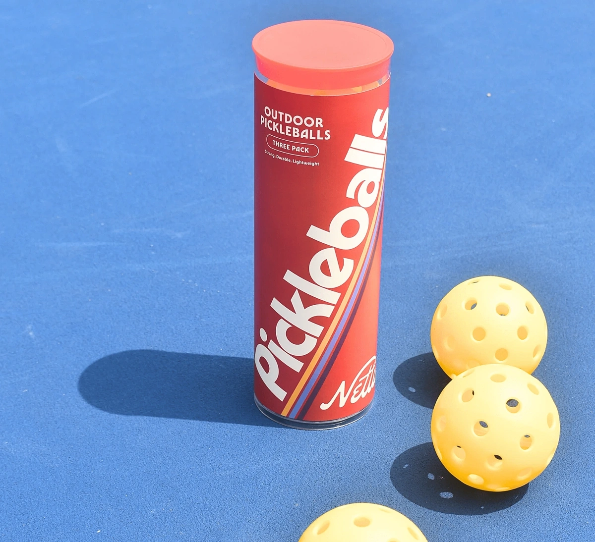
Look at Nettie, a pickleball outfitter.
The brand’s packaging and marketing are very reminiscent of the ‘70s.
Nettie’s packaging features an earthy red as the main color and subdued blue and orange as accent colors.
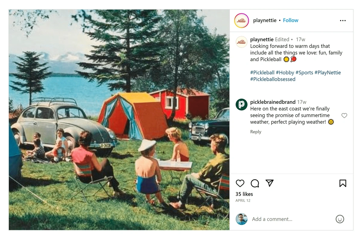
Nettie’s social media also showcases a very vintage feel. There are plenty of posts with modern images, but images of ‘70s sports stars and vintage lifestyle shots are featured too.
Nettie blends modern and retro on their Instagram page.
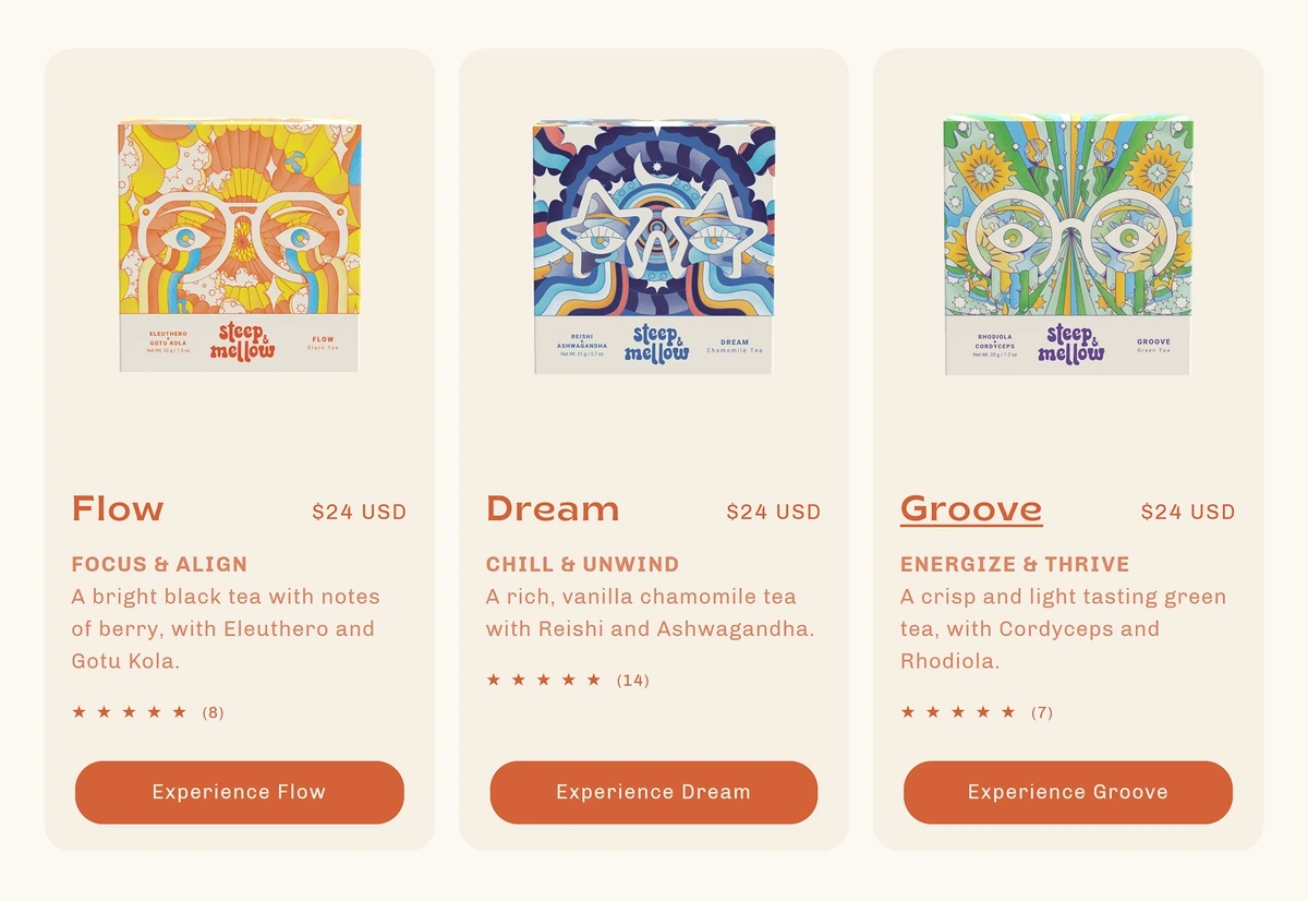
Tea company Steep & Mellow has built their brand with a hippie ‘70s aesthetic that still feels modern.
Steep & Mellow uses colors and fonts to embrace the ‘70s nostalgia.
This design is the perfect fit for their brand, which is focused on using herbal teas to nourish the bodies and minds of their customers.
Beyond the ‘70s nostalgia, other brands are bringing back a ‘90s and Y2K vibe in their designs.
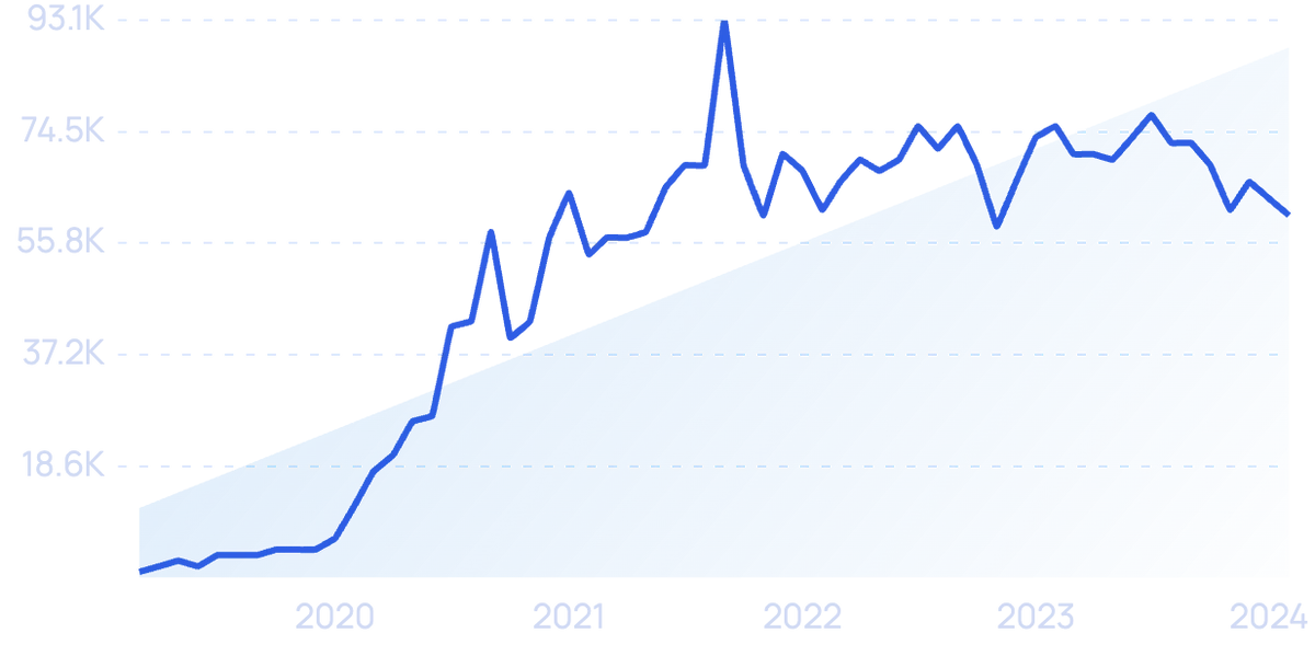
Search volume for “Y2K aesthetic” began building in 2020.
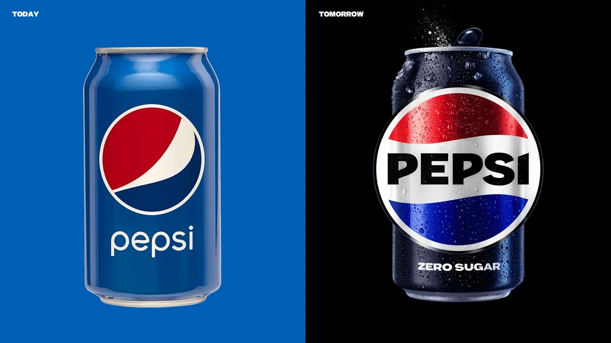
Pepsi recently debuted a new logo that’s inspired by the brand’s logo from the ‘90s.
The new Pepsi logo features a straight globe with the brand wordmark placed directly in the center.
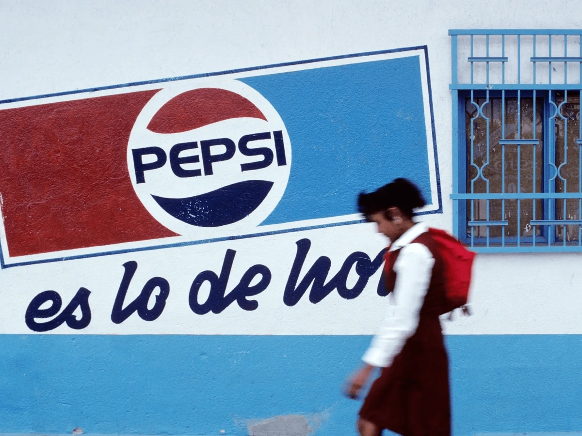
Pepsi designers said their research showed that most consumers who were asked to draw the Pepsi logo from memory came up with a design that’s very similar to the design that was used from 1987 to 1997.
The Pepsi logo in 1990.
Another way the ‘90s and Y2K are making their mark for the second time is the sticker book aesthetic.
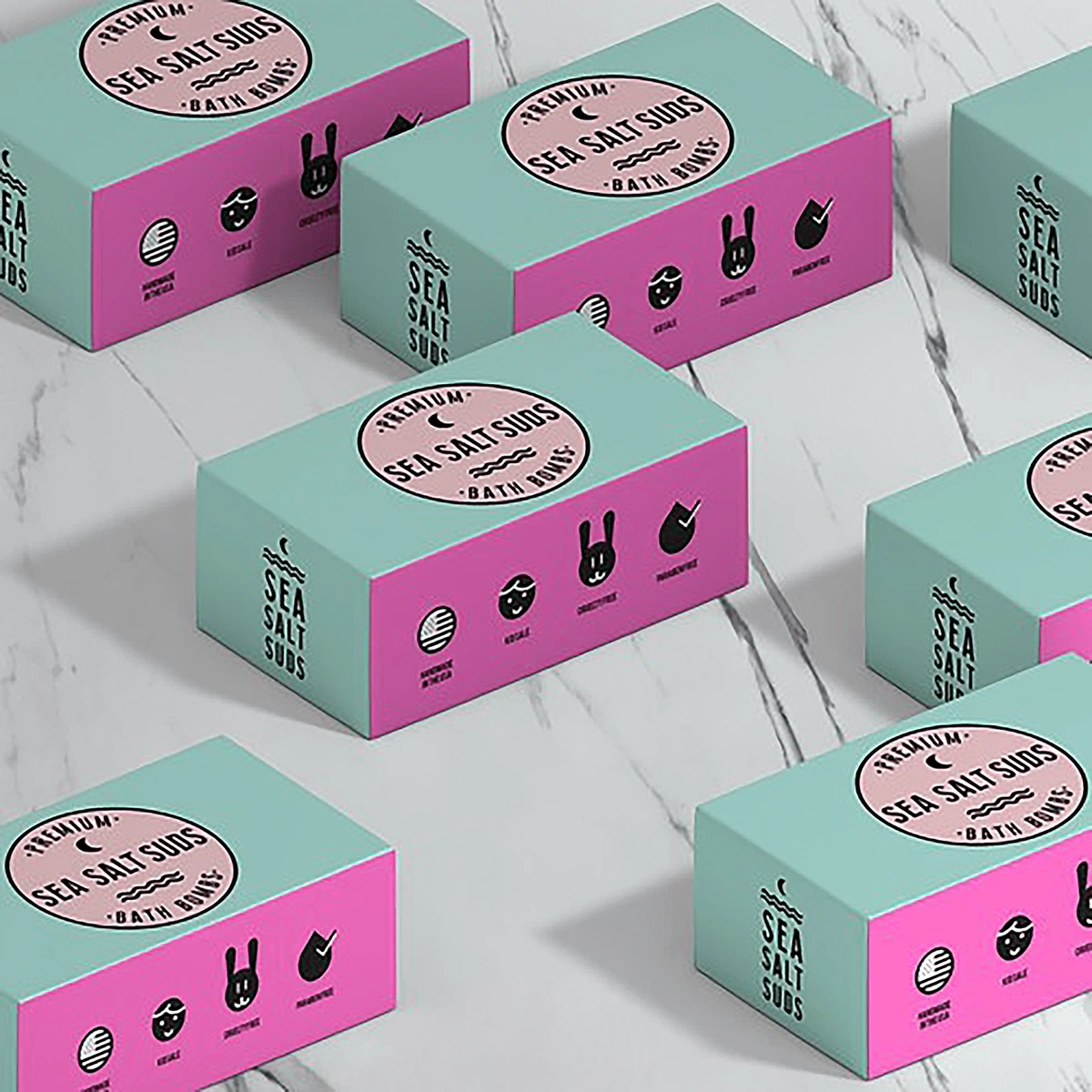
This is a design with a seemingly random combination of icons, doodles, stamps, and the like. They’re often accompanied by bright hues and a youthful appeal.
The icons and bright pastel hues of this packaging are reminiscent of the ‘90s.
2. Substituting Letters with Abstract Forms
Many brands have been giving their logos and marketing materials a lighter, more abstract feel in recent months.
Brands who are pushing for this design trend have the goal of communicating an instant, distinct feeling with consumers. This is designed to give consumers an experience with the brand in just a single glance.
With consumer attention spans being shorter than they’ve ever been, this immediate visual communication is more important than ever.
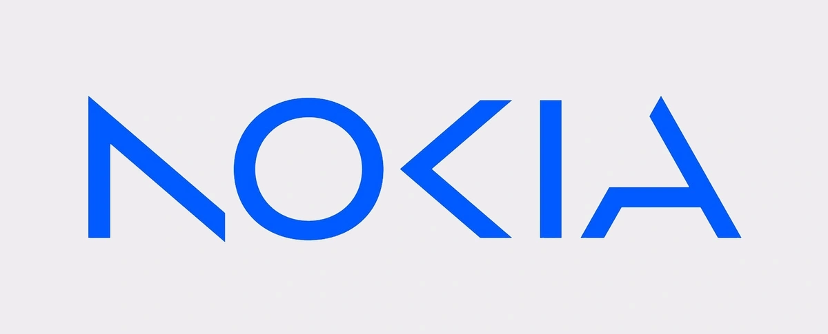
In one example of this trend, Nokia’s decades-old logo got a modern, slightly abstract, update in early 2023.
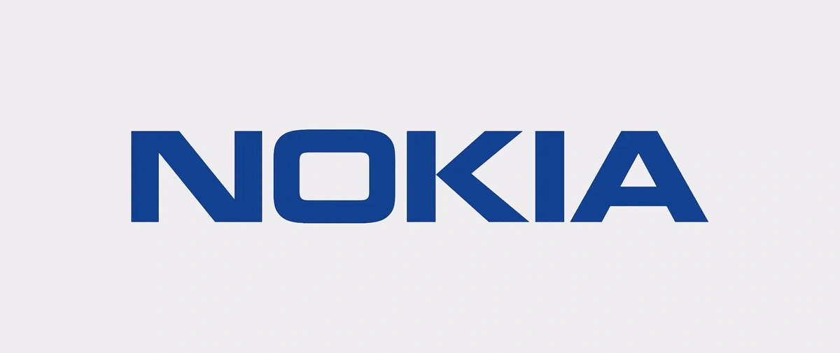
Their previous logo, which was originally designed back in 1979, was dark and bold.
Nokia’s old logo featured thick lines and a heavy appearance.
In their new logo, portions of the N, K, and A have been removed to create a lighter feel that looks more modern than the old logo.
They also updated the color to a brighter blue.
Nokia’s new logo was revealed early in 2023.
Nokia officials say the redesign is symbolic of the company’s energized, dynamic, and modern approach to B2B technology.
Other companies are opting to replace entire letters with shapes and symbols related to their brand.
Take Sophistiplate, for example.
This company creates disposable products that homeowners can use in crafting an upscale tablescape.
The brand’s logo replaces the O in the company name with a gold plate.
The Sophistiplate logo instantly communicates the brand’s product offerings.
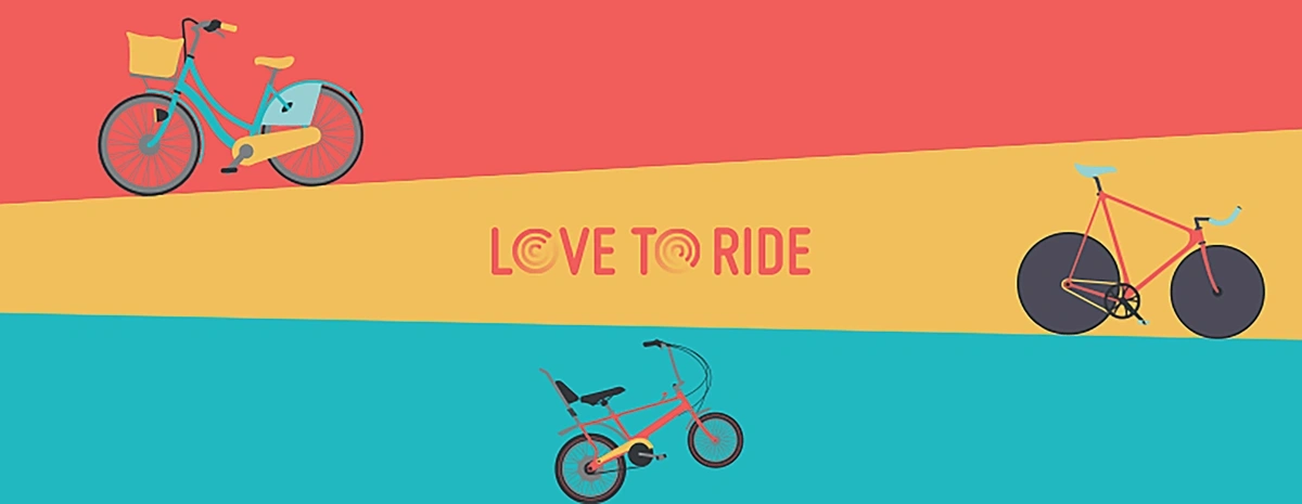
Another brand using this design strategy is Love to Ride, a cycling company.
Their brand logo replaces both Os in their name with visually engaging circles.
Love to Ride’s logo is simple but immediately engages cyclists.
They’re not an exact illustration of bicycle wheels, but they give the logo a modern appeal that instantly signals what the brand is all about.
3. Embracing Mascots
Mascots are another nostalgic trend that’s gaining momentum.
The past is full of memorable mascots like Mr. Clean, the Michelin Man, and the Energizer Bunny. But a few newer brands are also embracing the power of a mascot.
Mascots can increase brand loyalty, boost brand recall, and provide a way for brands to differentiate themselves from the competition.
In fact, research shows that brand mascots can increase emotional connection with customers by more than 40%.
A large part of that emotional connection in recent years has been the humanization of the mascot.
Today’s mascots are doing pranks on social media or wearing amused expressions on product packaging.
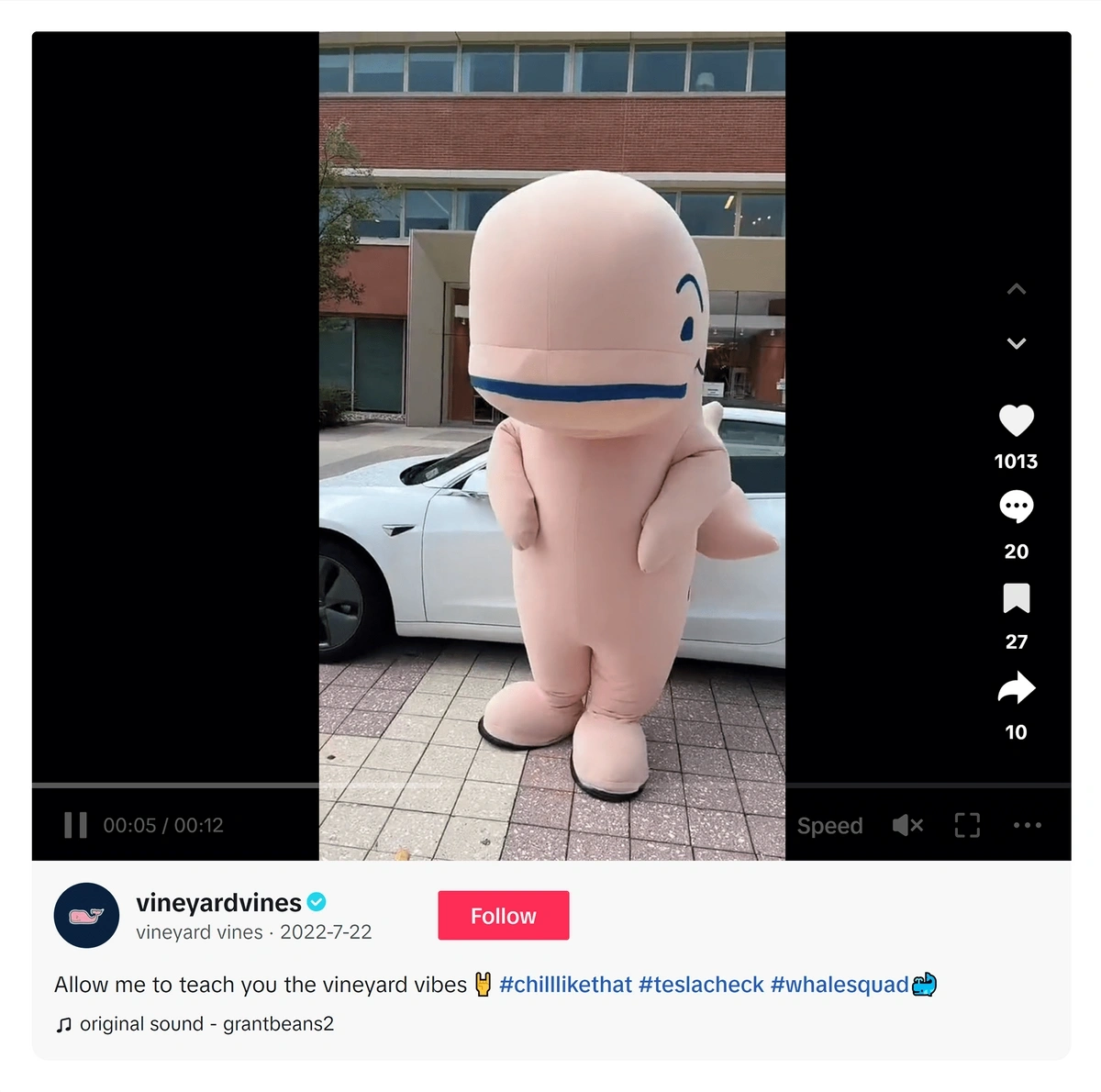
For example, the whale from Vineyard Vines has boosted the brand to 2.9 million likes on TikTok.
The whale appears in nearly all of Vineyard Vines’ TikTok videos.
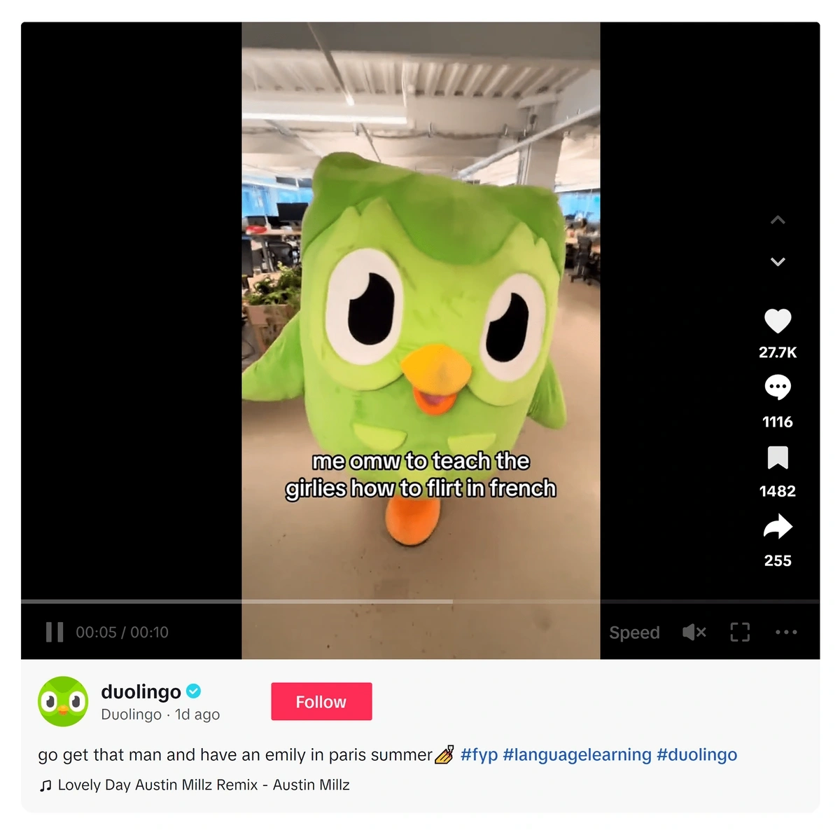
Duo from Duolingo is another mascot that’s amassed a huge social media following—more than 10 million on TikTok.
Duo has his own personality that comes out in Duolingo’s TikTok videos.
Duo also responds to comments on the TikToks, showing that Duolingo has truly doubled down on giving the mascot human characteristics.
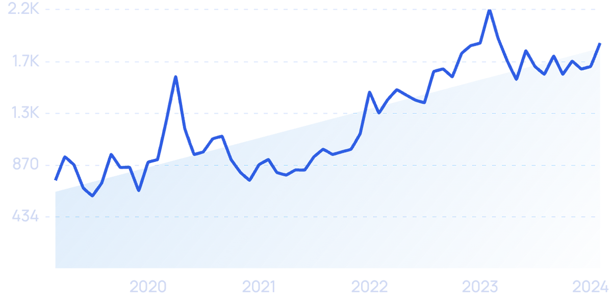
Search interest in “Duolingo Duo” is up more than 156% in recent months.
In one poll, Duo was ranked the number-one brand mascot of all time.
New mascots have hit the market in recent months, too.
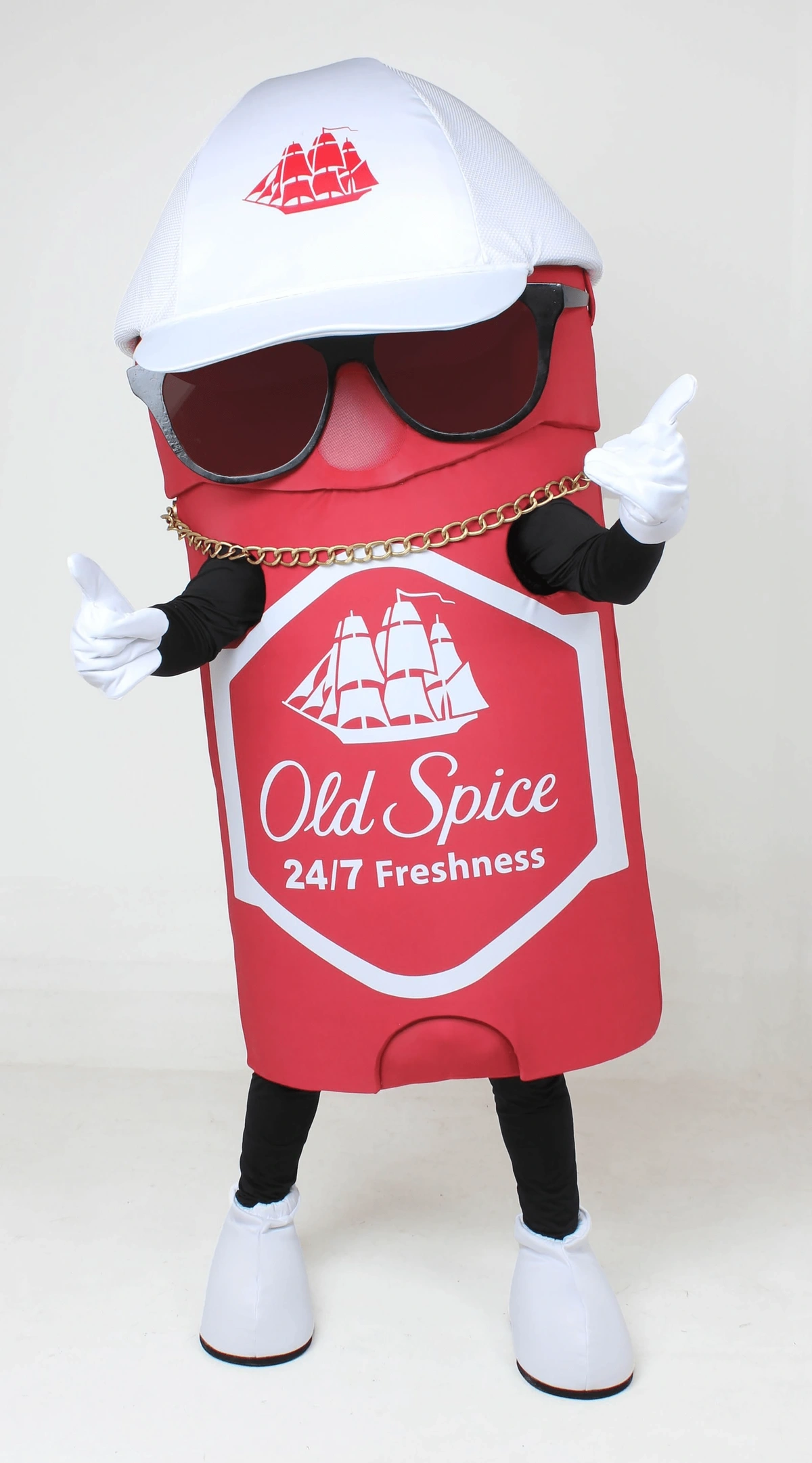
Old Spice launched its tongue-and-cheek mascot Swaggy Spice at the 2023 Super Bowl.
Swaggy Spice is a walking stick of deodorant.
Smaller brands are also using mascots to engage potential customers.
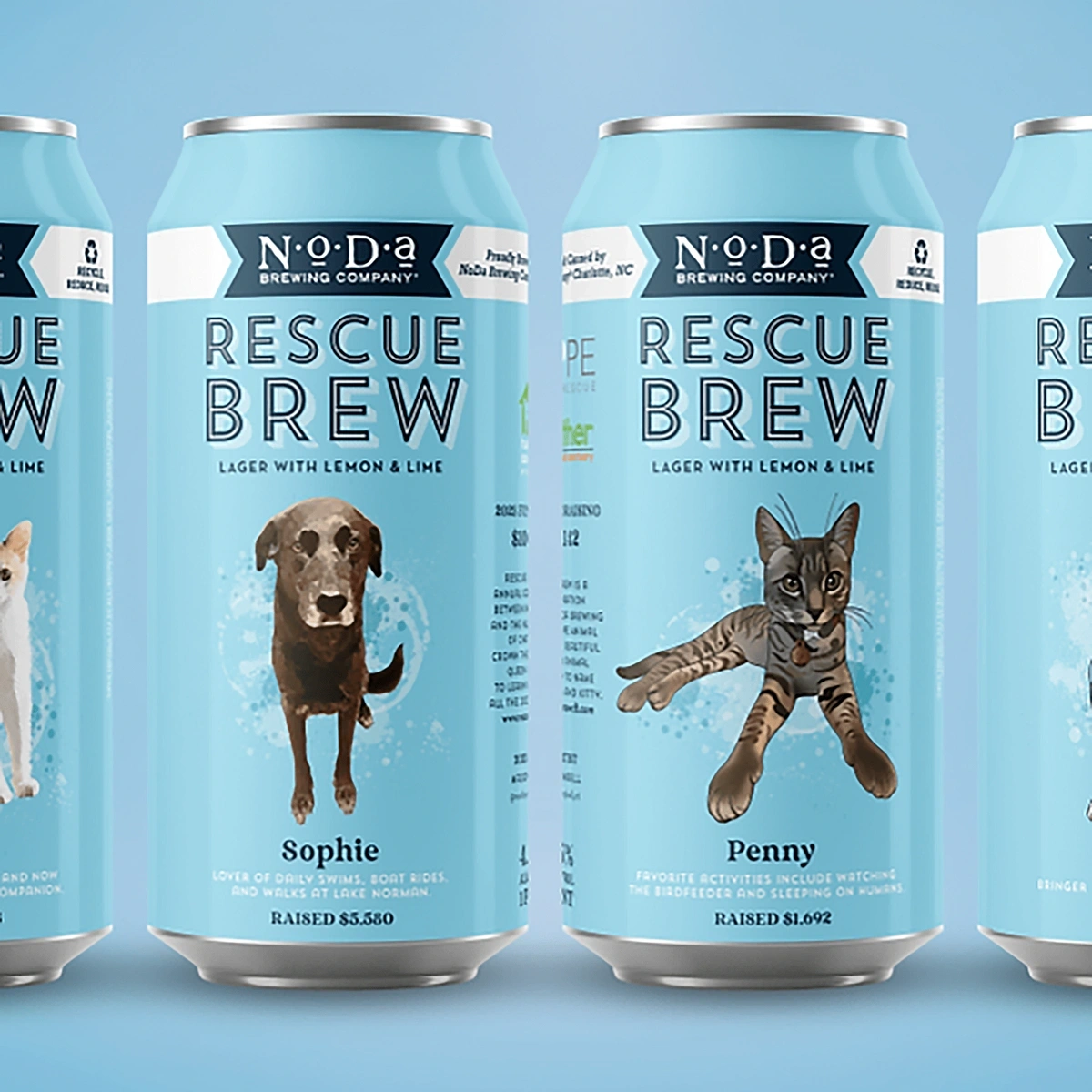
NoDa Brewing, a local craft brewer in Charlotte, North Carolina, goes as far as using dogs that are up for adoption as their mascots.
These dogs appear on the cans of lager that’s aptly named “Rescue Brew.”
NoDa Brewing markets its Rescue Brew with adoptable pets on the cans.
4. Showing Authenticity with Illustrations
Today’s consumers are demanding authenticity from brands.
Data from Forrester shows that 71% of consumers say they can relate to authentic brands and want to support them.
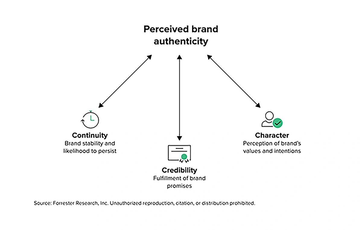
Three important factors come together to produce perceived brand authenticity.
In addition, 70% of consumers say when brands are authentic it makes them more confident in the brand’s products.
When consumers see a brand as authentic, they’re more likely to form an emotional attachment to that brand and tell their friends and family about the brand.
Authenticity also has a correlation with consumers’ purchasing decisions.
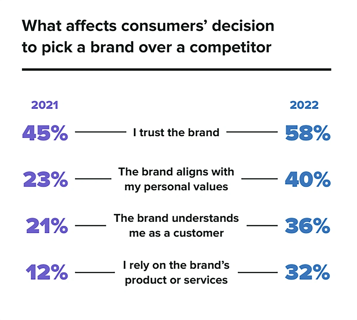
Research shows that 57% of consumers will spend more with a brand when they feel connected to that brand and 76% of consumers will choose that brand instead of a competitor if they feel an authentic connection.
Shoppers are choosing trustworthy brands that align with their values.
One way in which brands communicate authenticity through their designs is with illustrations.
Adobe named this trend as a top brand design trend of 2023 because it offers a real-life, unscripted way of communicating brand values.
Hand-drawn illustrations often look a bit unfinished but that’s purposeful. It gives the brand personality and an unscripted presence.
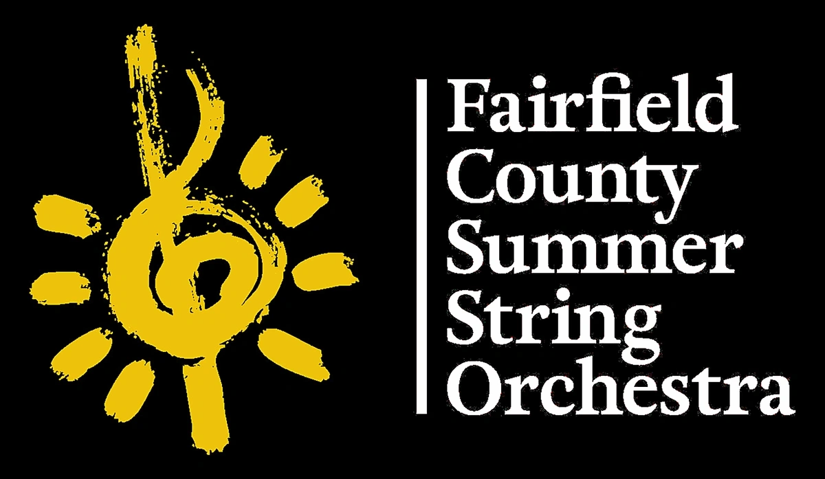
In one example, a local kids orchestra in Connecticut uses a hand-painted music note as its logo.
While some orchestra brands would present themselves as more formal, this authentic look fits the brand because it communicates the fun of summer and kids music.
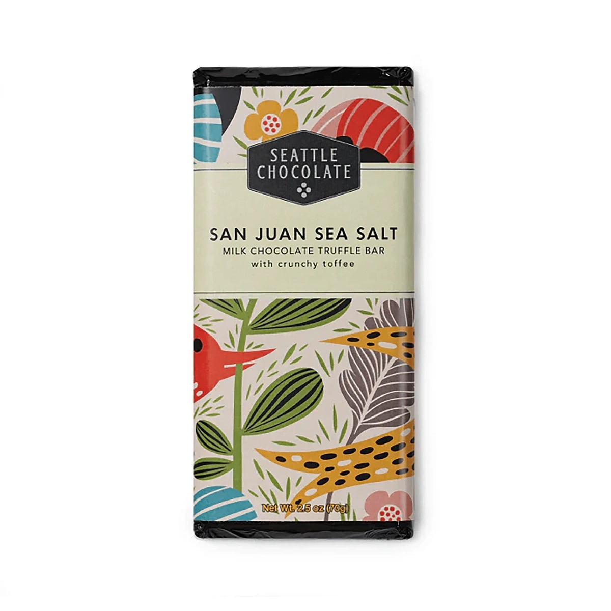
In another example, the packaging used by Seattle Chocolate features cheerful, friendly illustrations that authentically speak to what’s inside: artisan chocolate crafted with care.
Seattle Chocolate packages each of its products in festively illustrated wrappers.
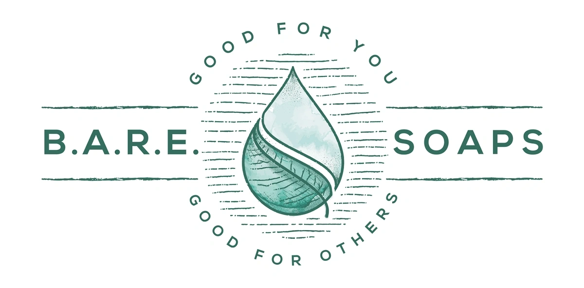
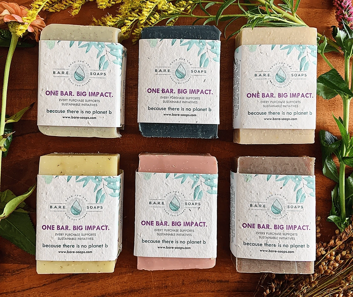
Bare Soaps uses a similar approach to its branding.
The Bare Soaps logo is a hand-drawn illustration.
The brand’s logo is simple in both color and design, but the illustration communicates the brand’s commitment to sustainability and natural ingredients.
The packaging follows its brand identity and features several line-art illustrations that use soft coloring.
Each bar of soap is packaged in an illustrated sleeve.
5. Going Even Deeper into Minimalism
The minimalist design aesthetic first popped up in the 2010s in response to Millennials, but it remains a strong brand design trend in 2024.
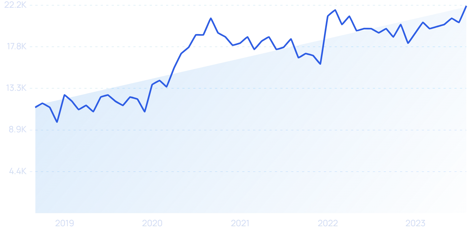
Search volume for “minimalist design” jumped in late 2020 and again in 2022.
Research shows that about 60% of major brands are using a minimalistic logo.
One reason is that many consumers find that the monochromatic colors and simplistic designs are soothing and uncomplicated, appealing to consumers’ frayed emotions in a post-pandemic world.
This is also a trend that’s very popular with luxury brands because of its clean lines and sleek appearance.
There’s also a practical reason for brands to stick with minimalist designs: they work everywhere.
This is especially true for small spaces like app icons or social media profiles. There’s only so much room for the brand’s design. And, a design with multiple elements is likely to look overwhelming with a small limit in terms of pixel space.
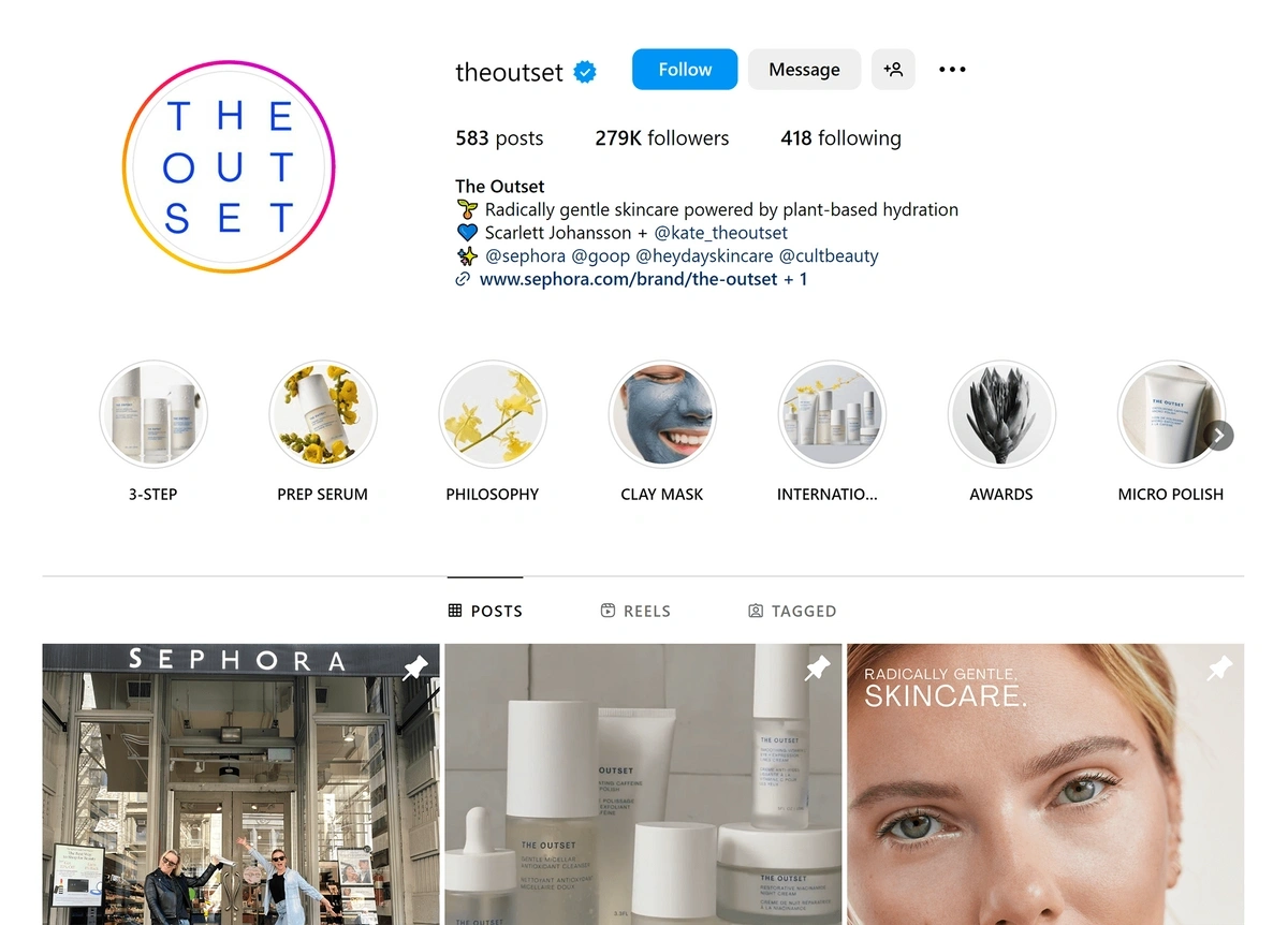
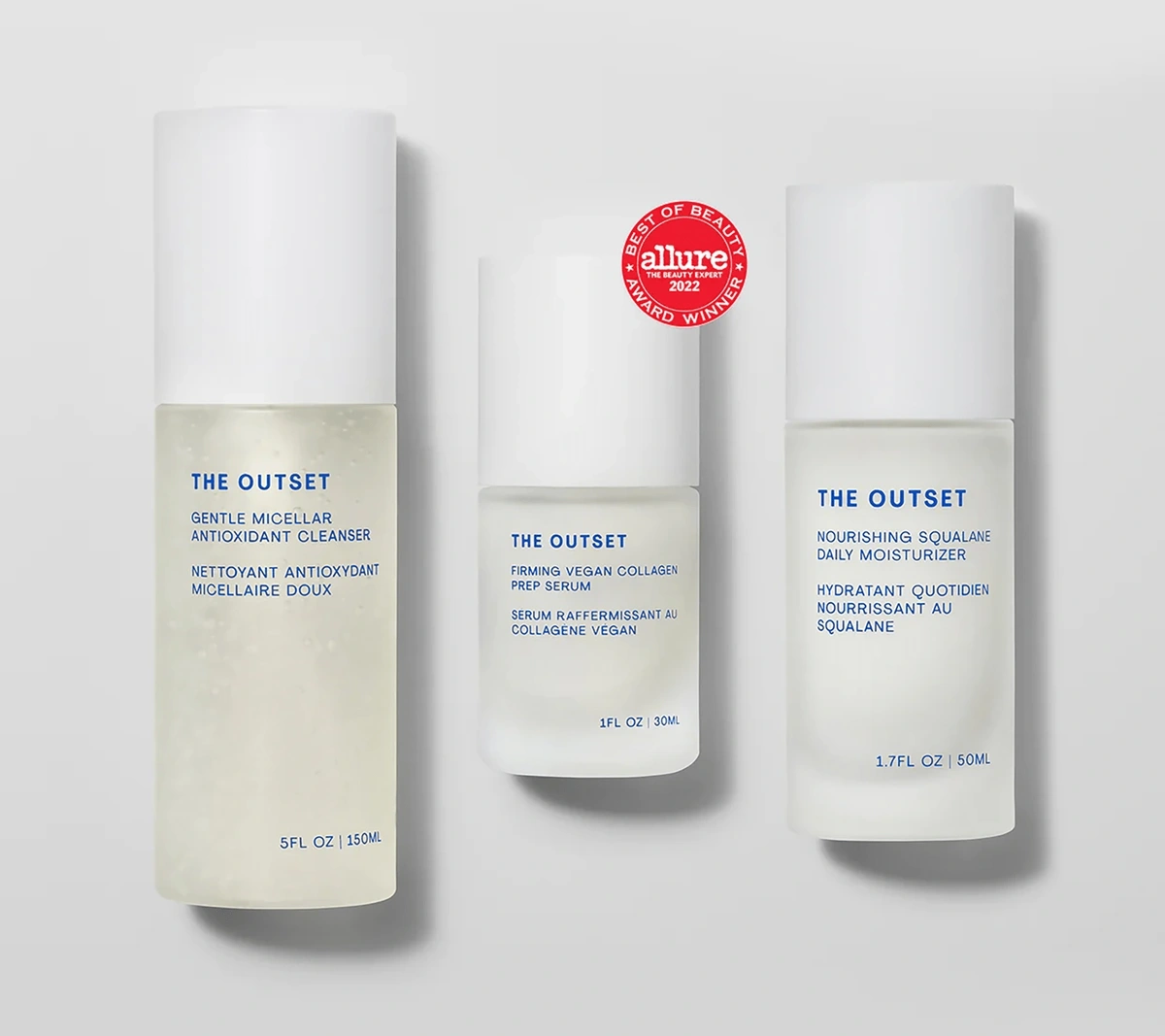
Scarlett Johansson’s luxury skincare line, The Outset, is one example of a minimalist brand design.
The Outset’s logo fits within the profile image space on Instagram.
The brand’s logo is a simple blue wordmark and the products are packaged in white bottles with sparse blue text.
The Outset aims to be “the classic white tee” of skin care.
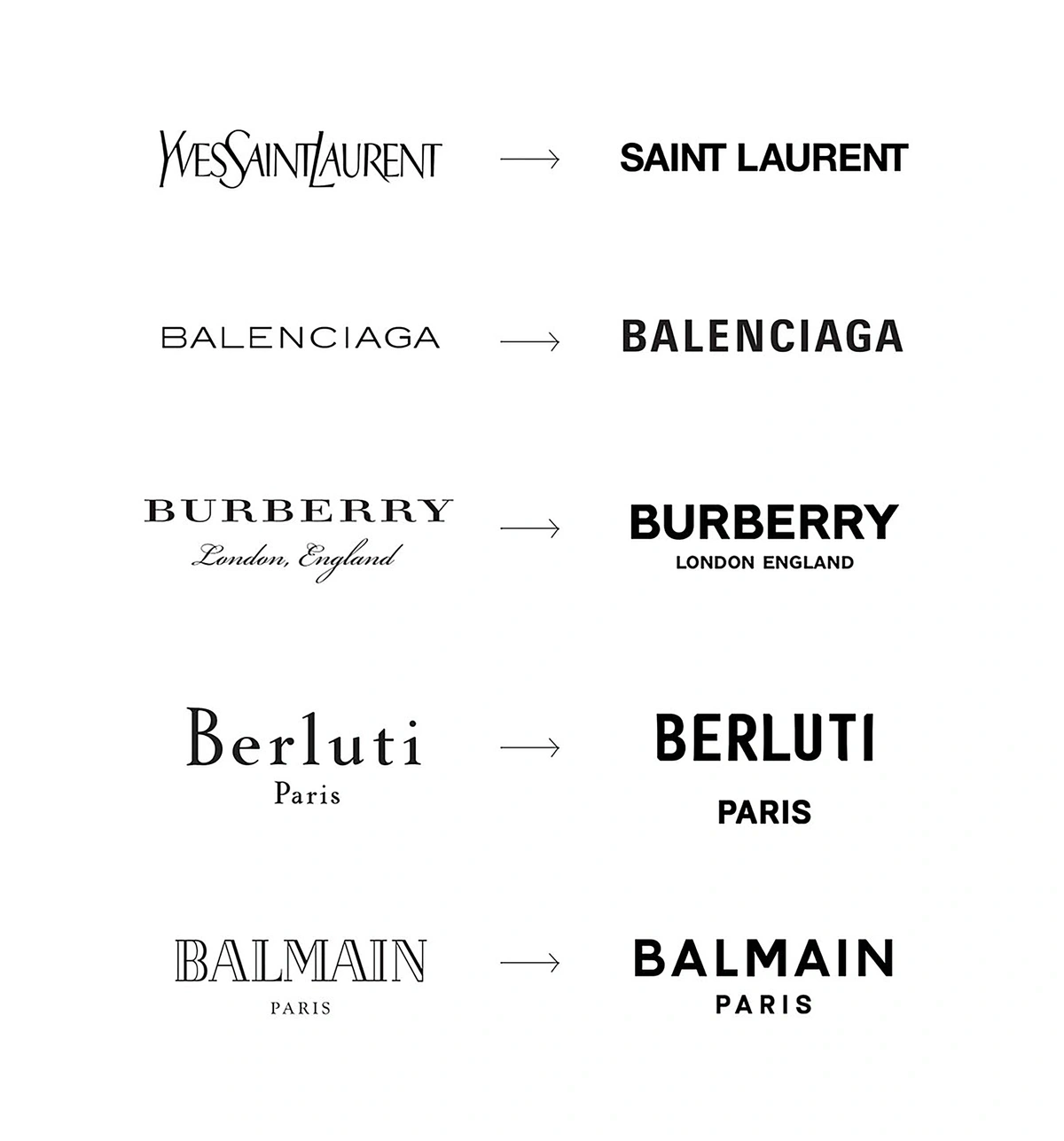
Beyond luxury skincare, many luxury fashion lines have also taken one step further into minimalist brand design in recent years. Yves Saint Laurent and Berluti are just two examples.
Luxury brands have been simplifying the typography in their logos in recent years.
Many automakers have also revamped their logos in recent months to create a cleaner appearance.
For example, in 2022, Audi traded in its silver rings for flat black rings.
Audi’s rings are now 2D.
And, in 2023, Infiniti took a bit of bulk out of its logo to create a slimmer look.
Infiniti executives say the new logo emphasizes their focus on the horizon and new opportunities.
Minimalism is making its way into CPG brand designs, too.
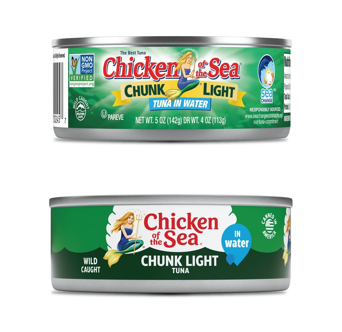
Chicken of the Seas recently rebranded to create a logo with a minimalistic typeface and a flatter design for product packaging.
The old packaging (top) was fairly busy in comparison to the new design (bottom).
Several beer brands are also adopting minimalist branding.
These designs aim to appeal to health-conscious drinkers and communicate transparency.
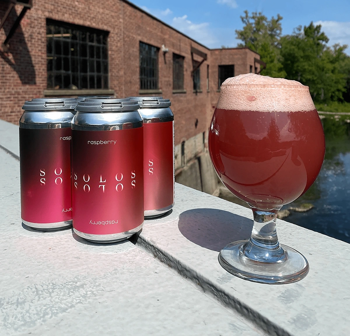
New York’s Brown’s Brewing Company uses a minimalistic gradient in the packaging for their seltzers.
The can design for Brown’s Brewing fruit refreshers features an upscale, minimalistic design.
6. Communicating Sustainability
In Morning Consult’s 2022 Sustainability Report, nearly 60% of survey participants said they’re likely to consider purchasing products from food and beverage companies that prioritize sustainability.
Nearly 50% of participants said they’re likely to consider products from healthcare brands that prioritize sustainability and 45% said the same thing about retail and ecommerce products.
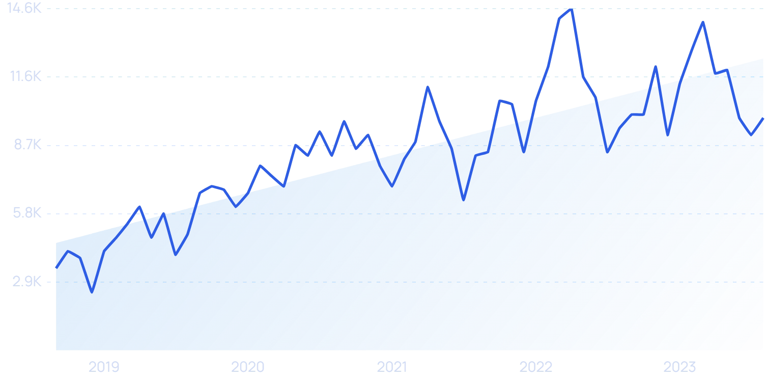
Search interest in “sustainable brand” is up more than 162% in recent years.
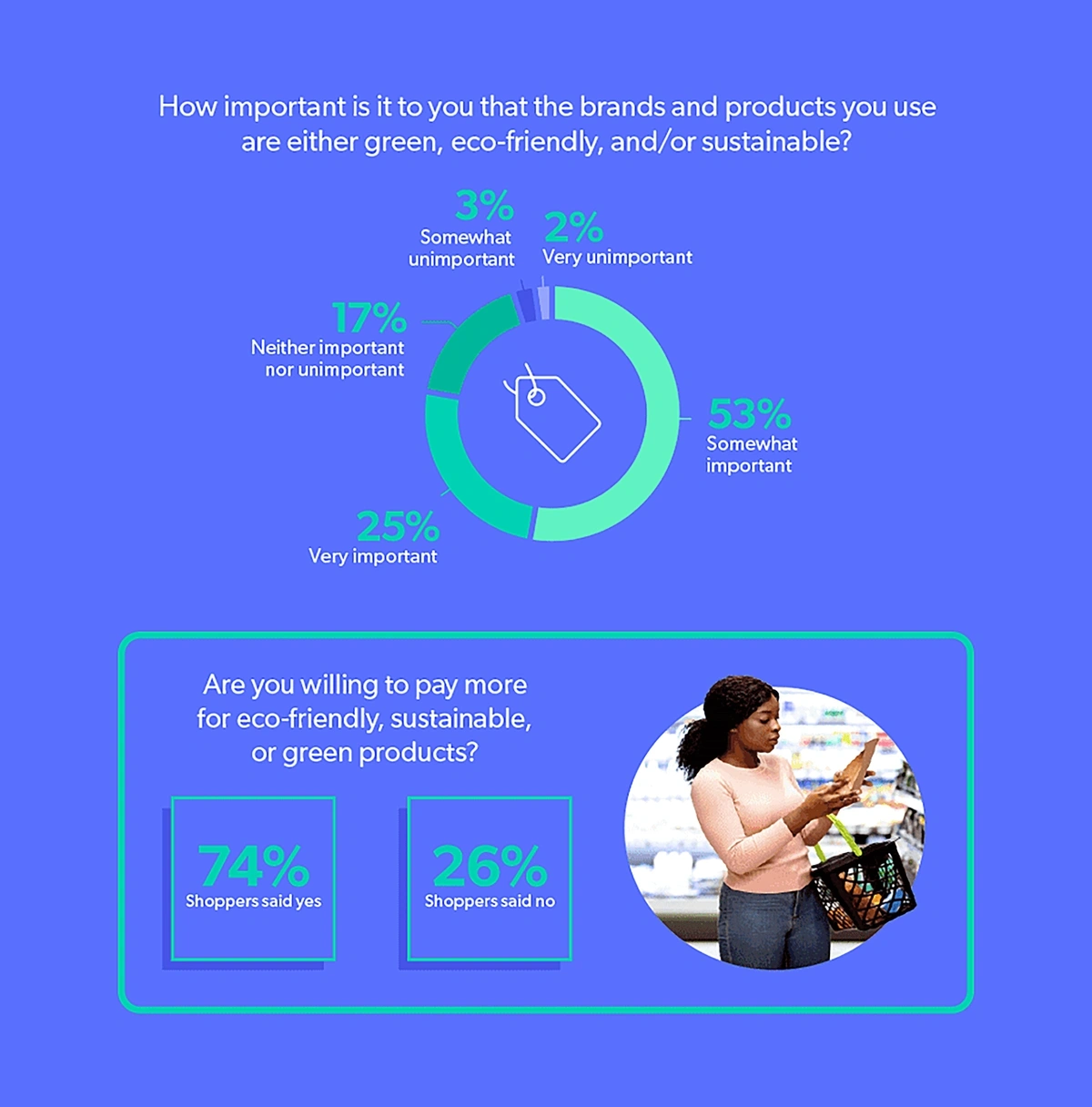
In another survey, 78% of individuals said that purchasing eco-friendly products was either “somewhat” or “very” important to them, and 74% of shoppers said they were willing to pay more for these types of products.
Three-quarters of consumers are willing to pay more for sustainable products.
This clearly underscores the importance of brand design for sustainability-focused companies.
In 2023, these companies look to be taking their branding designs beyond green leaves and text-based claims of “eco-friendly.”
Companies in this space have finessed their messaging in recent months and brands are communicating their sustainable values in future-focused designs.
These companies are also looking to build authenticity and relatability without coming right out and saying it.
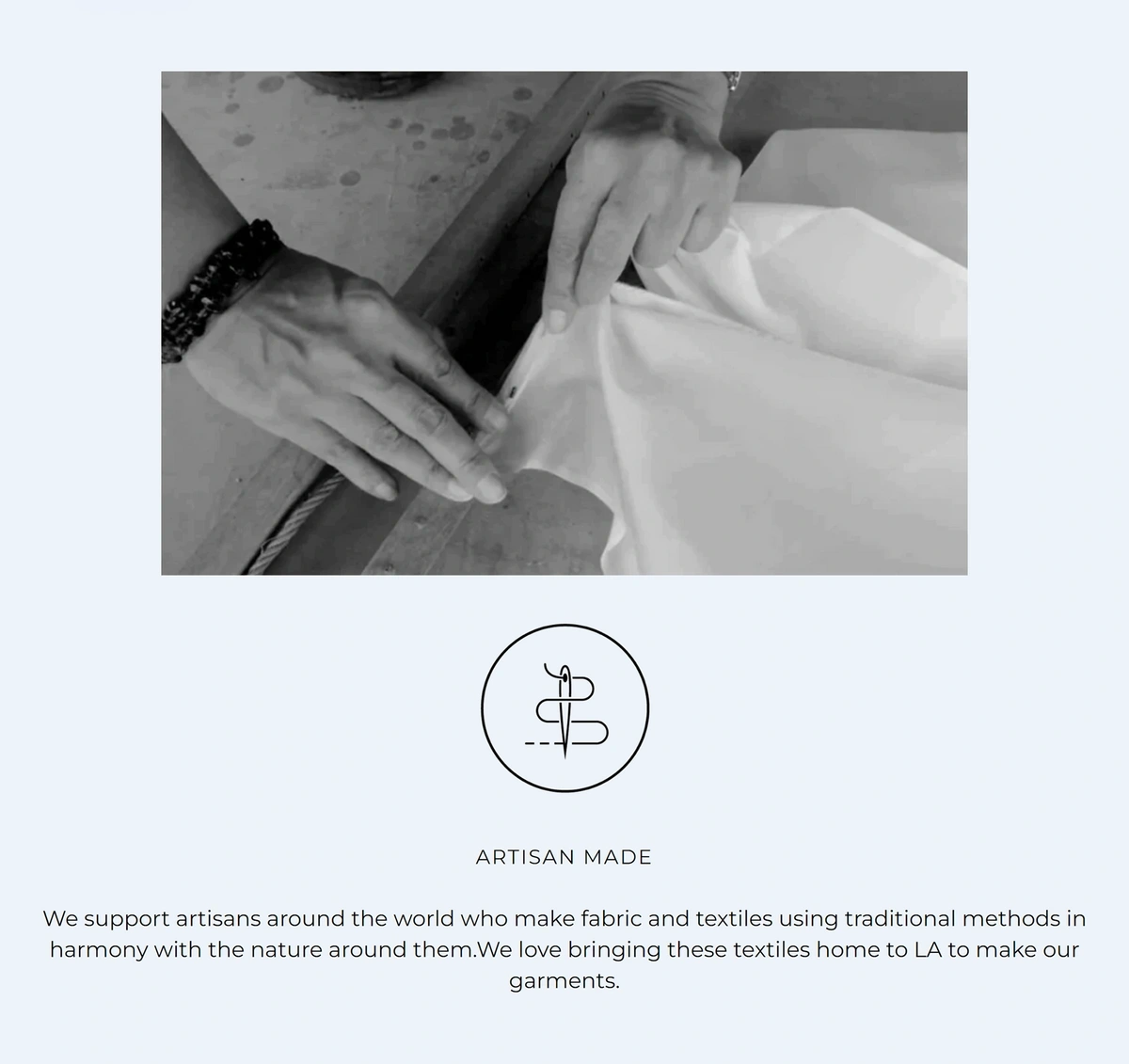
For example, clothing company Ocean + Main has developed a series of icons to use on their products. Each one indicates a sustainability factor like no dyes, zero water, and recycled water.
The icons from Ocean + Main are part of the brand’s aspirational design aesthetic.
Some companies are even using their designs to weave together brand stories about important social issues like climate change and plastic waste.
Branding experts say they’re expecting minimal and aspirational designs to dominate the eco-friendly brand space in the coming year.
Thinx is just one example.
The company sells reusable menstrual products. Thinx began as a DTC brand but now sells its products at Target and Walmart.
The brand is using minimalism to communicate the simplicity of sustainable actions to its customers.
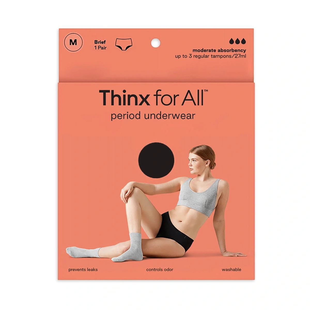
Thinx packaging features a one-color design and a simple image.
The text is sparse on Thinx packaging. The two-word heading is simple but conveys a bold message to consumers.
Thinx also sticks with one color, one image, and just a few icons.
The Thinxs brand logo is also incredibly simplistic: a wordmark accompanied by two droplets oriented toward the center.
The Thinx logo is clean and simple.
Grove Collaborative is another environmentally-focused brand that uses clean designs in its packaging, website, and social media.
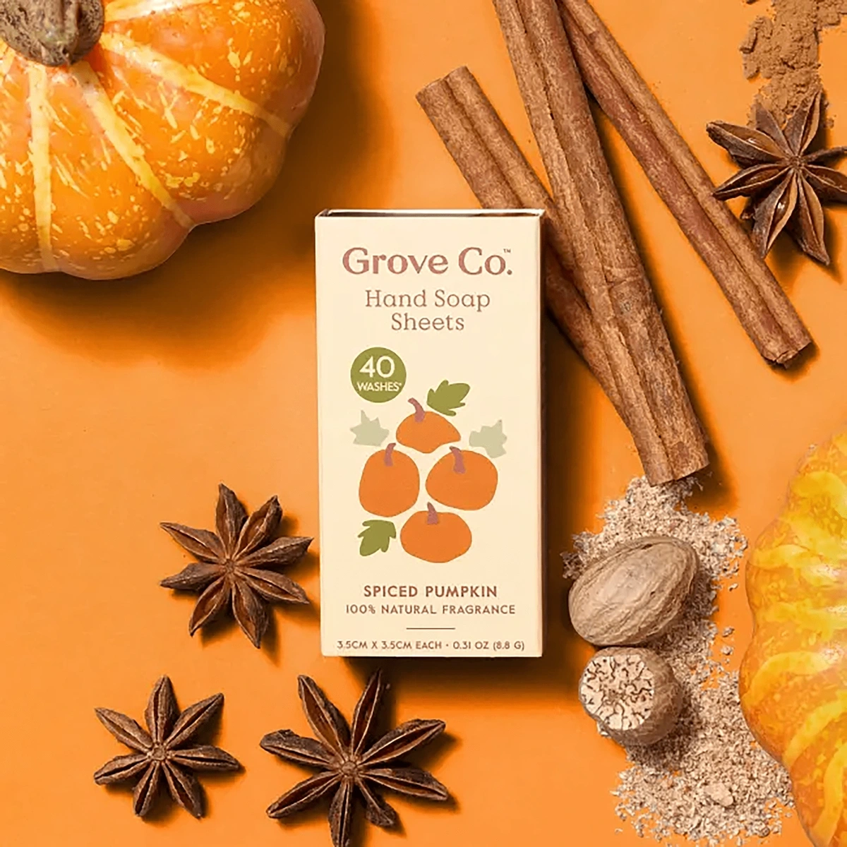
Hand soap sheets from Grove Collaborative are packaged with muted colors and a simple design.
The brand’s packaging features muted colors that seem soothing and peaceful.
Their aspirational brand designs strike up emotions, especially in individuals who are looking to have a sparkling clean home while maintaining an eco-friendly lifestyle.
Conclusion
That wraps up our list of the top six brand design trends.
For today’s companies, the most important factor of brand design is creating an emotional connection with customers.
Some brand designs are looking to do that by reinventing old designs, like nostalgia from the ‘70s or the ‘90s. Others are attempting to show the evolution of their brand, like those brands that continue to strip down and minimize their designs. The really bold brands are connecting with customers through humanized mascot personas.
Successful branding strategies will always vary between companies, but one thing remains true across the board: authentic, human brands are seeming to attract more consumers today and companies that express these values have the best potential to keep their brand elevated for the future.
Stop Guessing, Start Growing 🚀
Use real-time topic data to create content that resonates and brings results.
Exploding Topics is owned by Semrush. Our mission is to provide accurate data and expert insights on emerging trends. Unless otherwise noted, this page’s content was written by either an employee or a paid contractor of Semrush Inc.
Share
Newsletter Signup
By clicking “Subscribe” you agree to Semrush Privacy Policy and consent to Semrush using your contact data for newsletter purposes
Written By


Alison is an accomplished copywriter with proven success in editing, marketing, research, and management. Before writing for E... Read more
