Get Advanced Insights on Any Topic
Discover Trends 12+ Months Before Everyone Else
How We Find Trends Before They Take Off
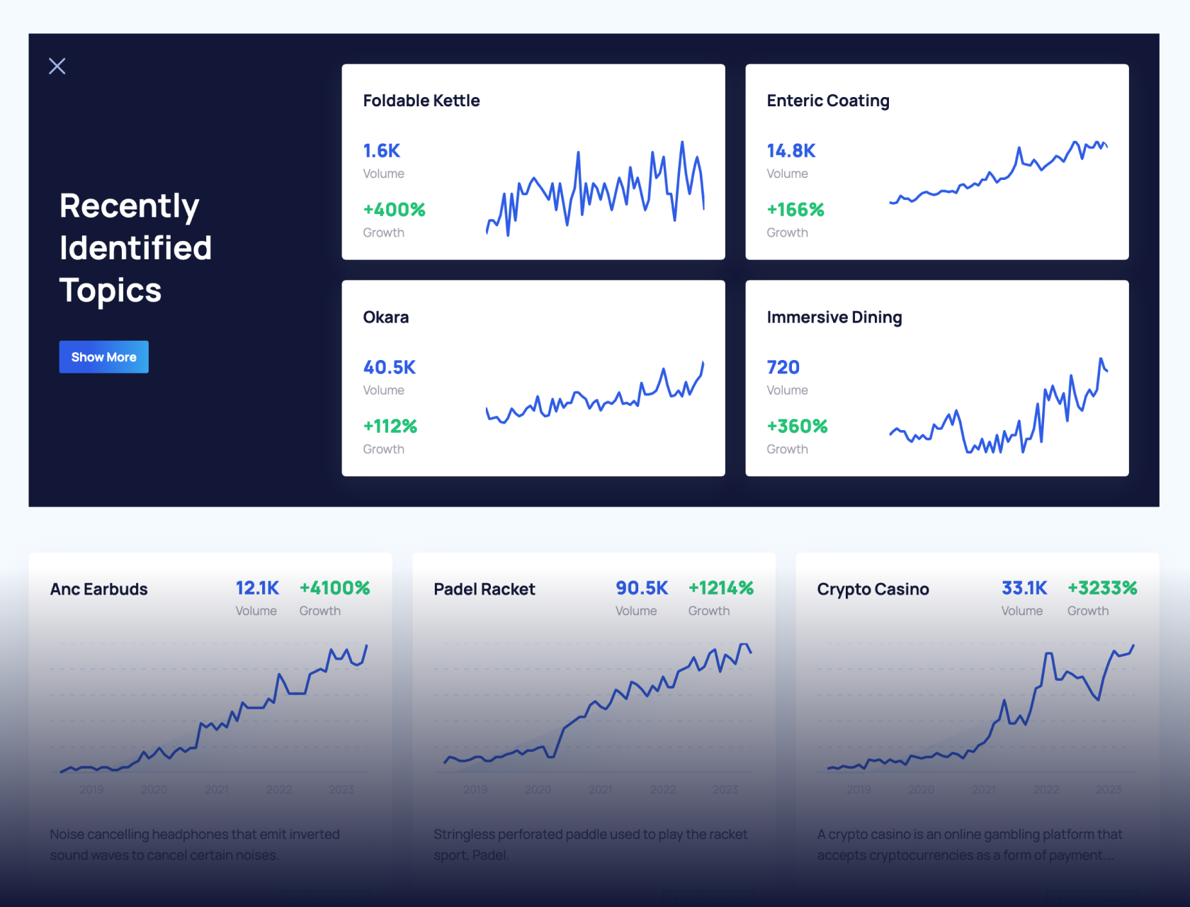
Exploding Topics’ advanced algorithm monitors millions of unstructured data points to spot trends early on.
Keyword Research
Performance Tracking
Competitor Intelligence
Fix Your Site’s SEO Issues in 30 Seconds
Find technical issues blocking search visibility. Get prioritized, actionable fixes in seconds.
Powered by data from
Latest Blog Posts
Featured Case Studies
See what's trending before everyone else
Each week, we'll send you our best Exploding Topics. Plus, expert insight and analysis.
25+ Fascinating Logo Statistics, Data, and Trends (2024)
When considering a brand’s identity, the first thing that comes to mind is its logo. Brand logos are designed to be unique and memorable — and do the impossible task of telling a brand’s story in a single image.
Design choices in logo-making can inspire customers or scare them away. Font, color, and other design elements send subtle signals to consumers, giving them a sense of what a brand represents. The very best designs leave a lasting impression.
How much do those design choices matter? To help you gain a deeper understanding of the world of logos and branding, here is a detailed breakdown of the latest logo statistics.
Top Logo Statistics
Before you start reading this in-depth list of stats, take a moment to review some of the more notable logo statistics:
- Apple has the most memorable logo
- Blue is the most popular logo color used by Fortune 500 companies
- Only 25% of small business owners are willing to pay more than $100 for a logo design
- 36.7% of small business owners use online logo makers
- Nike paid just $35 for its first “swoosh” logo
- Stella Artois’s logo has been around since 1366
Ready to learn more? Keep reading for some “big picture” logo stats.
General Logo Statistics
How are logos categorized? What are the world’s most recognizable logos? Which colors work best? This section covers the big picture when it comes to logos and logo design.
There are 7 main types of logos (Logo)
All logos are unique, but they can be broken down into 7 distinct categories:
- Abstract logos feature an icon that would otherwise be unrecognizable if not attached to a brand. Nike’s “swoosh” and Mastercard’s overlapping circles are two of the most memorable abstract logos.
- Wordmark logos feature a brand’s name written in a particular font. Examples include Coca-Cola’s iconic script and Google’s multi-colored wordmarks.
- Lettermark logos are often used when a brand is best known by an acronym. Lettermark logos are often used by media brands like HBO and CNN.
- Pictorial logos, unlike abstract logos, contain icons that depict known objects or ideas. Starbucks’ mermaid and Apple’s apple are both pictorial logos.
- Emblem logos are distinguished, “old world” logos that have often been around for 100 years or more. Notable examples include the Manchester United football club and Stella Artois brewing company.
- Mascot logos depict a character that represents a brand. Mr. Clean, Wendy’s, KFC, and Michelin all use mascot logos.
- Combination logos combine abstract, pictorial, emblem, or mascot elements with wordmarks or lettermarks. Walt Disney uses a script wordmark over a castle pictorial.
Apple has the most memorable logo (VistaPrint)
VistaPrint surveyed 2,000 Americans to find out which brand has the most memorable logo. Apple came out on top, beating long-established consumer brands like McDonald’s and Coca-Cola. Here are the top 10 most recognized brands by Americans:
- Apple
- McDonald’s
- Coca-Cola
- Nike
- Starbucks
- Adidas
- Amazon
- YouTube
61% of Fortune 500 company logos contain both a wordmark and an icon (Website Planet)
307 Fortune 500 companies use combination logos — by far the most popular style of logo. Logos containing just a wordmark are the second-most popular, with 155 (31%) companies using them. Less common logo styles are lettermarks, emblems, abstract icons, and pictorial icons.
Blue is the most popular logo color used by Fortune 500 companies (Website Planet)
39% of Fortune 500 companies use blue as the main color in their logos. Black is less popular but still frequently used, with 25% of companies featuring black in their logos. 16% of companies use red as a main color.
43% of Fortune 500 companies use two colors in their logos (Website Planet)
While most logos have a standout or “main” color, many use color combinations to create a memorable impression. 186 or 37% of Fortune 500 companies utilize a single color, while the rest use a combination. Two colors are the most popular, but some brands use three (14%), four (5%), or five or more colors (less than 1%).
71.6% of the world’s top 250 companies use Sans Serif fonts in their logos (Custom Neon)
Numbers don’t lie: Sans Serif is the most popular font style for company logos. 179 of the top 250 global companies use them. That’s more than three times the number of companies that use Serif fonts (22.4%).
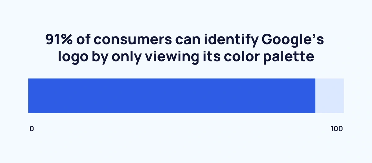
Over 9 in 10 consumers can identify Google’s logo by only viewing its color palette (Reboot)
What role does color play in brand recognition? Reboot set out to find the answer to that question by showing 2,500 consumers color palettes of 10 famous brands. A staggering 91% were able to correctly guess Google just by its color palette.
Other brands quickly identified by color alone were McDonald’s (84%), Starbucks (80%), Facebook (73%), and IKEA (67%). Consumers struggled to identify Cadbury (31%), Harrods (22%), and Tiffany & Co. (17%).
42% of consumers say that logos help convey a brand’s personality (VistaPrint)
Logos matter to consumers. More than half say they’re more likely to shop with a brand that has a logo they recognize. Conversely, 3 in 5 say they would avoid a brand with an ugly logo. For consumers, logos make a first impression:
- 42% say logos convey a brand’s personality.
- 40% say logos reveal the type of products brands sell.
- 39% say logos reveal the quality of a brand.
Small Business Logo Statistics
While big-name brands often have the most memorable logos, even small businesses and startups need logos to establish their brand identity. With tight budgets, small business owners must get creative to find a logo that’s both affordable and appealing.
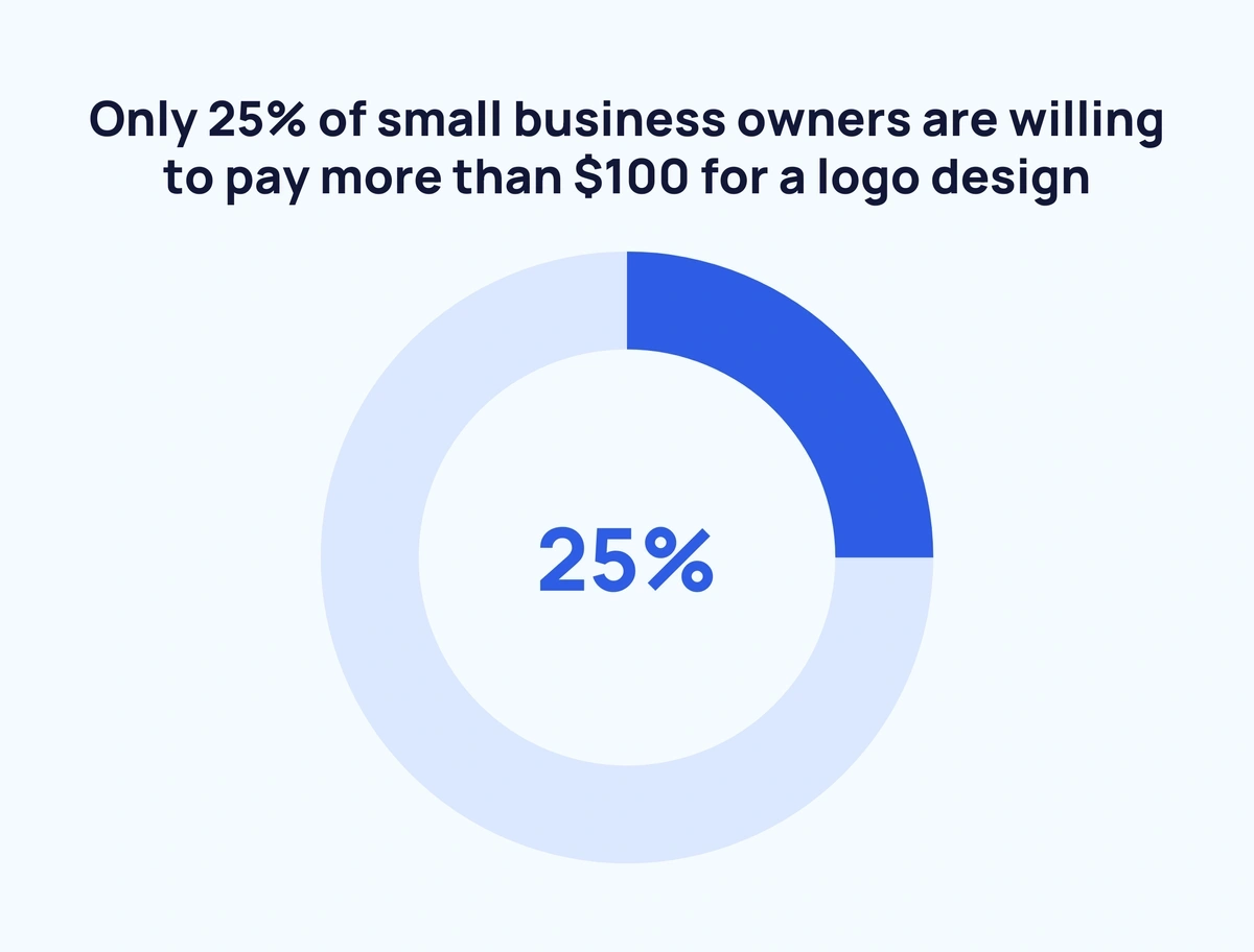
Just 1 in 4 small business owners would pay more than $100 for a logo design (ZenBusiness)
ZenBusiness surveyed 1,200 small business owners to determine the typical budget for logo design. 53.9% of respondents said their budgets were between $1 and $100. 20.5% said they had zero budget for a logo design. 19.2% said they’d be willing to pay between $100 and $500. Only 6.4% reported budgets of $500 or greater.
44.6% of small business owners expect their logo designs within one week (ZenBusiness)
Business owners have different views on how long a logo should take to make. 25.5% say they’re willing to wait up to a month for a design. On the other hand, 17.8% say they expect their new logo delivered in just one or two days, and 7.9% expect results in less than 24 hours.
More than three-quarters of small business owners design their logo before launching their business (ZenBusiness)
78.6% of entrepreneurs say they locked down a logo before launching their startups. Others opt to get business rolling before designing a logo: 16% wait 2-3 months after launch and 5.3% wait an entire year.
36.7% of small business owners use online logo makers (ZenBusiness)
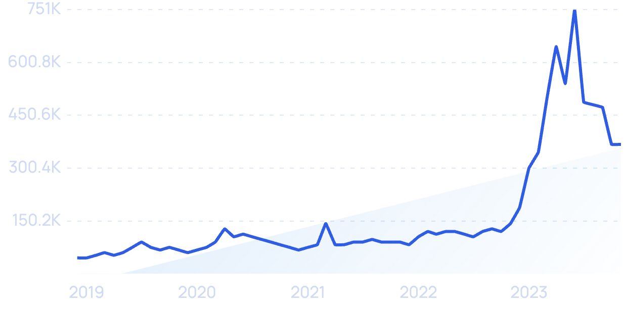
For budget-conscious business owners, designing their own logos with online logo makers can save time and money. Tools like Looka use AI to generate logo mockups based on keywords or brand names.
Google searches for "Looka" over the past 5 years.
There are other options beyond online logo generators. 23.7% of small business owners design their own logos. 20.4% hire freelance designers to create logos for them. Fewer than 20% reach out to design studios or agencies.
Logo Cost Statistics
When big brands look to refresh their image, they tend to have big budgets for logo redesigns. But some of the world’s most famous logos were created at little to no cost. Here are some big brands that paid either handsomely or next to nothing for their logos.
Google’s original logo was first designed in 1997 for free (Hubspot)
As one of the world’s most valuable brands, you might assume Google shelled out a lot of money for its logo. However, the search giant’s first logo was created by the founders in 1997.
Some say Larry Page designed it, others contend that Sergey Brin created it using the open-source image editor GIMP.
Google’s in-house designers have refreshed the logo several times since its first iteration in 1997.
Coca-Cola spent $0 on it’s iconic logo (Coca-Cola)
The world’s most famous soda was invented in 1886 by Dr. John S. Pemberton. Pemberton’s bookkeeper, Frank M. Robinson suggested the name Coca-Cola. He also hand-drew the timeless script-font logo the beverage company still uses today.
Nike paid just $35 for the first “swoosh” logo (Logo My Way)
In 1971, Phil Knight rebranded his company, Blue Ribbon Sports, into Nike. He wanted a memorable logo that elicited feelings of speed and grace. Knight commissioned graphic design student Carolyn Davidson, whose “swoosh” design netted her a whopping $35. Today Nike earns over $30 billion in annual revenue.
Pepsi spent $1,000,000 on their new logo (Simplio)
Pepsi’s logo has gone through several changes over the company’s century-plus lifespan. In 2008, the beverage maker sought to modernize its logo and spent approximately $1 million on a new design.
BP spent $210,000,000 on a logo rebrand in 2000 (Simplio)
At the beginning of the 21st century, BP was looking to refresh its brand image into something more “eco-friendly.” In the year 2000 it debuted the green and yellow flower logo still in use today. The logo rebrand is one of the most expensive in history, costing the company a reported $210 million.
Classic Logo Statistics
In keeping up with modern tastes, many brands will completely overhaul their logo and branding. But some brands have logos so iconic that they remain mostly unchanged for hundreds of years. Here are some of the world’s oldest logos still used today.
Stella Artois’s logo has been around in some form since 1366 (Time)
The Belgian beverage company has refined its logo several times over the past 657, but its most striking element — the horn — has been present since the company was founded in 1366.
The Twinings logo has been in continuous use since 1787 (Twinings)
English tea maker Twinings first rolled out their “two lions” logo in 1787—236 years ago. According to the company, it’s one of England’s oldest unchanged logos still in use today.
Bass Ale’s logo has been in use since 1876 (Logoworks)
England’s Bass Brewery opened its doors in 1777, but its red triangle and script logo didn’t jump on the scene until almost 100 years later. The beer’s logo was the first trademark granted in the UK under the 1875 Trade Mark Registration Act.
Levi Strauss & Co. debuted the “two-horse” logo in 1886 (Levi)
Look at the patch on the back of a pair of Levi’s and you’ll see two horses attempting to pull apart a pair of denim overalls. That logo — first designed in 1886 — has been a central part of Levi’s brand identity. Another brand element, the red Levi tab, was introduced in 1936.
Wrap Up
Nearly every brand — from local small businesses to multinational corporations — has a unique logo. Behind each of those logos are a series of careful considerations: design, font, color, cost, and time.
Old or new, free or absurdly expensive, logos help shape the world we live in today. We interact with dozens of brand logos throughout our days, and while most are forgotten, some stay etched in our consciousness.
Want to keep heading down the rabbit hole? Read these articles about branding statistics and marketing trends.
Stop Guessing, Start Growing 🚀
Use real-time topic data to create content that resonates and brings results.
Exploding Topics is owned by Semrush. Our mission is to provide accurate data and expert insights on emerging trends. Unless otherwise noted, this page’s content was written by either an employee or a paid contractor of Semrush Inc.
Share
Newsletter Signup
By clicking “Subscribe” you agree to Semrush Privacy Policy and consent to Semrush using your contact data for newsletter purposes
Written By


Josh is the Co-Founder and CTO of Exploding Topics. Josh has led Exploding Topics product development from the first line of co... Read more
