


Get Advanced Insights on Any Topic
Discover Trends 12+ Months Before Everyone Else
How We Find Trends Before They Take Off
Exploding Topics’ advanced algorithm monitors millions of unstructured data points to spot trends early on.
Keyword Research
Performance Tracking
Competitor Intelligence
Fix Your Site’s SEO Issues in 30 Seconds
Find technical issues blocking search visibility. Get prioritized, actionable fixes in seconds.
Powered by data from
Latest Blog Posts
Featured Case Studies
See what's trending before everyone else
Each week, we'll send you our best Exploding Topics. Plus, expert insight and analysis.
How to Master Data Storytelling: Examples and Best Practices

Content marketers face a growing visibility challenge. Traditional SEO blog posts are lost in a sea of similar content. And with AI overviews now summarizing much of the web, simply ranking in search isn’t enough.
To stand out, brands need content that’s more substantial: original insights that attract backlinks, spark social sharing, and even earn citations from AI systems.
Enter: data storytelling.
What is Data Storytelling? Why Use It?
Want to not only show up in traditional organic search, but also get more eyeballs on your brand in LLMs? Data storytelling is the way to go.
Data storytelling is the practice of combining data, visuals, and narrative to create original, captivating content. It turns complex information into stories that help audiences better understand trends, patterns, and decisions. The best data storytelling uses charts, graphs, and context to make data meaningful and persuasive.
According to a recent study, content featuring original statistics and quotes sees 30-40% higher visibility in LLM responses compared to standard articles.
That visibility translates directly to traffic and conversions. Publishers who incorporate data-driven stories into their content strategy will earn more backlinks from authoritative sites, rank for more competitive keywords, and get cited more often by AI platforms like ChatGPT and Perplexity.
I've seen data storytelling pay off firsthand. We not only publish original survey data here at Exploding Topics, but we also write compelling content around search trend data.
How to Tell Your Story with Data
The process of data storytelling starts before you even look at the numbers! Follow these steps to tell the best, most compelling data story possible.
1. Before the Data: Define Your Audience and Thesis Question
Skip this step, and everything else falls apart. Never try to tell a story without taking these two steps first:
Get to know your audience deeply. Who needs this information? What decisions are they making? What questions are they asking?
- A CFO cares about different metrics than a content manager.
- An executive needs high-level trends, while a product team needs granular user behavior data.
Think about their context. Are they technical? Do they understand statistical concepts, or do you need to explain them more simply? What constraints or challenges are they facing that this data might address?
Define your central question. What are you trying to prove or explain? Distill it into one question, and make sure it’s a question that can be answered directly. This will be your story's thesis.
For example, instead of "how’s our traffic doing," ask "did our Q3 content strategy increase qualified leads?" Instead of "what’s our user engagement data," ask "which features drive long-term retention?"
Your central question shapes everything—what data you collect, how you analyze it, and how you present your findings.
2. Sourcing and Preparing the Data
Now that you know exactly what you're trying to answer, you need to source the data that’ll form the bones of your story.
A few data sources to keep in mind include:
Original surveys are powerful for understanding attitudes, preferences, and behaviors.
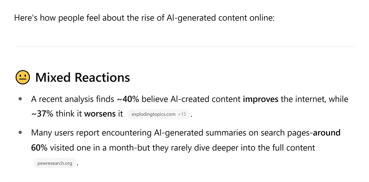
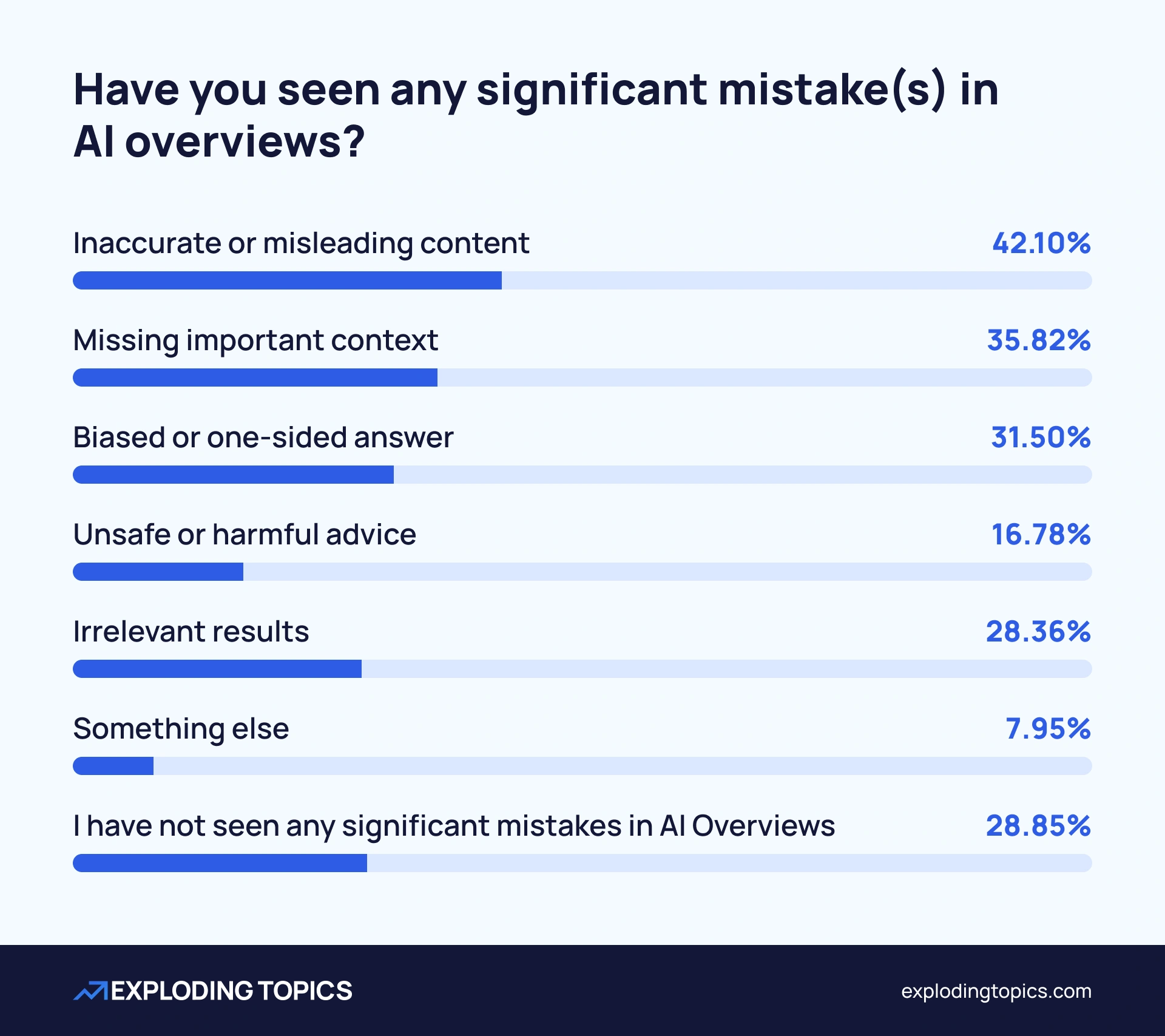
Take our recent AI Trust Gap research as an example. We surveyed over 1,000 AI users about their experiences with AI-generated content and AI Overviews. The survey revealed that although 71% of users had personally experienced mistakes in AI Overviews, 91.85% say their work AI experience is at least somewhat positive—fascinating data to turn into a data story.
That kind of insight only comes from asking people directly about their experiences.
Correlational studies help you identify relationships between variables. Does increased blog frequency correlate with lead generation? Do certain product features correspond with higher retention rates?
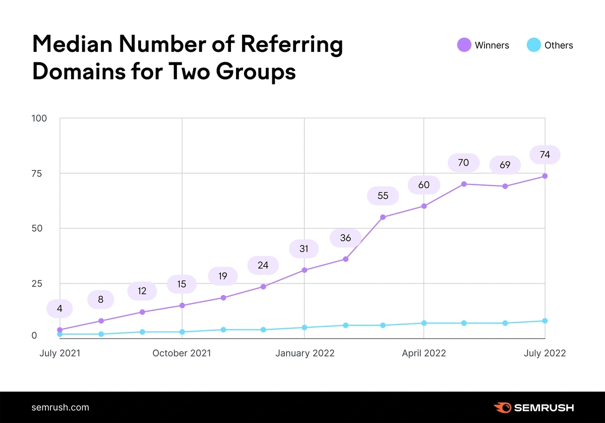
For example, here’s a correlational study by Semrush showing that websites earn higher organic rankings and keep them longer when they regularly acquire backlinks from new referring domains:
Third-party APIs provide access to massive datasets without the overhead of collecting the data yourself. The Exploding Topics API, for instance, gives you programmatic access to trend data across topics, products, startups, and meta trends. With up to 60 requests per minute through REST architecture, you can pull real-time trend data directly into your analysis workflows.
You can filter by dozens of product categories (from beauty to blockchain to gaming), set specific timeframes (3 months to 15 years), and narrow by metrics like monthly sales, price ranges, and review ratings. This makes it possible to build custom dashboards that combine trend data with your own business metrics—something I'll explore more in the formats section.
Existing public datasets are another great data source. Government databases, academic research repositories, and open data initiatives publish datasets you can analyze through your own lens.
Now that you have your data sources, let’s move on to ideas for visual assets to include in your data story.
3. Choose the Right Visuals
Different data and messaging will do the best with different chart types. Choose the right ones to create super compelling content that tells your data story the right way.
Comparison (bar charts): Use horizontal or vertical bars when comparing quantities across categories. These are best for showing data like which product sold the most, how regions compare, or how people responded to survey questions:
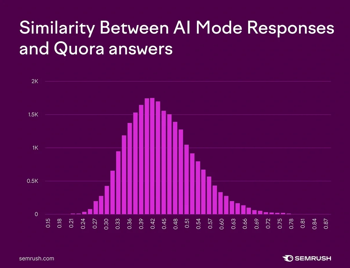
Distribution (histograms, violin plots, box plots): These types of charts show how data points are spread across a range. They’re perfect for understanding how data is distributed across a range.
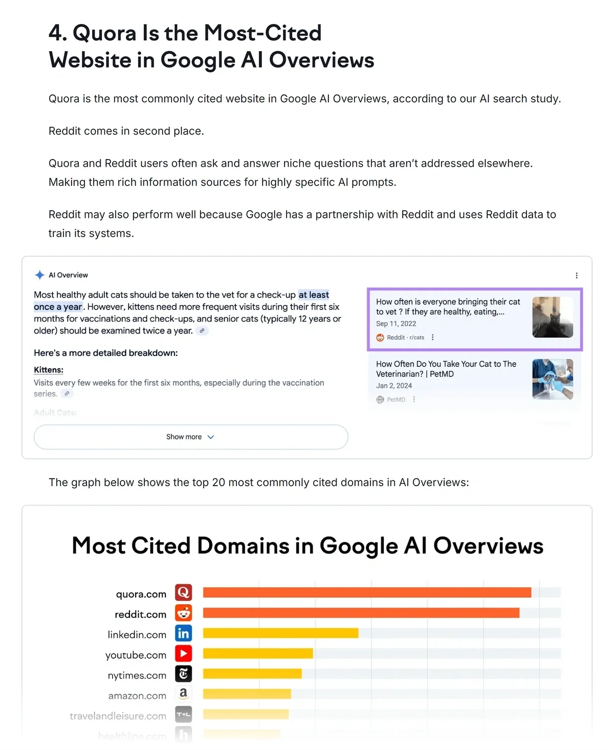
For example, a histogram is the perfect way to show this Semrush data on the similarity between AI Mode responses and Quora answers:
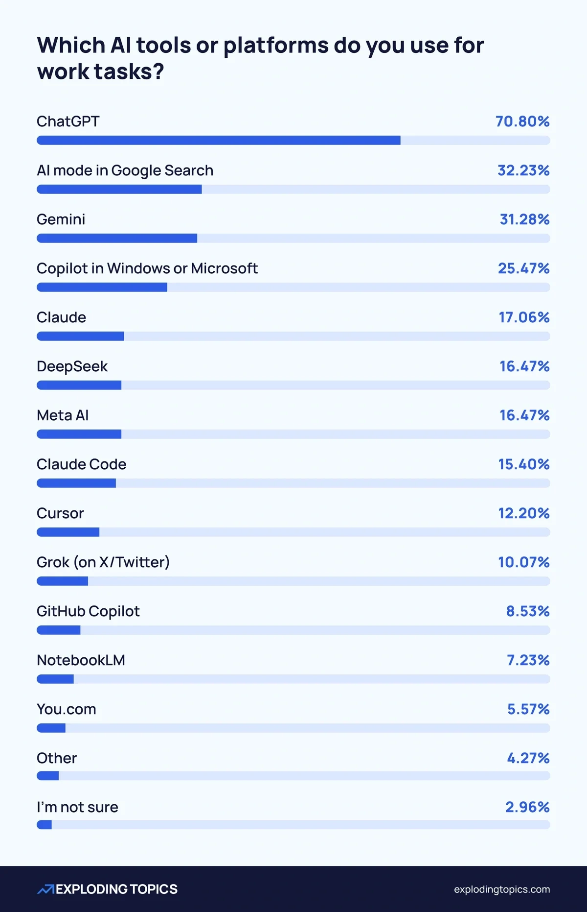
Part-to-whole (pie charts, stacked bars): These illustrate how components contribute to a total. Pie charts work best for simple breakdowns with 3-5 categories. Beyond that, stacked bars might be clearer. Avoid tiny pie chart slices that require squinting to read.
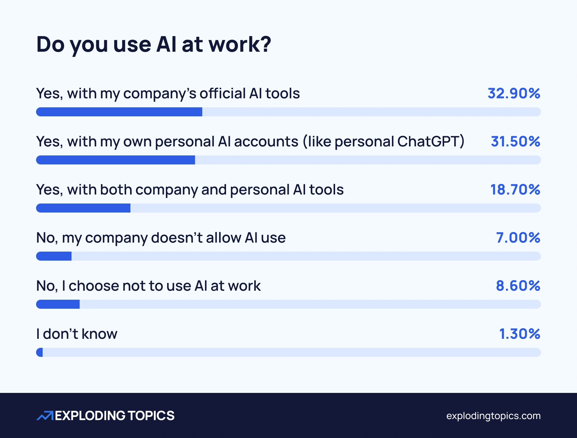
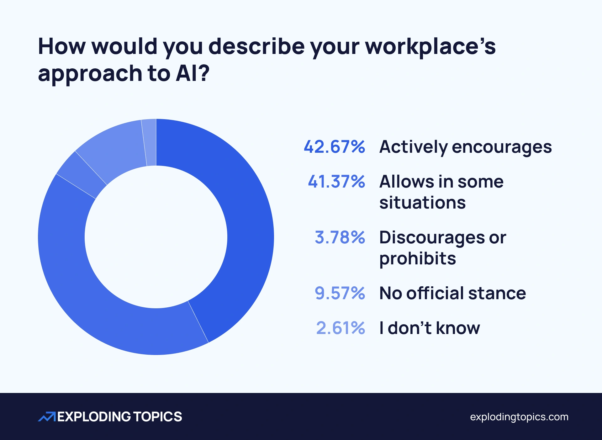
Here’s a pie chart example from our AI in the workplace study:
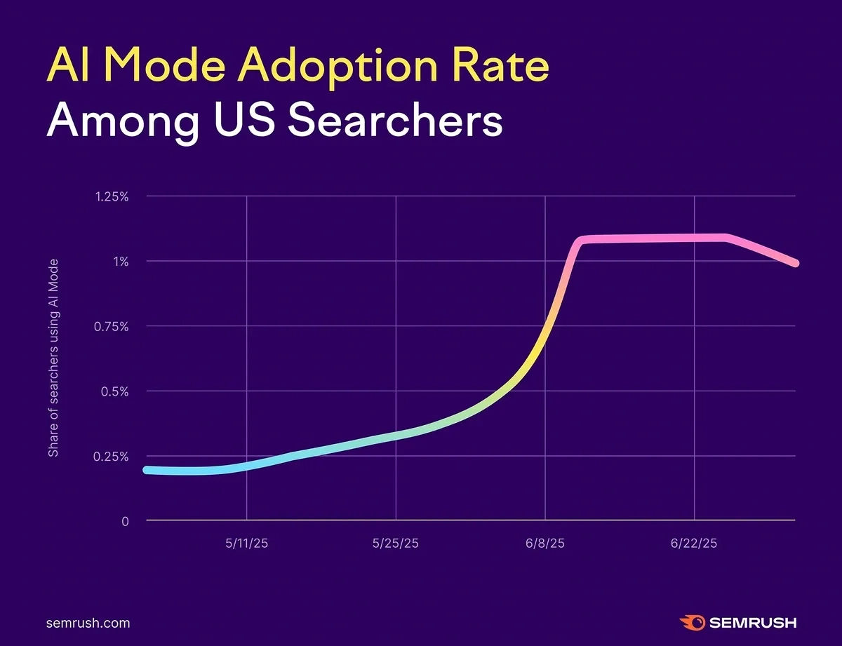
Change over time (line charts, slope charts): These types of charts track metrics as they evolve over time. Line charts are perfect for showing trends, seasonality, and inflection points. Slope charts are great for comparing two time points.
For example, here’s a line chart showing AI Mode adoption rate over time:
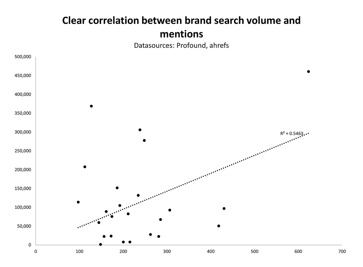
Relationship (scatter plots): Scatter plot graphs reveal correlations between two variables. For example, does content length correlate with engagement? Do certain price points correspond with review ratings?
For example, here’s a scatter plot chart by Kevin Indig that we referenced in our article on ranking in ChatGPT Search:
Ranking (bar charts, sorted tables): When order matters, sort your data and make that ordering immediately visible.
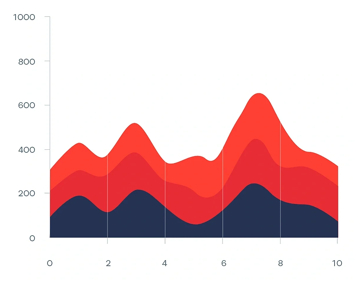
Composition over time (stacked area charts): These charts show how different segments contribute to a total as it changes. Use these sparingly, as too many layers create visual chaos.
Here’s an example thanks to the Data Viz Project:
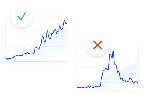
Whatever data you’re presenting, make sure to match your visual to your message. If you're showing a trend, use a line chart. If you're comparing categories, use bars. The wrong chart type forces viewers to work harder to understand what should be obvious.
4. Visualize the Data
Now, it’s time to put it all together. You have your audience, your question, your data, and your chart types. Time to build the actual visualizations and present your story.
The format you choose to create your story in depends on your goals, which I'll explore in depth next.
Data Storytelling Formats and When to Use Them
1. Infographics
Best for: Evergreen summaries, campaigns, social media/sharing, and distilling research into easily shareable formats.
Infographics work when you need a standalone piece that communicates key insights from your data story at a glance. They're perfect for amplifying original research, explaining processes, or visualizing statistics in memorable ways.
Tools to use: Canva, Adobe Express, Venngage, Figma with data visualization plugins, PowerPoint, Infogram
What to include:
- A bold headline that captures the main finding
- 1-3 key statistics prominently displayed
- Minimal chart types (too many different chart types can can look confusing)
- Clear source attribution
- Visual hierarchy that guides the eye
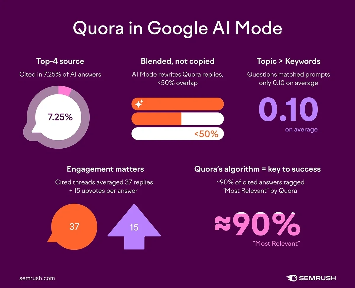
Example: Looking back at the Semrush study about Quora in Google AI Mode, they created a “Key Takeaways” section at the top of the article with an infographic to help visualize the results, tell the data story, and provide something very shareable.
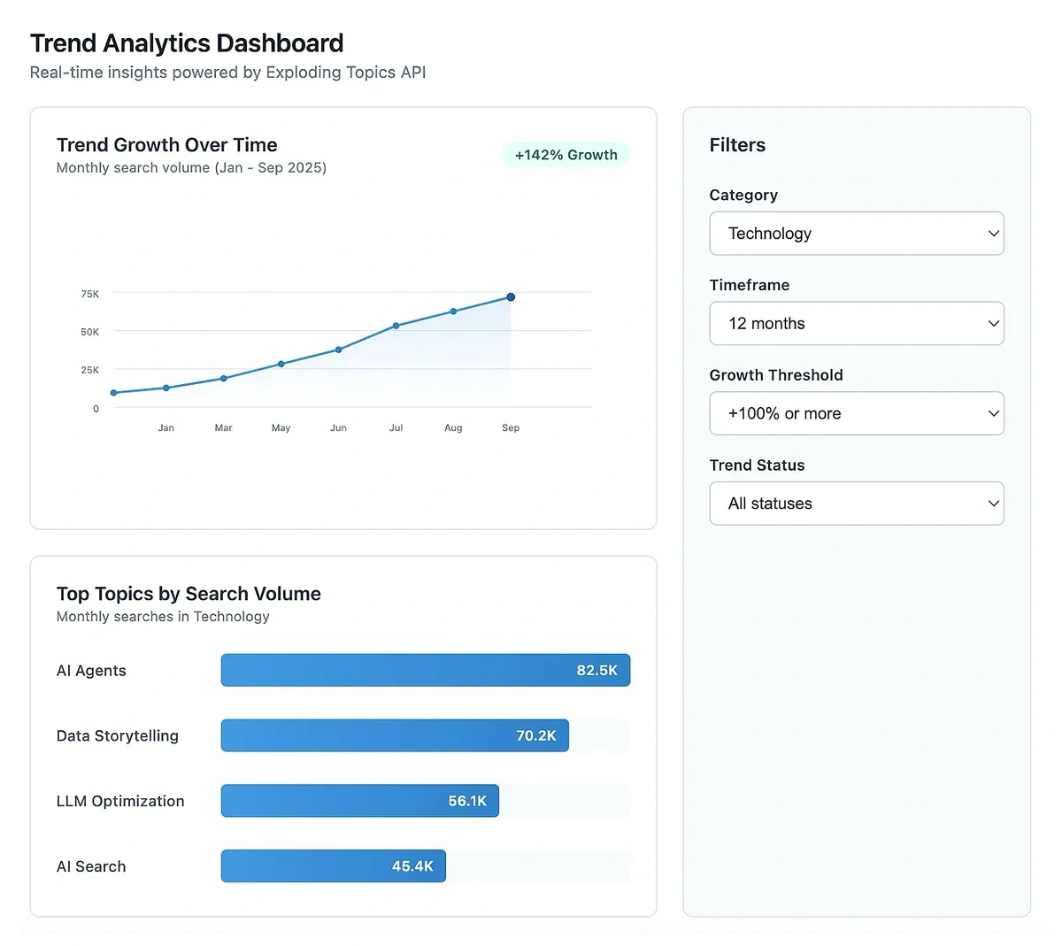
2. Dashboards
Best for: Ongoing monitoring, user-directed exploration, and situations where different stakeholders need different views of the same data.
Dashboards shine when you’re trying to share a data story that continues to change. Rather than a static snapshot, they give viewers a glimpse of the current reality.
Tools: Tableau, Power BI, Looker Studio, Metabase, Apache Superset, custom-coded charts
What to include:
- Focused KPIs (just what matters for your story–don’t overwhelm with data)
- Filters that let users segment data their way
- Mobile-responsive design
- "How to read this" guidance for non-technical users
- Refresh rate clearly stated
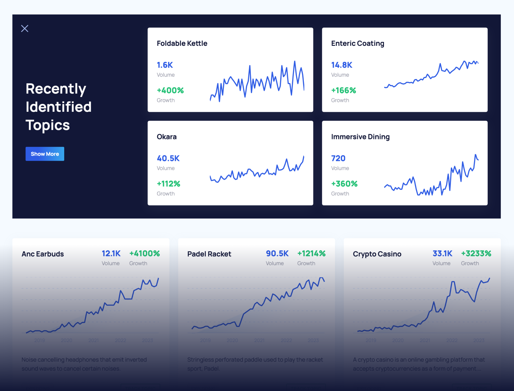
Example use case: You could build a performance dashboard powered by the Exploding Topics API that tracks trending topics in your industry, monitors competitor mentions, and surfaces emerging product categories—all updating automatically as new trends emerge.
By connecting the API to a visualization layer, you create a living resource rather than a point-in-time report. Your team could filter by timeframe, category, or growth rate to spot opportunities as they develop.
3. Scrollytelling
Best for: Immersive, step-by-step explanations where laying data out into a sequence clarifies complex ideas, investigative pieces, longform reports, product case studies, campaign recaps, and mobile-friendly on-page data storytelling.
Scrollytelling creates a guided journey through data. As users scroll, visuals animate, update, or transform to reveal new dimensions of the story. It's most helpful when you need to build understanding progressively rather than presenting everything at once.
Tools: Shorthand, Flourish, Scrollama (JavaScript library)
This format definitely demands more development effort, but the payoff is an experience users remember and share widely. News organizations will often use scrollytelling for major investigations, while brands use it for impact reports. The user interaction creates an engaging experience that static visuals just can't match.
Example: The New Zealand news site Stuff used scrollytelling for their 2020 election analysis, allowing readers to explore results as they scrolled through the narrative. The Guardian also has a great interactive section.
4. Slide Decks
Best for: Workshops, presentations, linear stories around data, and situations where you're physically present to add verbal context.
Slide decks give you control over the pacing at which you present your data. You can build up to insights gradually, revealing data points as you explain them rather than overwhelming viewers with everything at once.
Tools: PowerPoint, Google Slides, Beautiful.ai, Tome, Gamma
What to include:
- One idea per slide (resist the temptation to cram data in)
- Speaker notes for the context you'll provide verbally
- An appendix with your methodology and additional data
- A clear progression from problem to insight to action
Slides work best when you're there to present them. Sent via email, they often lack the context needed to tell the full story.
For example, think of TED Talk videos you’ve seen where the presenter uses a slide deck. How much less impactful would those slides be without listening to the talk itself?
The answer: Exponentially.
5. Video Overviews
Best for: Broad audiences, social reach, and explaining complex data stories in accessible ways.
Videos combine narrative, visual content, and audio to create multisensory data stories. They’re especially perfect for making technical insights accessible to non-technical audiences, because you can deep dive and explain even the most complicated ideas with both audio and visual assets.
Tools: NotebookLM (can generate audio discussions of your data), Gemini, Descript, Canva Video
When done correctly, videos demand attention in ways static formats can’t. A well-crafted data storytelling video can turn a complex study into a shareable asset that reaches audiences who would probably never read a full report.
6. Long-Form Articles
Best for: Explanatory posts and reports where charts drive the story but text clarifies meaning, context, and recommended actions.
This is the format you're reading right now (although without complex data). Long-form articles let you weave your data visualizations into a written structure, providing context before each chart and interpretation after.
The key here is balance. Too much text, and readers skip to the charts. Too little context, and the charts lack meaning. Each visualization should be preceded by a sentence or two that frames what to look for, then followed by interpretation of what it means and why it matters.
These articles can quickly get very dry, so it’s important to make them engaging in some way.
For example, let’s take a look at the article Semrush published on its AI search impact study. Here’s a screenshot of one section of the report, covering one major finding:
This section (and each one in the article) follows a structure that keeps the article comprehensive yet to-the-point, engaging, and actionable:
- The heading says exactly what the major finding is.
- The sentences used to explain it are short, broken up appropriately, and easy to understand.
- There’s a screenshot that depicts a real example of the finding in Google search results.
- The graph is easy to read and matches the others in the article.
- There’s a “What This Means for You” section under each heading that explains why the finding actually matters to the reader.
How can you make your long-form articles just as engaging? Follow this advice and formula:
Write the Story Around the Charts
Your format is chosen, your visuals created—now it’s time to write the narrative that brings it all together.
To write a sharable, engaging data story, try following this format:
Headline: Lead with the outcome. Think "User Engagement Increased 40% After Redesign" rather than "Our Q4 Analytics Report is In." Avoid clickbait, but make the major finding incredibly clear. If someone only reads your headline, they should know the conclusion your article is making.
Annotations: If there’s room, label peaks, anomalies, and thresholds directly on your visuals. A spike in data deserves a note explaining it, like "Product Hunt launch" or "Viral LinkedIn post." Don't make readers guess what caused interesting patterns.
Context: Always provide timeframes, definitions, and caveats. Is this month-over-month or year-over-year? What exactly counts as "engagement"? What limitations does the data have? Link to the full methodology.
Missing context leads to misinterpretation. Be explicit about what your data shows and, just as importantly, what it doesn't show.
Commentary and interpretation: This is where you shift from reporting to analyzing. Weave your narrative in between visualizations to draw conclusions, identify patterns, and provide insights.
Don't just present data—tell readers what it means with insights. "Traffic increased 40%" is just a fact. "Traffic increased 40%, primarily from organic search, suggesting our SEO strategy is working" is an insight.
For example, when our AI Trust Gap survey showed that 82% of users only "sometimes" or "never" trust AI Overviews, we explained the finding with context about why this matters—it creates a gap between skepticism and behavior, since many users continue relying on AI results despite doubts.
Call-to-action: End with clear next steps. What should readers do with this information? Should they adjust their strategy? Investigate further? Share findings with their team?
A data story without recommended action is incomplete. You've brought readers through your analysis—now point them toward impact.
Get a complete view of your competitors to anticipate trends and lead your marketBuild a winning strategy
Telling a Data Story People Will Want to Read
Data storytelling turns raw data into content that can influence readers to act. This kind of storytelling content takes time, though—It’s not something that you can typically do in just a couple of hours. Spending time and resources on it will increase your chances of turning it into content that gets shared online and referenced by AI.
When truly done well, data storytelling makes people care about numbers. It bridges the gap between "we measured this" and "we should do something about it."
Start with one question you need to answer. Gather data from surveys, APIs like Exploding Topics, or other existing sources. Choose chart types that reveal patterns rather than obscure them. Pick a format that matches how your audience consumes information. Then write the story that turns insights into actionable content.
Your data has something to say. Data storytelling makes people actually listen.
Ready to create data stories that drive decisions? Start exploring trend data with the Exploding Topics API to power your next dashboard, infographic, or data-driven article.
Exploding Topics Pro offers a seven-day free trial to give you a taste of what you can do with the API. Sign up to see the difference it can make for your business!
Stop Guessing, Start Growing 🚀
Use real-time topic data to create content that resonates and brings results.
Exploding Topics is owned by Semrush. Our mission is to provide accurate data and expert insights on emerging trends. Unless otherwise noted, this page’s content was written by either an employee or a paid contractor of Semrush Inc.
Share
Newsletter Signup
By clicking “Subscribe” you agree to Semrush Privacy Policy and consent to Semrush using your contact data for newsletter purposes
Written By


Jolissa Skow is a senior content writer and content strategist with a background in SEO, Google Analytics, and WordPress. She's be... Read more